Customize Storefront for Ticket Booking
In this tutorial, you'll customize the Next.js Starter Storefront based on the Ticket Booking system you implemented in the backend.
Summary#
In this tutorial, you'll customize the Next.js Starter Storefront to support ticket booking:
- Product Page: Allow customers to choose a show date, select seats from a seating layout, and add tickets to the cart.
- Cart Page: Display selected tickets with their seat numbers and show dates, and remove quantity controls for ticket items.
- Checkout Page: Remove the shipping steps and complete the cart using the custom complete cart API route you created earlier.
- Order Confirmation Page: Display ticket details for ticket items.

If you installed the Next.js Starter Storefront with the Medusa backend, the storefront was installed in a separate directory. The directory's name is {your-project}-storefront.
So, if your Medusa application's directory is medusa-ticketing, you can find the storefront by going back to the parent directory and changing to the medusa-ticketing-storefront directory:
Step 1: Ticket Product Utilities#
Before you customize the storefront, you'll create some types and utility functions that you'll use in your customizations.
Create the file src/lib/util/ticket-product.ts with the following content:
1import { HttpTypes } from "@medusajs/types"2 3export interface TicketProductAvailability {4 date: string5 row_types: {6 row_type: string7 total_seats: number8 available_seats: number9 sold_out: boolean10 }[]11 sold_out: boolean12}13 14export interface TicketProduct {15 id: string16 product_id: string17 venue: {18 id: string19 name: string20 address: string21 rows: Array<{22 id: string23 row_number: string24 row_type: string25 seat_count: number26 }>27 }28 dates: string[]29}30 31export interface TicketProductAvailabilityData {32 ticket_product: TicketProduct33 availability: TicketProductAvailability[]34}35 36export interface TicketProductSeatsData {37 venue: {38 id: string39 name: string40 address: string41 rows: Array<{42 id: string43 row_number: string44 row_type: string45 seat_count: number46 }>47 }48 date: string49 seat_map: {50 row_number: string51 row_type: string52 seats: {53 number: string54 is_purchased: boolean55 variant_id: string | null56 }[]57 }[]58}59 60/**61 * Check if a product is a ticket product by looking for the ticket_product property62 */63export function isTicketProduct(product: HttpTypes.StoreProduct): boolean {64 return !!(product as any).ticket_product65}
You define types for the ticket product availability and seating layout API responses, as well as a utility function to check if a product is a ticket product.
Step 2: Support Adding Items to Cart with Metadata#
Next, you'll add support for adding items to the cart with metadata. This is necessary because when adding tickets to the cart, you need to include metadata such as the seat number and show date.
This functionality is supported by the Medusa APIs, but you need to update the addToCart function in the storefront to accept and send metadata.
In src/lib/data/cart.ts, find the addToCart function and update its object parameter to include an optional metadata property:
Then, find the sdk.store.cart.createLineItem method usage and pass the metadata property to it:
Now, the addToCart function accepts an optional metadata property and sends it to the Medusa backend when creating a line item.
Step 3: Customize Product Page#
Next, you'll customize the product page. This includes:
- Creating a component that displays a calendar to choose a show date, with available dates determined by the availability API route you created earlier.
- Creating a component that displays a seat chart in a modal to select seats, with purchased seats determined by the seating layout API route you created earlier.
- Customizing the product page to use the above components.
Date Selector Component#
The date selector component will fetch the available dates for a ticket product using the API route you created in the backend part of the tutorial. Before creating the component, you'll add a server function to fetch the available dates.
Create the file src/lib/data/ticket-products.ts with the following content:
1"use server"2 3import { sdk } from "@lib/config"4import { getAuthHeaders, getCacheOptions } from "./cookies"5import { TicketProductAvailabilityData } from "@lib/util/ticket-product"6 7export const getTicketProductAvailability = async (8 productId: string9): Promise<TicketProductAvailabilityData> => {10 const headers = {11 ...(await getAuthHeaders()),12 }13 14 const next = {15 ...(await getCacheOptions("ticket-products")),16 }17 18 return sdk.client19 .fetch<TicketProductAvailabilityData>(20 `/store/ticket-products/${productId}/availability`,21 {22 method: "GET",23 headers,24 next,25 cache: "no-store", // Always fetch fresh data for availability26 }27 )28 .then((data) => data)29}
You create a server function getTicketProductAvailability that fetches the available dates for a ticket product using the /store/ticket-products/{id}/availability API route.
Next, you'll create the date selector component. It will show an input to select the number of tickets and a calendar to select a date.
Create the file src/modules/products/components/ticket-product-layout/date-quantity-selection.tsx with the following content:
8import { useState, useEffect } from "react"9 10type TicketDateSelectionProps = {11 product: HttpTypes.StoreProduct12 onDateSelect: (date: string, nbOfTickets: number) => void13 disabled?: boolean14}15 16export default function TicketDateSelection({17 product,18 onDateSelect,19 disabled = false,20}: TicketDateSelectionProps) {21 const [nbOfTickets, setNbOfTickets] = useState(1)22 const [selectedDate, setSelectedDate] = useState<Date | null>(null)23 const [availability, setAvailability] = useState<TicketProductAvailability[]>([])24 const [isLoading, setIsLoading] = useState(false)25 26 // Load availability data on mount27 useEffect(() => {28 const loadAvailability = async () => {29 setIsLoading(true)30 try {31 const data = await getTicketProductAvailability(product.id)32 setAvailability(data.availability)33 } catch (error) {34 toast.error("Failed to load ticket availability: " + error)35 } finally {36 setIsLoading(false)37 }38 }39 40 loadAvailability()41 }, [product.id])42 43 const getTotalAvailableSeats = (dateAvailability: TicketProductAvailability) => {44 return dateAvailability.row_types.reduce(45 (sum, rowType) => sum + rowType.available_seats, 046 )47 }48 49 const getFilteredAvailability = (quantity: number) => {50 return availability.filter((avail) => getTotalAvailableSeats(avail) >= quantity)51 }52 53 const filteredAvailability = getFilteredAvailability(nbOfTickets)54 55 const dateAsStr = (date: Date) => {56 return `${57 date.getFullYear()58 }-${59 String(date.getMonth() + 1).padStart(2, "0")60 }-${String(date.getDate()).padStart(2, "0")}`61 }62 63 const isDateUnavailable = (date: Date) => {64 const dateString = dateAsStr(date)65 return !filteredAvailability.some((avail) => avail.date === dateString)66 }67 68 const handleDateChange = (date: Date | null) => {69 setSelectedDate(date)70 }71 72 const handlePickSeats = () => {73 if (!selectedDate) {74 toast.error("Please select a date")75 return76 }77 78 const dateString = dateAsStr(selectedDate)79 onDateSelect(dateString, nbOfTickets)80 }81 82 // TODO render date selector83}
The TicketDateSelection component accepts the following props:
product: The Medusa product to select a date for.onDateSelect: A callback function that is called when the date and number of tickets are selected.disabled: A boolean to disable the component.
In the component, you define state variables to manage the number of tickets, the selected date, the availability data, and the loading state. You also load the availability data when the component mounts.
In addition, you define the following functions:
getTotalAvailableSeats: Calculates the total available seats for a given date availability.getFilteredAvailability: Filters the availability data based on the number of tickets requested.dateAsStr: Converts aDateobject to a string in the formatYYYY-MM-DD.isDateUnavailable: Checks if a date is unavailable based on the filtered availability.handleDateChange: Updates the selected date when the user selects a date from the calendar.handlePickSeats: Calls theonDateSelectcallback with the selected date and number of tickets, or shows an error if no date is selected.
Next, you'll render the date selector form. Replace the TODO with the following:
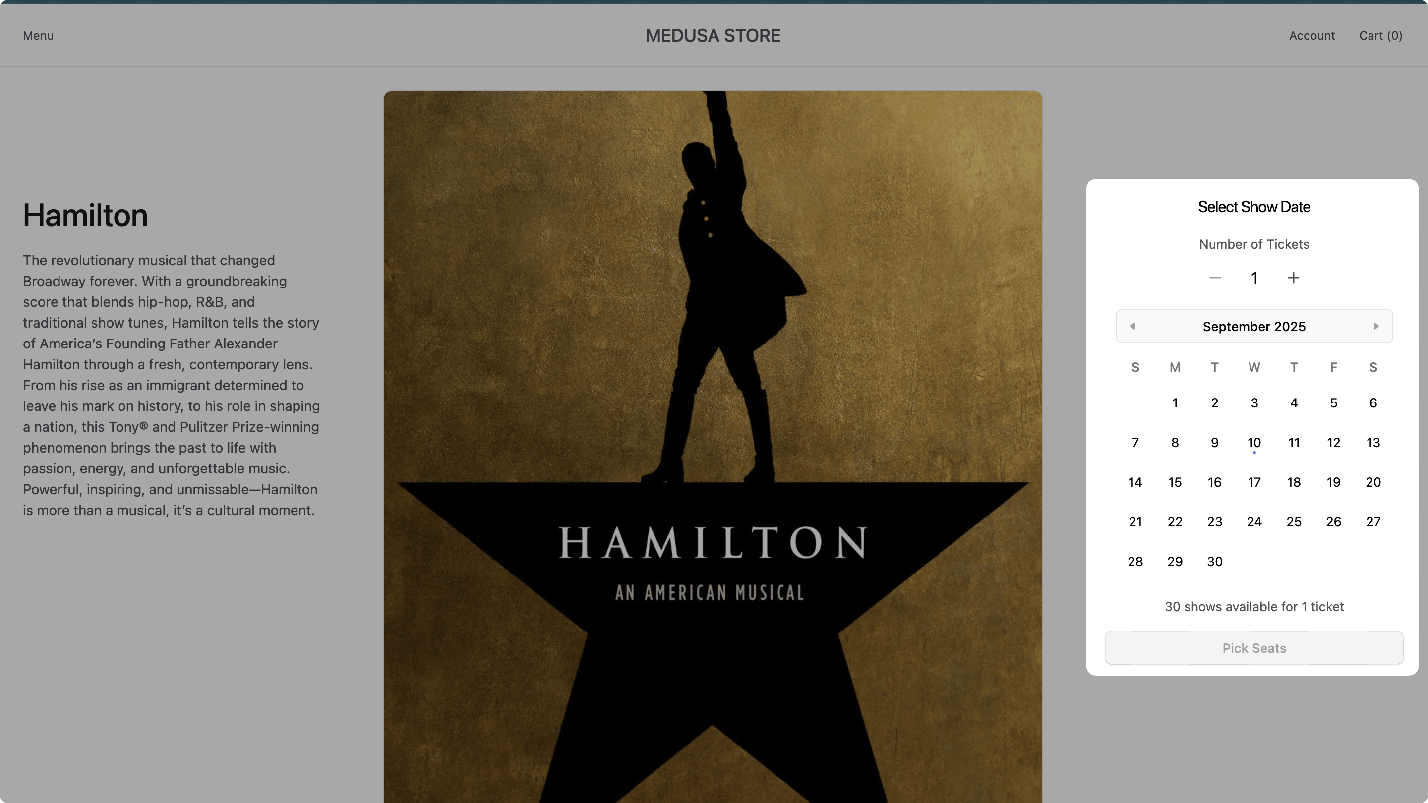
1return (2 <div className="bg-ui-bg-base">3 <h3 className="txt-large text-center mb-4">Select Show Date</h3>4 {isLoading && (5 <div className="flex flex-col gap-y-4">6 <div className="h-6 bg-ui-bg-subtle rounded animate-pulse w-32 mx-auto" />7 <div className="h-10 bg-ui-bg-subtle rounded animate-pulse w-48 mx-auto" />8 <div className="h-6 bg-ui-bg-subtle rounded animate-pulse w-40 mx-auto" />9 </div>10 )}11 {!isLoading && (12 <div className="flex flex-col gap-y-4">13 {/* Number of tickets selection */}14 <div className="flex justify-center">15 <div className="flex flex-col gap-y-2">16 <Label htmlFor="nbOfTickets" className="text-ui-fg-subtle txt-compact-small">Number of Tickets</Label>17 <div className="flex items-center justify-between rounded-md">18 <IconButton19 onClick={() => setNbOfTickets(Math.max(1, nbOfTickets - 1))}20 disabled={disabled || nbOfTickets <= 1}21 variant="transparent"22 >23 <Minus />24 </IconButton>25 {nbOfTickets}26 <IconButton27 onClick={() => setNbOfTickets(Math.min(10, nbOfTickets + 1))}28 disabled={disabled || nbOfTickets >= 10}29 variant="transparent"30 >31 <Plus />32 </IconButton>33 </div>34 </div>35 </div>36 37 {/* Calendar */}38 <div className="flex justify-center">39 <Calendar40 onChange={handleDateChange}41 minValue={filteredAvailability.length > 0 ? 42 new Date(filteredAvailability[0].date) : undefined43 }44 maxValue={filteredAvailability.length > 0 ? 45 new Date(filteredAvailability[filteredAvailability.length - 1].date) : undefined46 }47 isDateUnavailable={isDateUnavailable}48 />49 </div>50 51 {/* Available dates info */}52 {filteredAvailability.length > 0 && (53 <p className="txt-small text-ui-fg-subtle text-center txt-compact-small">54 {filteredAvailability.length} show{filteredAvailability.length !== 1 ? "s" : ""} available for {nbOfTickets} ticket{nbOfTickets !== 1 ? "s" : ""}55 </p>56 )}57 58 {/* Pick Seats Button */}59 <Button60 onClick={handlePickSeats}61 disabled={disabled || !selectedDate || filteredAvailability.length === 0}62 variant="primary"63 className="w-full"64 >65 Pick Seats66 </Button>67 </div>68 )}69 </div>70)
You display a quantity selector to choose the number of tickets, which affects the available dates shown in the calendar based on whether they have enough available seats.
You also display a calendar to select a show date, and a button to pick seats that calls the onDateSelect callback with the selected date and number of tickets.
Seat Selector Component#
The seat selector component will fetch the seating layout for a venue and date using the API route you created in the backend part of the tutorial. Before creating the component, you'll add a server function to fetch the seating layout.
In src/lib/data/ticket-products.ts, add the following import at the top of the file:
Then, add the following function to the file:
1export const getTicketProductSeats = async (2 productId: string,3 date: string4): Promise<TicketProductSeatsData> => {5 const headers = {6 ...(await getAuthHeaders()),7 }8 9 const next = {10 ...(await getCacheOptions("ticket-products")),11 }12 13 return sdk.client14 .fetch<TicketProductSeatsData>(15 `/store/ticket-products/${productId}/seats`,16 {17 method: "GET",18 query: {19 date,20 },21 headers,22 next,23 cache: "no-store", // Always fetch fresh data for seats24 }25 )26 .then((data) => data)27}
You create a server function getTicketProductSeats that fetches the seating layout for a ticket product and date using the /store/ticket-products/{id}/seats API route.
Next, you'll create the seat selector component. It will show a modal with a seat chart to select seats, and a button to add the seats to the cart and proceed to checkout.
You'll first create the seat chart component that displays the seating layout and allows selecting seats. Create the file src/modules/products/components/ticket-product-layout/seat-selection.tsx with the following content:
6import { convertToLocale } from "../../../../lib/util/money"7 8export type SelectedSeat = {9 seatNumber: string10 rowNumber: string11 rowType: string12 variantId: string13 date: string14 venueRowId: string15}16 17type SeatSelectionProps = {18 seatData: TicketProductSeatsData19 selectedSeats: SelectedSeat[]20 onSeatSelect: (seat: SelectedSeat) => void21 disabled?: boolean22 product: HttpTypes.StoreProduct23 maxSeats: number24}25 26export default function SeatSelection({27 seatData,28 selectedSeats,29 onSeatSelect,30 disabled = false,31 product,32 maxSeats,33}: SeatSelectionProps) {34 const getSeatStatus = (rowNumber: string, seatNumber: string) => {35 const seat = seatData.seat_map36 .find((row) => row.row_number === rowNumber)37 ?.seats.find((s) => s.number === seatNumber)38 39 if (!seat) {return "unavailable"}40 41 if (seat.is_purchased) {return "purchased"}42 43 const isSelected = selectedSeats.some((s) => 44 s.seatNumber === seatNumber && s.rowNumber === rowNumber && s.date === seatData.date45 )46 47 if (isSelected) {return "selected"}48 49 return "available"50 }51 52 const getSeatColor = (status: string) => {53 switch (status) {54 case "purchased":55 return "bg-ui-tag-neutral-bg text-ui-tag-neutral-text cursor-not-allowed"56 case "selected":57 return "bg-ui-tag-blue-bg text-ui-tag-blue-text"58 case "available":59 return "bg-ui-tag-green-bg text-ui-tag-green-text cursor-pointer hover:bg-ui-tag-green-bg-hover"60 default:61 return "bg-ui-tag-neutral-bg text-ui-tag-neutral-text cursor-not-allowed"62 }63 }64 65 const formatRowType = (rowType: string) => {66 switch (rowType.toLowerCase()) {67 case "vip":68 return "VIP"69 default:70 return rowType.charAt(0).toUpperCase() + rowType.slice(1).toLowerCase()71 }72 }73 74 // TODO handle seat selection75}
The SeatSelection component accepts the following props:
seatData: The seating layout data for the venue and date retrieved from the API.selectedSeats: An array of currently selected seats.onSeatSelect: A callback function that is called when a seat is selected.disabled: A boolean to disable seat selection.product: The Medusa product to select seats for.maxSeats: The maximum number of seats that can be selected.
In the component, you define the following functions:
getSeatStatus: Determines the status of a seat (purchased, selected, available, or unavailable) based on the seating data and selected seats.getSeatColor: Returns the appropriate CSS classes for a seat based on its status.formatRowType: Formats the row type string for display.
Next, you'll add a function to handle seat selection. Replace the TODO with the following:
1const handleSeatClick = (rowNumber: string, seatNumber: string, rowType: string) => {2 if (disabled) {return}3 4 const seat = seatData.seat_map5 .find((row) => row.row_number === rowNumber)6 ?.seats.find((s) => s.number === seatNumber)7 8 if (!seat || seat.is_purchased || !seat.variant_id) {return}9 10 // Check if seat is already selected11 const isAlreadySelected = selectedSeats.some(12 (selectedSeat) => selectedSeat.seatNumber === seatNumber && selectedSeat.rowNumber === rowNumber13 )14 15 if (isAlreadySelected) {16 // Unselect the seat17 onSeatSelect({18 seatNumber,19 rowNumber,20 rowType,21 variantId: seat.variant_id,22 date: seatData.date,23 venueRowId: seatData.venue.rows.find((row) => row.row_number === rowNumber)?.id as string,24 })25 return26 }27 28 // Check if we've reached the maximum number of seats29 if (selectedSeats.length >= maxSeats) {30 return31 }32 33 // Select the seat34 onSeatSelect({35 seatNumber,36 rowNumber,37 rowType,38 variantId: seat.variant_id,39 date: seatData.date,40 venueRowId: seatData.venue.rows.find((row) => row.row_number === rowNumber)?.id as string,41 })42}43 44// TODO render seat chart
You define the handleSeatClick function that handles the logic for toggling seat selection. It checks if the seat is purchasable, if it's already selected, and if the maximum number of seats has been reached before calling the onSeatSelect callback.
Finally, you'll render the seat chart. Replace the TODO with the following:
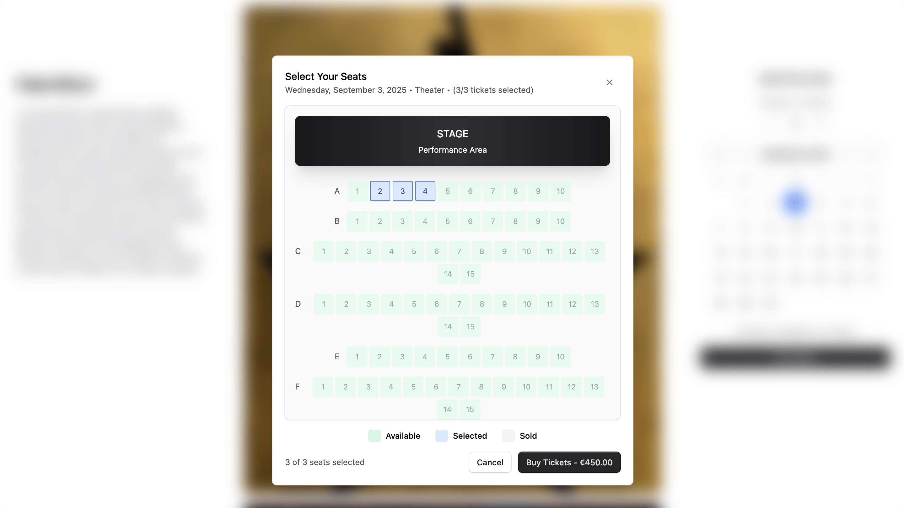
1return (2 <TooltipProvider>3 <div className="flex flex-col gap-y-4">4 {/* Theater Layout */}5 <div className="bg-gradient-to-b from-ui-bg-subtle to-ui-bg-subtle rounded-lg p-4 shadow-elevation-card-rest overflow-y-auto max-h-[500px]">6 {/* Stage Area */}7 <div className="text-center mb-6">8 <div className="bg-gradient-to-b from-ui-fg-base to-ui-fg-base text-white px-8 py-4 rounded-lg shadow-xl relative">9 <div className="absolute inset-0 bg-gradient-to-r from-transparent via-white/10 to-transparent rounded-lg"></div>10 <div className="relative">11 <div className="txt-large-plus mb-1">STAGE</div>12 <div className="txt-small text-ui-alpha-250">Performance Area</div>13 </div>14 </div>15 </div>16 17 {/* Seating Area */}18 <div>19 <div className="space-y-4">20 {seatData.seat_map.map((row, index) => (21 <div key={row.row_number} className="flex items-baseline justify-center gap-x-3">22 {/* Row label */}23 <div className="txt-small text-ui-fg-subtle">24 {row.row_number}25 </div>26 27 {/* Seats */}28 <div className="flex gap-x-1 gap-y-1 flex-wrap justify-center">29 {row.seats.map((seat) => {30 const status = getSeatStatus(row.row_number, seat.number)31 const variant = product.variants?.find((v) => v.id === seat.variant_id)32 const seatPrice = variant?.calculated_price?.calculated_amount || 033 const currencyCode = variant?.calculated_price?.currency_code || "USD"34 35 const tooltipContent = status === "purchased" 36 ? "Sold" 37 : status === "selected"38 ? "Selected"39 : seatPrice > 040 ? `Seat ${seat.number} - ${formatRowType(row.row_type)} - ${convertToLocale({41 amount: seatPrice,42 currency_code: currencyCode,43 minimumFractionDigits: 0,44 })}`45 : `Seat ${seat.number} - ${formatRowType(row.row_type)}`46 47 return (48 <Tooltip key={seat.number} content={tooltipContent} className="z-[76]">49 <button50 onClick={() => handleSeatClick(row.row_number, seat.number, row.row_type)}51 disabled={disabled || status === "purchased" || status === "unavailable" || (status === "available" && selectedSeats.length >= maxSeats)}52 className={`53 w-8 h-8 rounded-sm txt-xsmall transition-all duration-200 flex items-center justify-center54 ${getSeatColor(status)}55 ${status === "purchased" ? "cursor-not-allowed" : "cursor-pointer"}56 ${(status === "available" && selectedSeats.length >= maxSeats) || status === "purchased" ? "opacity-50 cursor-not-allowed" : ""}57 ${status === "available" ? "shadow-sm" : ""}58 ${status === "selected" ? "border border-ui-border-interactive" : ""}59 `}60 >61 {seat.number}62 </button>63 </Tooltip>64 )65 })}66 </div>67 </div>68 ))}69 </div>70 </div>71 </div>72 73 {/* Legend */}74 <div className="flex flex-wrap justify-center gap-x-6 gap-y-2 txt-small">75 <div className="flex items-center gap-x-2">76 <div className="w-5 h-5 bg-ui-tag-green-bg rounded"></div>77 <span className="txt-small-plus">Available</span>78 </div>79 <div className="flex items-center gap-x-2">80 <div className="w-5 h-5 bg-ui-tag-blue-bg rounded"></div>81 <span className="txt-small-plus">Selected</span>82 </div>83 <div className="flex items-center gap-x-2">84 <div className="w-5 h-5 bg-ui-tag-neutral-bg rounded"></div>85 <span className="txt-small-plus">Sold</span>86 </div>87 </div>88 </div>89 </TooltipProvider>90)
You display the seating layout with rows and seats. Each seat is a button that shows its status (available, selected, purchased) with different colors and tooltips. You also include a legend to explain the seat colors.
Next, you'll create the seat selector modal component that renders the SeatSelection component inside a modal. Create the file src/modules/products/components/ticket-product-layout/seat-selection-modal.tsx with the following content:
12import Modal from "../../../common/components/modal"13 14type SeatSelectionModalProps = {15 product: HttpTypes.StoreProduct16 selectedDate: string17 selectedQuantity: number18 isOpen: boolean19 onClose: () => void20 disabled?: boolean21}22 23export default function SeatSelectionModal({24 product,25 selectedDate,26 selectedQuantity,27 isOpen,28 onClose,29 disabled = false,30}: SeatSelectionModalProps) {31 const [selectedSeats, setSelectedSeats] = useState<SelectedSeat[]>([])32 const [seatData, setSeatData] = useState<TicketProductSeatsData | null>(null)33 const [isAddingToCart, setIsAddingToCart] = useState(false)34 35 const countryCode = useParams().countryCode as string36 const router = useRouter()37 38 const formatDate = (dateString: string) => {39 const date = new Date(dateString)40 return date.toLocaleDateString("en-US", {41 weekday: "long",42 year: "numeric",43 month: "long",44 day: "numeric",45 })46 }47 48 const totalPrice = useMemo(() => {49 return selectedSeats.reduce((total, seat) => {50 const variant = product.variants?.find((v) => v.id === seat.variantId)51 return total + (variant?.calculated_price?.calculated_amount || 0)52 }, 0)53 }, [selectedSeats, product.variants])54 55 // Load seat data when modal opens56 useEffect(() => {57 if (!isOpen || !selectedDate) {58 return59 }60 setSelectedSeats([])61 setSeatData(null)62 63 const loadSeatData = async () => {64 try {65 const data = await getTicketProductSeats(product.id, selectedDate)66 setSeatData(data)67 } catch (error) {68 toast.error("Failed to load seat data: " + error)69 }70 }71 72 loadSeatData()73 }, [isOpen, selectedDate, product.id])74 75 // TODO handle seat selection and cart addition76}
The SeatSelectionModal component accepts the following props:
product: The Medusa product to select seats for.selectedDate: The selected show date.selectedQuantity: The number of tickets to select.isOpen: A boolean to control the visibility of the modal.onClose: A callback function that is called when the modal is closed.disabled: A boolean to disable seat selection.
In the component, you define state and memo variables to manage the selected seats, the seating data, the loading state for the cart addition action, and the total price for the seat selection. You also load the seating data when the modal opens.
Next, you'll add functions to handle seat selection and adding seats to the cart. Replace the TODO with the following:
1const handleSeatSelect = (seat: SelectedSeat) => {2 setSelectedSeats((prev) => {3 const existingIndex = prev.findIndex(4 (s) => s.seatNumber === seat.seatNumber && s.rowNumber === seat.rowNumber5 )6 7 if (existingIndex >= 0) {8 // Remove seat if already selected9 return prev.filter((_, index) => index !== existingIndex)10 } else {11 // Add seat if not selected and under limit12 if (prev.length < selectedQuantity) {13 return [...prev, seat]14 }15 return prev16 }17 })18}19 20const handleAddToCart = async () => {21 if (selectedSeats.length === 0) {22 toast.error("Please select at least one seat")23 return24 }25 26 if (selectedSeats.length !== selectedQuantity) {27 toast.error(`Please select exactly ${selectedQuantity} seat${selectedQuantity !== 1 ? "s" : ""}`)28 return29 }30 31 setIsAddingToCart(true)32 try {33 // Add each seat as a separate cart item34 for (const seat of selectedSeats) {35 await addToCart({36 variantId: seat.variantId,37 quantity: 1,38 countryCode,39 metadata: {40 seat_number: seat.seatNumber,41 row_number: seat.rowNumber,42 show_date: seat.date,43 venue_row_id: seat.venueRowId,44 },45 })46 }47 48 toast.success(`Added ${selectedSeats.length} ticket${selectedSeats.length !== 1 ? "s" : ""} to cart`)49 50 // Redirect to checkout51 router.push(`/${countryCode}/checkout?step=address`)52 } catch (error) {53 toast.error("Failed to add tickets to cart: " + error)54 } finally {55 setIsAddingToCart(false)56 }57}58 59// TODO render modal with seat selection
You define the handleSeatSelect function that updates the selected seats when a seat is clicked, and the handleAddToCart function that adds the selected seats to the cart and redirects to the checkout page.
Finally, you'll render the modal with the seat selection component. Replace the TODO with the following:
1return (2 <Modal isOpen={isOpen} close={onClose}>3 <div className="flex items-center justify-between w-full mb-4">4 <div>5 <h2 className="txt-large-plus">Select Your Seats</h2>6 <p className="txt-small text-ui-fg-subtle">7 {formatDate(selectedDate)} • {seatData?.venue.name} • ({selectedSeats.length}/{selectedQuantity} tickets selected)8 </p>9 </div>10 <Button11 variant="transparent"12 onClick={onClose}13 className="text-ui-fg-muted hover:text-ui-fg-base"14 >15 ✕16 </Button>17 </div>18 19 <div>20 {seatData ? (21 <SeatSelection22 product={product}23 seatData={seatData}24 selectedSeats={selectedSeats}25 onSeatSelect={handleSeatSelect}26 maxSeats={selectedQuantity}27 disabled={disabled || isAddingToCart}28 />29 ) : (30 <div className="text-center py-8 min-h-[500px]">31 <p className="txt-medium text-ui-fg-subtle">No seat data available</p>32 </div>33 )}34 </div>35 36 {seatData && (37 <div className="flex items-center justify-between w-full mt-4">38 <div className="flex items-center justify-between w-full">39 <div className="txt-small text-ui-fg-subtle">40 {selectedSeats.length} of {selectedQuantity} seats selected41 </div>42 <div className="flex gap-x-3">43 <Button44 variant="secondary"45 onClick={onClose}46 disabled={isAddingToCart}47 >48 Cancel49 </Button>50 <Button51 variant="primary"52 onClick={handleAddToCart}53 disabled={disabled || isAddingToCart || selectedSeats.length !== selectedQuantity}54 isLoading={isAddingToCart}55 >56 {selectedSeats.length > 0 ? (57 <>58 Buy Tickets - {convertToLocale({59 amount: totalPrice,60 currency_code: product.variants?.[0]?.calculated_price?.currency_code || "USD",61 })}62 </>63 ) : (64 "Buy Tickets"65 )}66 </Button>67 </div>68 </div>69 </div>70 )}71 </Modal>72)
You display a modal with the seat selection component, along with a header and a footer. You use the Modal component that's part of the Next.js Starter Storefront.
Add Ticket Layout Component#
Next, you'll create a component that renders the date selector and seat selector modal components together. You'll display this component on the product page for ticket products.
Create the file src/modules/products/components/ticket-product-layout/index.tsx with the following content:
1"use client"2 3import React, { useState } from "react"4import { HttpTypes } from "@medusajs/types"5import TicketDateSelection from "./date-quantity-selection"6import SeatSelectionModal from "./seat-selection-modal"7 8type TicketLayoutProps = {9 product: HttpTypes.StoreProduct10}11 12const TicketLayout: React.FC<TicketLayoutProps> = ({ product }) => {13 const [isSeatModalOpen, setIsSeatModalOpen] = useState(false)14 const [selectedDate, setSelectedDate] = useState<string | null>(null)15 const [selectedQuantity, setSelectedQuantity] = useState<number>(1)16 17 const handleDateQuantitySelect = (date: string, quantity: number) => {18 setSelectedDate(date)19 setSelectedQuantity(quantity)20 setIsSeatModalOpen(true)21 }22 23 const handleCloseSeatModal = () => {24 setIsSeatModalOpen(false)25 setSelectedDate(null)26 setSelectedQuantity(1)27 }28 29 return (30 <>31 <TicketDateSelection32 product={product}33 onDateSelect={handleDateQuantitySelect}34 disabled={false}35 />36 37 <SeatSelectionModal38 product={product}39 selectedDate={selectedDate || ""}40 selectedQuantity={selectedQuantity}41 isOpen={isSeatModalOpen}42 onClose={handleCloseSeatModal}43 disabled={false}44 />45 </>46 )47}48 49export default TicketLayout
The TicketLayout component manages the state for the selected date, number of tickets, and the visibility of the seat selection modal. It renders the TicketDateSelection component to select a date and quantity, and the SeatSelectionModal component to select seats.
When a date and quantity are selected, it opens the seat selection modal. When the modal is closed, it resets the state.
Update Product Page Layout#
Next, you'll update the product page layout to use the date selector and seat selector modal components you created earlier.
In src/modules/products/templates/index.tsx, replace the file content with the following:
9import TicketLayout from "../components/ticket-product-layout"10 11type ProductTemplateProps = {12 product: HttpTypes.StoreProduct13 region: HttpTypes.StoreRegion14 countryCode: string15}16 17const ProductTemplate: React.FC<ProductTemplateProps> = ({18 product,19 countryCode,20}) => {21 if (!product || !product.id) {22 return notFound()23 }24 25 return (26 <>27 <div28 className="content-container flex flex-col py-6 relative"29 data-testid="product-container"30 >31 <div className="flex flex-col small:flex-row small:items-start gap-y-6">32 <div className="flex flex-col small:sticky small:top-48 small:py-0 small:max-w-[300px] w-full py-8 gap-y-6">33 <ProductInfo product={product} />34 </div>35 <div className="flex flex-col w-full relative">36 <div className="block w-full relative">37 <ImageGallery images={product?.images || []} />38 </div>39 </div>40 <div className="flex flex-col small:sticky small:top-48 small:py-0 small:max-w-[300px] w-full py-8 gap-y-6">41 <TicketLayout product={product} />42 </div>43 </div>44 </div>45 46 <div47 className="content-container my-16 small:my-32"48 data-testid="related-products-container"49 >50 <Suspense fallback={<SkeletonRelatedProducts />}>51 <RelatedProducts product={product} countryCode={countryCode} />52 </Suspense>53 </div>54 </>55 )56}57 58export default ProductTemplate
This makes the following main changes:
- Removes the
ProductTabscomponent since it's not needed for ticket products. - Shows the
TicketLayoutcomponent on the right side of the product images.
Retrieve Ticket Product with Product#
Next, you'll update the server function that retrieves products to include ticket products. This allows you to access the ticket product details when fetching a product.
In src/lib/data/products.ts, find the listProducts function and update the fields parameter passed to the SDK call to include the *ticket_product relation:
1export const listProducts = async ({2 // ...3}: {4 // ...5}): Promise<{6 // ...7}> => {8 // ...9 return sdk.client10 .fetch<{11 // ...12 }>(13 `/store/products`,14 {15 // ...16 query: {17 // ...18 fields: "*variants.calculated_price,+variants.inventory_quantity,+metadata,+tags,*ticket_product",19 },20 }21 )22 // ...23}
This updates the fields parameter to include *ticket_product, which retrieves the ticket product relation when fetching products.
Change Modal Styling#
To ensure the height of the modal can hold the seat selection component, you'll need to adjust the modal styling.
In src/modules/common/components/modal/index.tsx, change the classNames of the Dialog.Panel to include max-h-[90vh] overflow-y-auto:
Add Toaster to Layout#
Since you used the toast function in your customization to show toast messages, you need to ensure the Toaster component is included in your layout.
In src/app/layout.tsx, add the following import at the top of the file:
Then, add the <Toaster /> component at the end of the body tag in the return statement:
Test Product Page#
To test the product page in the Next.js Starter Storefront, run the following command in the Medusa application's directory:
And run the following command in the Next.js Starter Storefront application's directory:
Then:
- Open the storefront at
http://localhost:8000. - Click on Menu in the navbar, and choose Store.
- In the store page, click on a ticket product you created.
You'll see on the product page the date selector component on the right side of the product images.

Select a date and number of tickets, then click the "Pick Seats" button. A modal will open with the seat selection component. You can select seats and click the "Buy Tickets" button to add them to the cart and proceed to checkout.
This will open the checkout page with the selected tickets in the cart. You'll customize the checkout and cart components next.
Step 4: Customize Cart and Checkout#
In this section, you'll customize the cart and checkout components and functions to:
- Display the selected seats for items, which appears in the cart and checkout pages.
- Remove the Shipping Address and Shipping Method steps from the checkout process since ticket products don't require shipping. Instead, you'll only collect the billing address.
- Update the function that retrieves the cart to retrieve its billing address.
- Update the function that saves the address to only save the billing address.
- Use the custom cart completion API route to place an order.
Display Selected Seats in Cart and Checkout#
First, you'll customize the cart item component to display the selected seats for ticket products.
In src/modules/cart/components/item/index.tsx, find the LineItemOptions component in the return statement of the Item component, and replace it with the following:
1{item.metadata?.seat_number !== undefined && (2 <Text className="txt-medium text-ui-fg-subtle">3 Seat {item.metadata?.row_number as string}{item.metadata?.seat_number as string}4 </Text>5)}6{item.metadata?.show_date !== undefined && (7 <Text className="txt-medium text-ui-fg-subtle">8 Show Date: {new Date(item.metadata?.show_date as string).toLocaleDateString()}9 </Text>10)}
This displays the selected seat number and show date for ticket products instead of the variant name.
You should also remove the quantity selector for ticket products since you can't purchase multiple tickets for the same seat. Remove the following highlighted lines from the return statement of the Item component:
1{type === "full" && (2 <Table.Cell>3 <div className="flex gap-2 items-center w-28">4 <DeleteButton id={item.id} data-testid="product-delete-button" />5 <CartItemSelect6 value={item.quantity}7 onChange={(value) => changeQuantity(parseInt(value.target.value))}8 className="w-14 h-10 p-4"9 data-testid="product-select-button"10 >11 {/* TODO: Update this with the v2 way of managing inventory */}12 {Array.from(13 {14 length: Math.min(maxQuantity, 10),15 },16 (_, i) => (17 <option value={i + 1} key={i}>18 {i + 1}19 </option>20 )21 )}22 23 <option value={1} key={1}>24 125 </option>26 </CartItemSelect>27 {updating && <Spinner />}28 </div>29 <ErrorMessage error={error} data-testid="product-error-message" />30 </Table.Cell>31)}
This removes the quantity selector and error message for ticket products.
You can also remove the quantity indicator later in the component. Remove the following line from the return statement of the Item component:
This prevents displaying the quantity for ticket products, as it's redundant.
Add Billing Address Step#
Next, you'll add a component that shows a step to enter the billing address during checkout. You'll later use this component in the checkout page.
Create the file src/modules/checkout/components/billing-address/index.tsx with the following content:
7import CountrySelect from "../country-select"8 9const BillingAddress = ({10 customer,11 cart,12}: {13 customer: HttpTypes.StoreCustomer | null14 cart: HttpTypes.StoreCart | null15}) => {16 const [formData, setFormData] = useState<Record<string, any>>({17 "billing_address.first_name": cart?.billing_address?.first_name || "",18 "billing_address.last_name": cart?.billing_address?.last_name || "",19 "billing_address.address_1": cart?.billing_address?.address_1 || "",20 "billing_address.company": cart?.billing_address?.company || "",21 "billing_address.postal_code": cart?.billing_address?.postal_code || "",22 "billing_address.city": cart?.billing_address?.city || "",23 "billing_address.country_code": cart?.billing_address?.country_code || "",24 "billing_address.province": cart?.billing_address?.province || "",25 "billing_address.phone": cart?.billing_address?.phone || "",26 email: cart?.email || "",27 })28 29 const countriesInRegion = useMemo(30 () => cart?.region?.countries?.map((c) => c.iso_2),31 [cart?.region]32 )33 34 // check if customer has saved addresses that are in the current region35 const addressesInRegion = useMemo(36 () =>37 customer?.addresses.filter(38 (a) => a.country_code && countriesInRegion?.includes(a.country_code)39 ),40 [customer?.addresses, countriesInRegion]41 )42 43 const setFormAddress = (44 address?: HttpTypes.StoreCartAddress,45 email?: string46 ) => {47 address &&48 setFormData((prevState: Record<string, any>) => ({49 ...prevState,50 "billing_address.first_name": address?.first_name || "",51 "billing_address.last_name": address?.last_name || "",52 "billing_address.address_1": address?.address_1 || "",53 "billing_address.company": address?.company || "",54 "billing_address.postal_code": address?.postal_code || "",55 "billing_address.city": address?.city || "",56 "billing_address.country_code": address?.country_code || "",57 "billing_address.province": address?.province || "",58 "billing_address.phone": address?.phone || "",59 }))60 61 email &&62 setFormData((prevState: Record<string, any>) => ({63 ...prevState,64 email: email,65 }))66 }67 68 useEffect(() => {69 // Ensure cart is not null and has a billing_address before setting form data70 if (cart && cart.billing_address) {71 setFormAddress(cart?.billing_address, cart?.email)72 }73 74 if (cart && !cart.email && customer?.email) {75 setFormAddress(undefined, customer.email)76 }77 }, [cart]) // Add cart as a dependency78 79 const handleChange = (80 e: React.ChangeEvent<81 HTMLInputElement | HTMLInputElement | HTMLSelectElement82 >83 ) => {84 setFormData({85 ...formData,86 [e.target.name]: e.target.value,87 })88 }89 90 return (91 <>92 {customer && (addressesInRegion?.length || 0) > 0 && (93 <Container className="mb-6 flex flex-col gap-y-4 p-5">94 <p className="text-small-regular">95 {`Hi ${customer.first_name}, do you want to use one of your saved addresses?`}96 </p>97 <AddressSelect98 addresses={customer.addresses}99 addressInput={100 mapKeys(formData, (_, key) =>101 key.replace("billing_address.", "")102 ) as HttpTypes.StoreCartAddress103 }104 onSelect={setFormAddress}105 />106 </Container>107 )}108 <div className="grid grid-cols-2 gap-4">109 <Input110 label="First name"111 name="billing_address.first_name"112 autoComplete="given-name"113 value={formData["billing_address.first_name"]}114 onChange={handleChange}115 required116 data-testid="shipping-first-name-input"117 />118 <Input119 label="Last name"120 name="billing_address.last_name"121 autoComplete="family-name"122 value={formData["billing_address.last_name"]}123 onChange={handleChange}124 required125 data-testid="shipping-last-name-input"126 />127 <Input128 label="Address"129 name="billing_address.address_1"130 autoComplete="address-line1"131 value={formData["billing_address.address_1"]}132 onChange={handleChange}133 required134 data-testid="shipping-address-input"135 />136 <Input137 label="Company"138 name="billing_address.company"139 value={formData["billing_address.company"]}140 onChange={handleChange}141 autoComplete="organization"142 data-testid="shipping-company-input"143 />144 <Input145 label="Postal code"146 name="billing_address.postal_code"147 autoComplete="postal-code"148 value={formData["billing_address.postal_code"]}149 onChange={handleChange}150 required151 data-testid="shipping-postal-code-input"152 />153 <Input154 label="City"155 name="billing_address.city"156 autoComplete="address-level2"157 value={formData["billing_address.city"]}158 onChange={handleChange}159 required160 data-testid="shipping-city-input"161 />162 <CountrySelect163 name="billing_address.country_code"164 autoComplete="country"165 region={cart?.region}166 value={formData["billing_address.country_code"]}167 onChange={handleChange}168 required169 data-testid="shipping-country-select"170 />171 <Input172 label="State / Province"173 name="billing_address.province"174 autoComplete="address-level1"175 value={formData["billing_address.province"]}176 onChange={handleChange}177 data-testid="shipping-province-input"178 />179 <Input180 label="Email"181 name="email"182 type="email"183 title="Enter a valid email address."184 autoComplete="email"185 value={formData.email}186 onChange={handleChange}187 required188 data-testid="shipping-email-input"189 />190 <Input191 label="Phone"192 name="billing_address.phone"193 autoComplete="tel"194 value={formData["billing_address.phone"]}195 onChange={handleChange}196 data-testid="shipping-phone-input"197 />198 </div>199 </>200 )201}202 203export default BillingAddress
This displays the billing address form with the relevant fields. If the customer has saved addresses, it also displays an address selector at the top.
Update Checkout Steps#
Next, you'll update the checkout steps to remove the shipping address and shipping method steps, and add the billing address step.
In src/modules/checkout/templates/checkout-form/index.tsx, remove the shippingMethods variable in the CheckoutForm component and change the condition before the return statement:
1export default async function CheckoutForm({2 cart,3 customer,4}: {5 cart: HttpTypes.StoreCart | null6 customer: HttpTypes.StoreCustomer | null7}) {8 // ...9 // REMOVE THIS LINE10 // const shippingMethods = await listCartShippingMethods(cart.id)11 const paymentMethods = await listCartPaymentMethods(cart.region?.id ?? "")12 13 // Change this condition to only check for payment methods14 if (!paymentMethods) {15 return null16 }17 // ...18}
This removes the shippingMethods variable and changes the condition to only check for payment methods since shipping is not needed for ticket products.
Then, remove the Shipping component from the return statement. The return statement should look like this:
This removes the Shipping component since shipping is not needed for ticket products.
Next, you'll update the Addresses component to use the BillingAddress component you created earlier.
In src/modules/checkout/components/addresses/index.tsx, add the following import at the top of the file:
Then, you'll change the return statement of the Addresses component to:
- Use the
BillingAddresscomponent instead of theShippingAddresscomponent. - Update the header text to "Billing Address".
- Replace all instances of
shipping_addresswithbilling_address. - Remove the same-as-billing checkbox and related logic.
- Change the button that proceeds to the next step to say "Continue to payment".
The return statement should look like this:
1return (2 <div className="bg-white">3 <div className="flex flex-row items-center justify-between mb-6">4 <Heading5 level="h2"6 className="flex flex-row text-3xl-regular gap-x-2 items-baseline"7 >8 Billing Address9 {!isOpen && <CheckCircleSolid />}10 </Heading>11 {!isOpen && cart?.billing_address && (12 <Text>13 <button14 onClick={handleEdit}15 className="text-ui-fg-interactive hover:text-ui-fg-interactive-hover"16 data-testid="edit-address-button"17 >18 Edit19 </button>20 </Text>21 )}22 </div>23 {isOpen ? (24 <form action={formAction}>25 <div className="pb-8">26 <BillingAddress27 customer={customer}28 cart={cart}29 />30 <SubmitButton className="mt-6" data-testid="submit-address-button">31 Continue to payment32 </SubmitButton>33 <ErrorMessage error={message} data-testid="address-error-message" />34 </div>35 </form>36 ) : (37 <div>38 <div className="text-small-regular">39 {cart && cart.billing_address ? (40 <div className="flex items-start gap-x-8">41 <div className="flex items-start gap-x-1 w-full">42 <div43 className="flex flex-col w-1/3"44 data-testid="billing-address-summary"45 >46 <Text className="txt-medium-plus text-ui-fg-base mb-1">47 Billing Address48 </Text>49 <Text className="txt-medium text-ui-fg-subtle">50 {cart.billing_address.first_name}{" "}51 {cart.billing_address.last_name}52 </Text>53 <Text className="txt-medium text-ui-fg-subtle">54 {cart.billing_address.address_1}{" "}55 {cart.billing_address.address_2}56 </Text>57 <Text className="txt-medium text-ui-fg-subtle">58 {cart.billing_address.postal_code},{" "}59 {cart.billing_address.city}60 </Text>61 <Text className="txt-medium text-ui-fg-subtle">62 {cart.billing_address.country_code?.toUpperCase()}63 </Text>64 </div>65 66 <div67 className="flex flex-col w-1/3 "68 data-testid="billing-contact-summary"69 >70 <Text className="txt-medium-plus text-ui-fg-base mb-1">71 Contact72 </Text>73 <Text className="txt-medium text-ui-fg-subtle">74 {cart.billing_address.phone}75 </Text>76 <Text className="txt-medium text-ui-fg-subtle">77 {cart.email}78 </Text>79 </div>80 81 <div82 className="flex flex-col w-1/3"83 data-testid="billing-address-summary"84 >85 <Text className="txt-medium-plus text-ui-fg-base mb-1">86 Billing Address87 </Text>88 </div>89 </div>90 </div>91 ) : (92 <div>93 <Spinner />94 </div>95 )}96 </div>97 </div>98 )}99 <Divider className="mt-8" />100 </div>101)
Next, you'll update other steps to remove the checks for the shipping address and shipping method.
In src/modules/checkout/components/payment/index.tsx, find the paymentReady variable in the Payment component and change it to the following:
Similarly, in src/modules/checkout/components/payment-button/index.tsx, find the notReady variable in the PaymentButton component and change it to the following:
Finally, in src/modules/checkout/components/review/index.tsx, find the previousStepsCompleted variable in the Review component and change it to the following:
Update Cart Functions#
Next, you'll update cart server functions to retrieve and save the billing address instead of the shipping address, and to use the custom cart completion API route.
In src/lib/data/cart.ts, find the retrieveCart function and update the fields variable to include billing_address:
Then, you need to update the setAddresses function in the same file to only save billing address information. Replace the entire function with the following:
1export async function setAddresses(currentState: unknown, formData: FormData) {2 try {3 if (!formData) {4 throw new Error("No form data found when setting addresses")5 }6 const cartId = getCartId()7 if (!cartId) {8 throw new Error("No existing cart found when setting addresses")9 }10 11 const data = {12 billing_address: {13 first_name: formData.get("billing_address.first_name"),14 last_name: formData.get("billing_address.last_name"),15 address_1: formData.get("billing_address.address_1"),16 address_2: "",17 company: formData.get("billing_address.company"),18 postal_code: formData.get("billing_address.postal_code"),19 city: formData.get("billing_address.city"),20 country_code: formData.get("billing_address.country_code"),21 province: formData.get("billing_address.province"),22 phone: formData.get("billing_address.phone"),23 },24 email: formData.get("email"),25 } as any26 await updateCart(data)27 } catch (e: any) {28 return e.message29 }30 31 redirect(32 `/${formData.get("billing_address.country_code")}/checkout?step=payment`33 )34}
This updates the function to only handle the billing address and email fields. It also redirects to the payment step of checkout instead of the shipping step.
Finally, you'll update the placeOrder function to use the custom cart completion API route you created in the backend part of the tutorial. Replace the entire function with the following:
1export async function placeOrder(cartId?: string) {2 const id = cartId || (await getCartId())3 4 if (!id) {5 throw new Error("No existing cart found when placing an order")6 }7 8 const headers = {9 ...(await getAuthHeaders()),10 }11 12 const cartRes = await sdk.client.fetch<HttpTypes.StoreCompleteCartResponse>(`/store/carts/${id}/complete-tickets`, {13 method: "POST",14 headers,15 })16 .then(async (cartRes) => {17 const cartCacheTag = await getCacheTag("carts")18 revalidateTag(cartCacheTag)19 return cartRes20 })21 .catch(medusaError)22 23 if (cartRes?.type === "order") {24 const countryCode =25 cartRes.order.billing_address?.country_code?.toLowerCase()26 27 const orderCacheTag = await getCacheTag("orders")28 revalidateTag(orderCacheTag)29 30 removeCartId()31 redirect(`/${countryCode}/order/${cartRes?.order.id}/confirmed`)32 }33 34 return cartRes.cart35}
This updates the function to call the /store/carts/{id}/complete-tickets endpoint to complete the cart and place the order. It also retrieves the country code from the billing address instead of the shipping address to redirect to the order confirmation page.
Test Checkout Page#
To test the latest cart and checkout changes, start both the Medusa application and the Next.js Starter Storefront.
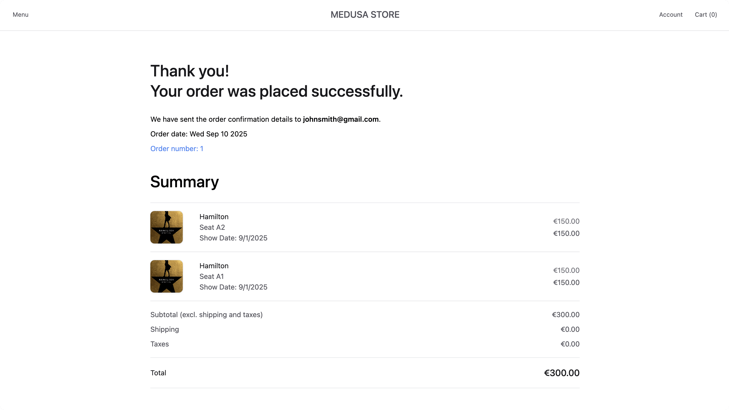
Then, add a ticket product to the cart by selecting a date, quantity, and seats on the product page. You'll be taken to the checkout page where you can see only three steps: Billing Address, Payment, and Review.

Fill out the billing address form, choose a payment method, and click "Place Order" in the Review step. Once the order is placed, you'll be redirected to the order confirmation page. You may see an error related to shipping details missing, which you'll fix by customizing the order confirmation page next.
Step 5: Customize Order Confirmation Page#
The last storefront customization you'll make is to:
- Display billing details instead of shipping details on the order confirmation page.
- Display the selected seats and show date for each ticket item on the order confirmation page.
Add Billing Details Component#
First, you'll create a component that displays the billing details on the order confirmation page.
Create the file src/modules/order/components/billing-details/index.tsx with the following content:
1import { convertToLocale } from "@lib/util/money"2import { HttpTypes } from "@medusajs/types"3import { Heading, Text } from "@medusajs/ui"4 5import Divider from "@modules/common/components/divider"6 7type BillingDetailsProps = {8 order: HttpTypes.StoreOrder9}10 11const BillingDetails = ({ order }: BillingDetailsProps) => {12 return (13 <div>14 <Heading level="h2" className="flex flex-row text-3xl-regular my-6">15 Billing Address16 </Heading>17 <div className="flex items-start gap-x-8">18 <div19 className="flex flex-col w-1/3"20 data-testid="shipping-address-summary"21 >22 <Text className="txt-medium-plus text-ui-fg-base mb-1">23 Billing Address24 </Text>25 <Text className="txt-medium text-ui-fg-subtle">26 {order.billing_address?.first_name}{" "}27 {order.billing_address?.last_name}28 </Text>29 <Text className="txt-medium text-ui-fg-subtle">30 {order.billing_address?.address_1}{" "}31 {order.billing_address?.address_2}32 </Text>33 <Text className="txt-medium text-ui-fg-subtle">34 {order.billing_address?.postal_code},{" "}35 {order.billing_address?.city}36 </Text>37 <Text className="txt-medium text-ui-fg-subtle">38 {order.billing_address?.country_code?.toUpperCase()}39 </Text>40 </div>41 42 <div43 className="flex flex-col w-1/3 "44 data-testid="billing-contact-summary"45 >46 <Text className="txt-medium-plus text-ui-fg-base mb-1">Contact</Text>47 <Text className="txt-medium text-ui-fg-subtle">48 {order.billing_address?.phone}49 </Text>50 <Text className="txt-medium text-ui-fg-subtle">{order.email}</Text>51 </div>52 </div>53 <Divider className="mt-8" />54 </div>55 )56}57 58export default BillingDetails
This component displays the billing address and contact information from the order.
Then, you'll update the order confirmation and order details pages to use the BillingDetails component.
In src/modules/order/templates/order-completed-template.tsx, add the following import at the top of the file:
And replace the ShippingDetails component in the return statement of the OrderCompletedTemplate component with the BillingDetails component:
Similarly, in src/modules/order/templates/order-details-template.tsx, add the following import at the top of the file:
And replace the ShippingDetails component in the return statement of the OrderDetailsTemplate component with the BillingDetails component:
The order confirmation page now should show the billing details instead of shipping details.

Show Selected Seats in Order Items#
Next, you'll update the order item component to display the selected seats and show date for ticket products.
In src/modules/order/components/item/index.tsx, find the LineItemOptions component in the return statement of the Item component, and replace it with the following:
1{item.metadata?.seat_number !== undefined && (2 <Text className="txt-medium text-ui-fg-subtle">3 Seat {item.metadata?.row_number as string}{item.metadata?.seat_number as string}4 </Text>5)}6{item.metadata?.show_date !== undefined && (7 <Text className="txt-medium text-ui-fg-subtle">8 Show Date: {new Date(item.metadata?.show_date as string).toLocaleDateString()}9 </Text>10)}
You can also remove the quantity by removing the following line from the return statement of the Item component:
This prevents displaying the quantity for ticket products, as it's redundant.
If you check the order confirmation page now, you'll see the selected seats and show dates for each ticket item.
Next Steps#
You've now customized the Next.js Starter Storefront to support ticket products. You can further customize the storefront to change the styling and user experience to fit your brand.
Learn More About Medusa#
If you're new to Medusa, check out the main documentation, where you'll get a more in-depth understanding of all the concepts you've used in this guide and more.
To learn more about the commerce features that Medusa provides, check out Medusa's Commerce Modules.
Troubleshooting#
If you encounter issues during your development, check out the troubleshooting guides.
Getting Help#
If you encounter issues not covered in the troubleshooting guides:
- Visit the Medusa GitHub repository to report issues or ask questions.
- Join the Medusa Discord community for real-time support from community members.