Implement Product Builder in Medusa
In this tutorial, you'll learn how to implement a product builder in Medusa.
When you install a Medusa application, you get a fully-fledged commerce platform with a Framework for customization. The Medusa application's commerce features are built around Commerce Modules that are available out-of-the-box.
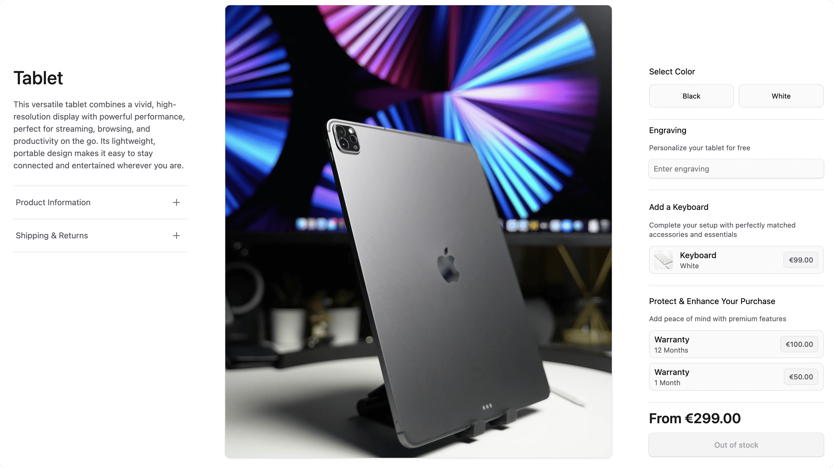
A product builder allows customers to customize the product before adding it to the cart. This may include entering custom options like engraving text, adding complementary products to the cart, or purchasing add-ons with the product, such as insurance.
Summary#
By following this tutorial, you will learn how to:
- Install and set up Medusa with the Next.js Starter Storefront.
- Define and manage data models useful for the product builder.
- Allow admin users to manage the builder configurations of a product from Medusa Admin.
- Customize the storefront to allow customers to choose a product's builder configurations.
- Customize cart and order pages on the storefront to reflect the selected builder configurations of items.
- Customize the order details page on the Medusa Admin to reflect the selected builder configurations of items.
You can follow this tutorial whether you're new to Medusa or an advanced Medusa developer.
Step 1: Install a Medusa Application#
Start by installing the Medusa application on your machine with the following command:
You'll first be asked for the project's name. Then, when asked whether you want to install the Next.js Starter Storefront, choose Yes.
Afterward, the installation process will start, which will install the Medusa application as a monorepository in a directory with your project's name. The backend is installed in the apps/backend directory, and the Next.js Starter Storefront is installed in the apps/storefront directory.
Once the installation finishes successfully, the Medusa Admin dashboard will open with a form to create a new user. Enter the user's credentials and submit the form. Afterward, you can log in with the new user and explore the dashboard.
apps/backend directory of your Medusa project.Step 2: Create Product Builder Module#
In Medusa, you can build custom features in a module. A module is a reusable package with the data models and functionalities related to a single feature or domain. Medusa integrates the module into your application without implications or side effects on your setup.
In this step, you'll build a Product Builder Module that defines the data models and logic to manage product builder configurations. The module will support three types of configurations:
- Custom Fields: Allow customers to enter personalized information like engraving text or custom messages for the product.
- Complementary Products: Suggest related products that enhance the main product, like keyboards with computers.
- Add-ons: Optional extras like warranties, insurance, or premium features that customers can purchase alongside the main product.
a. Create Module Directory#
Create the directory src/modules/product-builder that will hold the Product Builder Module's code.
b. Create Data Models#
A data model represents a table in the database. You create data models using Medusa's Data Model Language (DML). It simplifies defining a table's columns, relations, and indexes with straightforward methods and configurations.
For the Product Builder Module, you'll define four data models to represent the different aspects of product customization.
ProductBuilder Data Model
The first data model will hold the main builder configurations for a product. It will have relations to the custom fields, complementary products, and add-ons.
To create the data model, create the file src/modules/product-builder/models/product-builder.ts with the following content:
1import { model } from "@medusajs/framework/utils"2import ProductBuilderCustomField from "./product-builder-custom-field"3import ProductBuilderComplementary from "./product-builder-complementary"4import ProductBuilderAddon from "./product-builder-addon"5 6const ProductBuilder = model.define("product_builder", {7 id: model.id().primaryKey(),8 product_id: model.text().unique(),9 custom_fields: model.hasMany(() => ProductBuilderCustomField, {10 mappedBy: "product_builder",11 }),12 complementary_products: model.hasMany(() => ProductBuilderComplementary, {13 mappedBy: "product_builder",14 }),15 addons: model.hasMany(() => ProductBuilderAddon, {16 mappedBy: "product_builder",17 }),18})19 20export default ProductBuilder
The ProductBuilder data model has the following properties:
id: The primary key of the table.product_id: The ID of the product that this builder configuration applies to.- Later, you'll learn how to link this data model to Medusa's
Productdata model.
- Later, you'll learn how to link this data model to Medusa's
custom_fields: Fields that the customer can personalize.complementary_products: Products to suggest alongside the main product.addons: Products that the customer can buy alongside the main product.
Ignore the type errors for the related data models. You'll create them next.
ProductBuilderCustomField Data Model
The ProductBuilderCustomField data model represents fields that the customer can personalize. For example, engraving text or custom messages.
To create the data model, create the file src/modules/product-builder/models/product-builder-custom-field.ts with the following content:
1import { model } from "@medusajs/framework/utils"2import ProductBuilder from "./product-builder"3 4const ProductBuilderCustomField = model.define("product_builder_custom_field", {5 id: model.id().primaryKey(),6 name: model.text(),7 type: model.text(),8 description: model.text().nullable(),9 is_required: model.boolean().default(false),10 product_builder: model.belongsTo(() => ProductBuilder, {11 mappedBy: "custom_fields",12 }),13})14 15export default ProductBuilderCustomField
The ProductBuilderCustomField data model has the following properties:
id: The primary key of the table.name: The display name shown to customers (for example, "Engraving Text" or "Custom Message").type: The input type, such astextornumber.description: Optional helper text to guide customers (for example, "Enter your name to be engraved").is_required: Whether customers must fill this field before adding the product to cart.product_builder: A relation back to the parentProductBuilderconfiguration.
ProductBuilderComplementary Data Model
The ProductBuilderComplementary data model represents products that are suggested alongside the main product. For example, if you're selling an iPad, you can suggest a keyboard to be purchased together.
To create the data model, create the file src/modules/product-builder/models/product-builder-complementary.ts with the following content:
1import { model } from "@medusajs/framework/utils"2import ProductBuilder from "./product-builder"3 4const ProductBuilderComplementary = model.define("product_builder_complementary", {5 id: model.id().primaryKey(),6 product_id: model.text(),7 product_builder: model.belongsTo(() => ProductBuilder, {8 mappedBy: "complementary_products",9 }),10})11 12export default ProductBuilderComplementary
The ProductBuilderComplementary data model has the following properties:
id: The primary key of the table.product_id: The ID of the complementary product to suggest.- Later, you'll learn how to link this to Medusa's
Productdata model.
- Later, you'll learn how to link this to Medusa's
product_builder: A relation back to the parentProductBuilderconfiguration.
ProductBuilderAddon Data Model
The last data model you'll implement is the ProductBuilderAddon data model, which represents optional add-on products like warranties or premium features. Add-ons are typically only sold with the main product.
To create the data model, create the file src/modules/product-builder/models/product-builder-addon.ts with the following content:
1import { model } from "@medusajs/framework/utils"2import ProductBuilder from "./product-builder"3 4const ProductBuilderAddon = model.define("product_builder_addon", {5 id: model.id().primaryKey(),6 product_id: model.text(),7 product_builder: model.belongsTo(() => ProductBuilder, {8 mappedBy: "addons",9 }),10})11 12export default ProductBuilderAddon
The ProductBuilderAddon data model has the following properties:
id: The primary key of the table.product_id: The ID of the add-on product (for example, warranty or insurance product).- Later, you'll learn how to link this to Medusa's
Productdata model.
- Later, you'll learn how to link this to Medusa's
product_builder: A relation back to the parentProductBuilderconfiguration.
c. Create Module's Service#
You can manage your module's data models in a service.
A service is a TypeScript class that the module exports. In the service's methods, you can connect to the database, allowing you to manage your data models, or connect to a third-party service, which is useful if you're integrating with external services.
To create the Product Builder Module's service, create the file src/modules/product-builder/service.ts with the following content:
1import { MedusaService } from "@medusajs/framework/utils"2import ProductBuilder from "./models/product-builder"3import ProductBuilderCustomField from "./models/product-builder-custom-field"4import ProductBuilderComplementary from "./models/product-builder-complementary"5import ProductBuilderAddon from "./models/product-builder-addon"6 7class ProductBuilderModuleService extends MedusaService({8 ProductBuilder,9 ProductBuilderCustomField,10 ProductBuilderComplementary,11 ProductBuilderAddon,12}) {}13 14export default ProductBuilderModuleService
The ProductBuilderModuleService extends MedusaService, which generates a class with data-management methods for your module's data models. This saves you time on implementing Create, Read, Update, and Delete (CRUD) methods.
So, the ProductBuilderModuleService class now has methods like createProductBuilders and retrieveProductBuilder.
d. Create the Module Definition#
The final piece to a module is its definition, which you export in an index.ts file at its root directory. This definition tells Medusa the name of the module and its service.
So, create the file src/modules/product-builder/index.ts with the following content:
You use the Module function to create the module's definition. It accepts two parameters:
- The module's name, which is
productBuilder. - An object with a required property
serviceindicating the module's service.
You also export the module's name as PRODUCT_BUILDER_MODULE so you can reference it later.
Add Module to Medusa's Configurations#
Once you finish building the module, add it to Medusa's configurations to start using it.
In medusa-config.ts, add a modules property and pass an array with your custom module:
Each object in the modules array has a resolve property, whose value is either a path to the module's directory, or an npm package’s name.
Generate Migrations#
Since data models represent tables in the database, you define how they're created in the database with migrations. A migration is a TypeScript class that defines database changes made by a module.
Medusa's CLI tool can generate the migrations for you. To generate a migration for the Product Builder Module, run the following command in the apps/backend directory:
The db:generate command of the Medusa CLI accepts the name of the module to generate the migration for. You'll now have a migrations directory under src/modules/product-builder that holds the generated migration.
Then, to reflect these migrations on the database, run the following command:
The tables for the data models are now created in the database.
Step 3: Define Links between Data Models#
Since Medusa isolates modules to integrate them into your application without side effects, you can't directly create relationships between data models of different modules.
Instead, Medusa provides a mechanism to define links between data models, and retrieve and manage linked records while maintaining module isolation.
In this step, you'll define links between the data models in the Product Builder Module and the data models in Medusa's Product Module:
ProductBuilder↔Product: A product builder record represents the builder configurations of a product.ProductBuilderComplementary↔Product: A complementary product record suggests a Medusa product related to the main product.ProductBuilderAddon↔Product: An add-on product record suggests a Medusa product that can be added to the main product in the cart.
a. ProductBuilder ↔ Product#
To define a link between the ProductBuilder and Product data models, create the file src/links/product-builder-product.ts with the following content:
1import ProductBuilderModule from "../modules/product-builder"2import ProductModule from "@medusajs/medusa/product"3import { defineLink } from "@medusajs/framework/utils"4 5export default defineLink(6 {7 linkable: ProductBuilderModule.linkable.productBuilder,8 deleteCascade: true,9 },10 ProductModule.linkable.product11)
You define a link using the defineLink function. It accepts two parameters:
- An object indicating the first data model part of the link. A module has a special
linkableproperty that contains link configurations for its data models. You pass the linkable configurations of the Product Builder Module'sProductBuilderdata model, and you enable thedeleteCascadeoption to automatically delete the builder configuration when the product is deleted. - An object indicating the second data model part of the link. You pass the linkable configurations of the Product Module's
Productdata model.
b. ProductBuilderComplementary ↔ Product#
Next, to define a link between the ProductBuilderComplementary and Product data models, create the file src/links/product-builder-complementary-product.ts with the following content:
1import ProductBuilderModule from "../modules/product-builder"2import ProductModule from "@medusajs/medusa/product"3import { defineLink } from "@medusajs/framework/utils"4 5export default defineLink(6 {7 linkable: ProductBuilderModule.linkable.productBuilderComplementary,8 deleteCascade: true,9 },10 ProductModule.linkable.product11)
You define a link similarly to the previous one. You also enable the deleteCascade option to automatically delete the complementary product record when the main product is deleted.
c. ProductBuilderAddon ↔ Product#
Finally, to define a link between the ProductBuilderAddon and Product data models, create the file src/links/product-builder-addon-product.ts with the following content:
1import ProductBuilderModule from "../modules/product-builder"2import ProductModule from "@medusajs/medusa/product"3import { defineLink } from "@medusajs/framework/utils"4 5export default defineLink(6 {7 linkable: ProductBuilderModule.linkable.productBuilderAddon,8 deleteCascade: true,9 },10 ProductModule.linkable.product11)
Similarly to the previous links, you define a link between the ProductBuilderAddon and Product data models. You also enable the deleteCascade option to automatically delete the add-on product record when the main product is deleted.
d. Sync Links to Database#
After defining links, you need to sync them to the database. This creates the necessary tables to store the links.
To sync the links to the database, run the migrations command again in the apps/backend directory:
This command will create the necessary tables to store the links between your Product Builder Module and Medusa's Product Module.
Step 4: Manage Product Builder Configurations#
In this step, you'll implement the logic to manage product builder configurations. You'll also expose this functionality to clients, allowing you later to use it in the admin dashboard customizations.
To implement the product builder management functionality, you'll create:
- A workflow to create or update (upsert) product builder configurations.
- An API route to expose the workflow's functionality to client applications.
a. Upsert Product Builder Workflow#
The first workflow you'll implement creates or updates builder configurations for a product.
A workflow is a series of queries and actions, called steps, that complete a task. A workflow is similar to a function, but it allows you to track its executions' progress, define roll-back logic, and configure other advanced features.
The workflow you'll build will have the following steps:
Workflow hook
Step conditioned by when
View step details
The useQueryGraphStep, createRemoteLinkStep, and dismissRemoteLinkStep are available through Medusa's @medusajs/medusa/core-flows package. You'll implement other steps in the workflow.
createProductBuilderStep
The createProductBuilderStep creates a new product builder configuration.
To create the step, create the file src/workflows/steps/create-product-builder.ts with the following content:
npm run dev or yarn dev command to generate the necessary type definitions, as explained in the Automatically Generated Types guide.1import { createStep, StepResponse } from "@medusajs/framework/workflows-sdk"2import { PRODUCT_BUILDER_MODULE } from "../../modules/product-builder"3 4export type CreateProductBuilderStepInput = {5 product_id: string6}7 8export const createProductBuilderStep = createStep(9 "create-product-builder",10 async (input: CreateProductBuilderStepInput, { container }) => {11 const productBuilderModuleService = container.resolve(PRODUCT_BUILDER_MODULE)12 13 const productBuilder = await productBuilderModuleService.createProductBuilders({14 product_id: input.product_id,15 })16 17 return new StepResponse(productBuilder, productBuilder)18 },19 async (productBuilder, { container }) => {20 if (!productBuilder) {return}21 22 const productBuilderModuleService = container.resolve(PRODUCT_BUILDER_MODULE)23 24 await productBuilderModuleService.deleteProductBuilders(productBuilder.id)25 }26)
You create a step with the createStep function. It accepts three parameters:
- The step's unique name.
- An async function that receives two parameters:
- The step's input, which is an object with the product builder's properties.
- An object that has properties including the Medusa container, which is a registry of Framework and commerce tools that you can access in the step.
- An async compensation function that undoes the actions performed by the step function. This function is only executed if an error occurs during the workflow's execution.
In the step function, you resolve the Product Builder Module's service from the Medusa container and create a product builder record.
A step function must return a StepResponse instance with the step's output, which is the created product builder record in this case.
You also pass the product builder record to the compensation function, which deletes the product builder record if an error occurs during the workflow's execution.
prepareProductBuilderCustomFieldsStep
The prepareProductBuilderCustomFieldsStep receives the custom fields from the workflow's input and returns which custom fields should be created, updated, or deleted.
To create the step, create the file src/workflows/steps/prepare-product-builder-custom-fields.ts with the following content:
1import { createStep, StepResponse } from "@medusajs/framework/workflows-sdk"2import { PRODUCT_BUILDER_MODULE } from "../../modules/product-builder"3 4export type PrepareProductBuilderCustomFieldsStepInput = {5 product_builder_id: string6 custom_fields?: Array<{7 id?: string8 name: string9 type: string10 is_required?: boolean11 description?: string | null12 }>13}14 15export const prepareProductBuilderCustomFieldsStep = createStep(16 "prepare-product-builder-custom-fields",17 async (input: PrepareProductBuilderCustomFieldsStepInput, { container }) => {18 const productBuilderModuleService = container.resolve(PRODUCT_BUILDER_MODULE)19 20 // Get existing custom fields for this product builder21 const existingCustomFields = await productBuilderModuleService.listProductBuilderCustomFields({22 product_builder_id: input.product_builder_id,23 })24 25 // Separate operations: create, update, and delete26 const toCreate: any[] = []27 const toUpdate: any[] = []28 29 // TODO determine the fields to create, update, or delete30 }31)
The step function receives as an input the product builder ID and the custom fields to manage.
In the step, you resolve the Product Builder Module's service and retrieve the existing custom fields associated with the product builder.
Then, you prepare arrays to hold the fields to create and update.
Next, you need to check which custom fields should be created, updated, or deleted based on the input and existing custom fields.
Replace the TODO with the following:
1// Process input fields to determine creates vs updates2input.custom_fields?.forEach((fieldData) => {3 const existingField = existingCustomFields.find((f) => f.id === fieldData.id)4 if (fieldData.id && existingField) {5 // Update existing field6 toUpdate.push({7 id: fieldData.id,8 name: fieldData.name,9 type: fieldData.type,10 is_required: fieldData.is_required ?? false,11 description: fieldData.description ?? "",12 })13 } else {14 // Create new field15 toCreate.push({16 product_builder_id: input.product_builder_id,17 name: fieldData.name,18 type: fieldData.type,19 is_required: fieldData.is_required ?? false,20 description: fieldData.description ?? "",21 })22 }23})24 25// Find fields to delete (existing but not in input)26const toDelete = existingCustomFields.filter(27 (field) => !input.custom_fields?.some((f) => f.id === field.id)28)29 30return new StepResponse({31 toCreate,32 toUpdate,33 toDelete,34})
You loop over the custom_fields array in the input to determine which fields need to be created or updated, then you add them to the appropriate arrays.
Afterwards, you find the fields that need to be deleted by checking which existing fields are not present in the input.
Finally, you return an object that has the custom fields to create, update, and delete.
createProductBuilderCustomFieldsStep
The createProductBuilderCustomFieldsStep creates custom fields.
To create the step, create the file src/workflows/steps/create-product-builder-custom-fields.ts with the following content:
1import { createStep, StepResponse } from "@medusajs/framework/workflows-sdk"2import { PRODUCT_BUILDER_MODULE } from "../../modules/product-builder"3 4export type CreateProductBuilderCustomFieldsStepInput = {5 custom_fields: Array<{6 product_builder_id: string7 name: string8 type: string9 is_required: boolean10 description?: string11 }>12}13 14export const createProductBuilderCustomFieldsStep = createStep(15 "create-product-builder-custom-fields",16 async (input: CreateProductBuilderCustomFieldsStepInput, { container }) => {17 const productBuilderModuleService = container.resolve(PRODUCT_BUILDER_MODULE)18 19 const createdFields = await productBuilderModuleService.createProductBuilderCustomFields(20 input.custom_fields21 )22 23 return new StepResponse(createdFields, {24 createdItems: createdFields,25 })26 },27 async (compensationData, { container }) => {28 if (!compensationData?.createdItems?.length) {29 return30 }31 32 const productBuilderModuleService = container.resolve(PRODUCT_BUILDER_MODULE)33 await productBuilderModuleService.deleteProductBuilderCustomFields(34 compensationData.createdItems.map((f: any) => f.id)35 )36 }37)
This step receives the custom fields to create as input.
In the step function, you create the custom fields and return them.
In the compensation function, you delete the created custom fields if an error occurs during the workflow's execution.
updateProductBuilderCustomFieldsStep
The updateProductBuilderCustomFieldsStep updates existing custom fields.
To create the step, create the file src/workflows/steps/update-product-builder-custom-fields.ts with the following content:
1import { createStep, StepResponse } from "@medusajs/framework/workflows-sdk"2import { PRODUCT_BUILDER_MODULE } from "../../modules/product-builder"3 4export type UpdateProductBuilderCustomFieldsStepInput = {5 custom_fields: Array<{6 id: string7 name: string8 type: string9 is_required: boolean10 description?: string11 }>12}13 14export const updateProductBuilderCustomFieldsStep = createStep(15 "update-product-builder-custom-fields",16 async (input: UpdateProductBuilderCustomFieldsStepInput, { container }) => {17 const productBuilderModuleService = container.resolve(PRODUCT_BUILDER_MODULE)18 19 // Store original state for compensation20 const originalFields = await productBuilderModuleService.listProductBuilderCustomFields({21 id: input.custom_fields.map((f) => f.id),22 })23 24 const updatedFields = await productBuilderModuleService.updateProductBuilderCustomFields(25 input.custom_fields26 )27 28 return new StepResponse(updatedFields, {29 originalItems: originalFields,30 })31 },32 async (compensationData, { container }) => {33 if (!compensationData?.originalItems?.length) {34 return35 }36 37 const productBuilderModuleService = container.resolve(PRODUCT_BUILDER_MODULE)38 await productBuilderModuleService.updateProductBuilderCustomFields(39 compensationData.originalItems.map((f: any) => ({40 id: f.id,41 name: f.name,42 type: f.type,43 is_required: f.is_required,44 description: f.description,45 }))46 )47 }48)
The step receives the custom fields to update as input.
In the step function, you update the custom fields and return them.
In the compensation function, you restore the custom fields to their original values if an error occurs during the workflow's execution.
deleteProductBuilderCustomFieldsStep
The deleteProductBuilderCustomFieldsStep deletes custom fields.
To create the step, create the file src/workflows/steps/delete-product-builder-custom-fields.ts with the following content:
1import { createStep, StepResponse } from "@medusajs/framework/workflows-sdk"2import { PRODUCT_BUILDER_MODULE } from "../../modules/product-builder"3 4export type DeleteProductBuilderCustomFieldsStepInput = {5 custom_fields: Array<{6 id: string7 product_builder_id: string8 name: string9 type: string10 is_required: boolean11 description?: string | null12 }>13}14 15export const deleteProductBuilderCustomFieldsStep = createStep(16 "delete-product-builder-custom-fields",17 async (input: DeleteProductBuilderCustomFieldsStepInput, { container }) => {18 const productBuilderModuleService = container.resolve(PRODUCT_BUILDER_MODULE)19 20 await productBuilderModuleService.deleteProductBuilderCustomFields(21 input.custom_fields.map((f) => f.id)22 )23 24 return new StepResponse(input.custom_fields, {25 deletedItems: input.custom_fields,26 })27 },28 async (compensationData, { container }) => {29 if (!compensationData?.deletedItems?.length) {30 return31 }32 33 const productBuilderModuleService = container.resolve(PRODUCT_BUILDER_MODULE)34 await productBuilderModuleService.createProductBuilderCustomFields(35 compensationData.deletedItems.map((f: any) => ({36 id: f.id,37 product_builder_id: f.product_builder_id,38 name: f.name,39 type: f.type,40 is_required: f.is_required,41 description: f.description,42 }))43 )44 }45)
The step receives the custom fields to delete as input.
In the step function, you delete the custom fields and return them.
In the compensation function, you restore the custom fields if an error occurs during the workflow's execution.
prepareProductBuilderComplementaryProductsStep
The prepareProductBuilderComplementaryProductsStep receives the complementary products from the workflow's input and returns which complementary products should be created or deleted.
To create the step, create the file src/workflows/steps/prepare-product-builder-complementary-products.ts with the following content:
1import { createStep, StepResponse } from "@medusajs/framework/workflows-sdk"2import { PRODUCT_BUILDER_MODULE } from "../../modules/product-builder"3 4export type PrepareProductBuilderComplementaryProductsStepInput = {5 product_builder_id: string6 complementary_products?: Array<{7 id?: string8 product_id: string9 }>10}11 12export const prepareProductBuilderComplementaryProductsStep = createStep(13 "prepare-product-builder-complementary-products",14 async (input: PrepareProductBuilderComplementaryProductsStepInput, { container }) => {15 const productBuilderModuleService = container.resolve(PRODUCT_BUILDER_MODULE)16 17 // Get existing complementary products for this product builder18 const existingComplementaryProducts = await productBuilderModuleService19 .listProductBuilderComplementaries({20 product_builder_id: input.product_builder_id,21 })22 23 // Separate operations: create and delete24 const toCreate: any[] = []25 26 // Process input products to determine creates27 input.complementary_products?.forEach((productData) => {28 const existingProduct = existingComplementaryProducts.find(29 (p) => p.product_id === productData.product_id30 )31 if (!existingProduct) {32 // Create new complementary product33 toCreate.push({34 product_builder_id: input.product_builder_id,35 product_id: productData.product_id,36 })37 }38 })39 40 // Find products to delete (existing but not in input)41 const toDelete = existingComplementaryProducts.filter(42 (product) => !input.complementary_products?.some(43 (p) => p.product_id === product.product_id44 )45 )46 47 return new StepResponse({48 toCreate,49 toDelete,50 })51 }52)
The step receives the ID of the product builder and the complementary products to manage as input.
In the step, you retrieve the existing complementary products for the specified product builder and determine which products need to be created or deleted based on whether it exists in the input.
You return an object that has the complementary products to create and delete.
createProductBuilderComplementaryProductsStep
The createProductBuilderComplementaryProductsStep creates complementary products.
To create the step, create the file src/workflows/steps/create-product-builder-complementary-products.ts with the following content:
1import { createStep, StepResponse } from "@medusajs/framework/workflows-sdk"2import { PRODUCT_BUILDER_MODULE } from "../../modules/product-builder"3 4export type CreateProductBuilderComplementaryProductsStepInput = {5 complementary_products: Array<{6 product_builder_id: string7 product_id: string8 }>9}10 11export const createProductBuilderComplementaryProductsStep = createStep(12 "create-product-builder-complementary-products",13 async (input: CreateProductBuilderComplementaryProductsStepInput, { container }) => {14 const productBuilderModuleService = container.resolve(PRODUCT_BUILDER_MODULE)15 16 const created = await productBuilderModuleService.createProductBuilderComplementaries(17 input.complementary_products18 )19 const createdArray = Array.isArray(created) ? created : [created]20 21 return new StepResponse(createdArray, {22 createdIds: createdArray.map((p: any) => p.id),23 })24 },25 async (compensationData, { container }) => {26 if (!compensationData?.createdIds?.length) {27 return28 }29 30 const productBuilderModuleService = container.resolve(PRODUCT_BUILDER_MODULE)31 await productBuilderModuleService.deleteProductBuilderComplementaries(32 compensationData.createdIds33 )34 }35)
The step receives the complementary products to create as input.
In the step, you create the complementary products and return them.
In the compensation function, you delete the created complementary products if an error occurs during the workflow's execution.
deleteProductBuilderComplementaryProductsStep
The deleteProductBuilderComplementaryProductsStep deletes complementary products.
To create the step, create the file src/workflows/steps/delete-product-builder-complementary-products.ts with the following content:
1import { createStep, StepResponse } from "@medusajs/framework/workflows-sdk"2import { PRODUCT_BUILDER_MODULE } from "../../modules/product-builder"3 4export type DeleteProductBuilderComplementaryProductsStepInput = {5 complementary_products: Array<{6 id: string7 product_id: string8 product_builder_id: string9 }>10}11 12export const deleteProductBuilderComplementaryProductsStep = createStep(13 "delete-product-builder-complementary-products",14 async (input: DeleteProductBuilderComplementaryProductsStepInput, { container }) => {15 const productBuilderModuleService = container.resolve(PRODUCT_BUILDER_MODULE)16 17 await productBuilderModuleService.deleteProductBuilderComplementaries(18 input.complementary_products.map((p) => p.id)19 )20 21 return new StepResponse(input.complementary_products, {22 deletedItems: input.complementary_products,23 })24 },25 async (compensationData, { container }) => {26 if (!compensationData?.deletedItems?.length) {27 return28 }29 30 const productBuilderModuleService = container.resolve(PRODUCT_BUILDER_MODULE)31 await productBuilderModuleService.createProductBuilderComplementaries(32 compensationData.deletedItems.map((p: any) => ({33 id: p.id,34 product_builder_id: p.product_builder_id,35 product_id: p.product_id,36 }))37 )38 }39)
This step receives complementary products to delete as input.
In the step, you delete the complementary products.
In the compensation function, you recreate the deleted complementary products if an error occurs during the workflow's execution.
prepareProductBuilderAddonsStep
The prepareProductBuilderAddonsStep receives the addon products from the workflow's input and returns which addon products should be created or deleted.
To create the step, create the file src/workflows/steps/prepare-product-builder-addons.ts with the following content:
1import { createStep, StepResponse } from "@medusajs/framework/workflows-sdk"2import { PRODUCT_BUILDER_MODULE } from "../../modules/product-builder"3 4export type PrepareProductBuilderAddonsStepInput = {5 product_builder_id: string6 addon_products?: Array<{7 id?: string8 product_id: string9 }>10}11 12export const prepareProductBuilderAddonsStep = createStep(13 "prepare-product-builder-addons",14 async (input: PrepareProductBuilderAddonsStepInput, { container }) => {15 const productBuilderModuleService = container.resolve(PRODUCT_BUILDER_MODULE)16 17 // Get existing addon associations for this product builder18 const existingAddons = await productBuilderModuleService.listProductBuilderAddons({19 product_builder_id: input.product_builder_id,20 })21 22 // Separate operations: create, update, and delete23 const toCreate: any[] = []24 25 // Process input products to determine creates26 input.addon_products?.forEach((productData) => {27 const existingAddon = existingAddons.find(28 (a) => a.product_id === productData.product_id29 )30 if (!existingAddon) {31 // Create new addon product32 toCreate.push({33 product_builder_id: input.product_builder_id,34 product_id: productData.product_id,35 })36 }37 })38 39 // Find products to delete (existing but not in input)40 const toDelete = existingAddons.filter(41 (product) => !input.addon_products?.some(42 (p) => p.product_id === product.product_id43 )44 )45 46 return new StepResponse({47 toCreate,48 toDelete,49 })50 }51)
The step receives the ID of the product builder and the addon products to manage as input.
In the step, you retrieve the existing addon products for the specified product builder and determine which products need to be created or deleted based on whether it exists in the input.
You return an object that has the addon products to create and delete.
createProductBuilderAddonsStep
The createProductBuilderAddonsStep creates addon products.
To create the step, create the file src/workflows/steps/create-product-builder-addons.ts with the following content:
1import { createStep, StepResponse } from "@medusajs/framework/workflows-sdk"2import { PRODUCT_BUILDER_MODULE } from "../../modules/product-builder"3 4export type CreateProductBuilderAddonsStepInput = {5 addon_products: Array<{6 product_builder_id: string7 product_id: string8 }>9}10 11export const createProductBuilderAddonsStep = createStep(12 "create-product-builder-addons",13 async (input: CreateProductBuilderAddonsStepInput, { container }) => {14 const productBuilderModuleService = container.resolve(PRODUCT_BUILDER_MODULE)15 16 const createdAddons = await productBuilderModuleService.createProductBuilderAddons(17 input.addon_products18 )19 20 return new StepResponse(createdAddons, {21 createdItems: createdAddons,22 })23 },24 async (compensationData, { container }) => {25 if (!compensationData?.createdItems?.length) {26 return27 }28 29 const productBuilderModuleService = container.resolve(PRODUCT_BUILDER_MODULE)30 await productBuilderModuleService.deleteProductBuilderAddons(31 compensationData.createdItems.map((a: any) => a.id)32 )33 }34)
The step receives the addon products to create as input.
In the step, you create the addon products and return them.
In the compensation function, you delete the created addon products if an error occurs during the workflow's execution.
deleteProductBuilderAddonsStep
The deleteProductBuilderAddonsStep deletes addon products.
To create the step, create the file src/workflows/steps/delete-product-builder-addons.ts with the following content:
1import { createStep, StepResponse } from "@medusajs/framework/workflows-sdk"2import { PRODUCT_BUILDER_MODULE } from "../../modules/product-builder"3 4export type DeleteProductBuilderAddonsStepInput = {5 addon_products: Array<{6 id: string7 product_builder_id: string8 product_id: string9 }>10}11 12export const deleteProductBuilderAddonsStep = createStep(13 "delete-product-builder-addons",14 async (input: DeleteProductBuilderAddonsStepInput, { container }) => {15 const productBuilderModuleService = container.resolve(PRODUCT_BUILDER_MODULE)16 17 await productBuilderModuleService.deleteProductBuilderAddons(18 input.addon_products.map((a) => a.id)19 )20 21 return new StepResponse(input.addon_products, {22 deletedItems: input.addon_products,23 })24 },25 async (compensationData, { container }) => {26 if (!compensationData?.deletedItems?.length) {27 return28 }29 30 const productBuilderModuleService = container.resolve(PRODUCT_BUILDER_MODULE)31 await productBuilderModuleService.createProductBuilderAddons(32 compensationData.deletedItems.map((a: any) => ({33 id: a.id,34 product_builder_id: a.product_builder_id,35 product_id: a.product_id,36 }))37 )38 }39)
This step receives addon products to delete as input.
In the step, you delete the addon products.
In the compensation function, you recreate the deleted addon products if an error occurs during the workflow's execution.
Create Workflow
You now have the necessary steps to build the workflow that upserts a product builder configuration. Since the workflow is long, you'll create it in chunks.
Start by creating the file src/workflows/upsert-product-builder.ts with the following content:
16import { PRODUCT_BUILDER_MODULE } from "../modules/product-builder"17 18export type UpsertProductBuilderWorkflowInput = {19 product_id: string20 custom_fields?: Array<{21 id?: string22 name: string23 type: string24 is_required?: boolean25 description?: string | null26 }>27 complementary_products?: Array<{28 id?: string29 product_id: string30 }>31 addon_products?: Array<{32 id?: string33 product_id: string34 }>35}36 37export const upsertProductBuilderWorkflow = createWorkflow(38 "upsert-product-builder",39 (input: UpsertProductBuilderWorkflowInput) => {40 // TODO retrieve or create product builder41 }42)
You create a workflow using the createWorkflow function. It accepts the workflow's unique name as a first parameter.
It accepts as a second parameter a constructor function that holds the workflow's implementation.
The function accepts an input object holding the details of the product builder to create or update, including its associated product ID, custom fields, complementary products, and addon products.
The first part of the workflow is to retrieve or create the product builder configuration. So, replace the TODO with the following:
1const { data: existingProductBuilder } = useQueryGraphStep({2 entity: "product_builder",3 fields: [4 "id",5 ],6 filters: {7 product_id: input.product_id,8 },9})10 11const productBuilder = when({12 existingProductBuilder,13 // @ts-ignore14}, ({ existingProductBuilder }) => existingProductBuilder.length === 0)15 .then(() => {16 const productBuilder = createProductBuilderStep({17 product_id: input.product_id,18 })19 20 const productBuilderLink = transform({21 productBuilder,22 }, (data) => [{23 [PRODUCT_BUILDER_MODULE]: {24 product_builder_id: data.productBuilder!.id,25 },26 [Modules.PRODUCT]: {27 product_id: data.productBuilder!.product_id,28 },29 }])30 31 const link = createRemoteLinkStep(productBuilderLink)32 33 return productBuilder34 })35 36const productBuilderId = transform({37 existingProductBuilder, productBuilder,38}, (data) => data.productBuilder?.id || data.existingProductBuilder[0]!.id)39 40// TODO manage custom fields
In this snippet, you:
- Try to retrieve the existing product builder using the
useQueryGraphStep.- This step uses Query to retrieve data across modules.
- Use when-then to check whether the existing product builder was found.
- If there's no existing product builder, you create a new one using the
createProductBuilderStep, then link it to the product using thecreateRemoteLinkStep.
- If there's no existing product builder, you create a new one using the
- Use transform to extract the product builder ID from either the existing or newly created product builder.
Next, you need to manage the custom fields passed in the input. Replace the new TODO in the workflow with the following:
1// Prepare custom fields operations2const {3 toCreate: customFieldsToCreate,4 toUpdate: customFieldsToUpdate,5 toDelete: customFieldsToDelete,6} = prepareProductBuilderCustomFieldsStep({7 product_builder_id: productBuilderId,8 custom_fields: input.custom_fields,9})10 11parallelize(12 createProductBuilderCustomFieldsStep({13 custom_fields: customFieldsToCreate,14 }),15 updateProductBuilderCustomFieldsStep({16 custom_fields: customFieldsToUpdate,17 }),18 deleteProductBuilderCustomFieldsStep({19 custom_fields: customFieldsToDelete,20 })21)22 23// TODO manage complementary products and addons
In this portion, you use the prepareProductBuilderCustomFieldsStep to determine which custom fields need to be created, updated, or deleted.
Then, you run the createProductBuilderCustomFieldsStep, updateProductBuilderCustomFieldsStep, and deleteProductBuilderCustomFieldsStep in parallel to manage the custom fields.
Next, you need to manage the complementary products passed in the input. Replace the new TODO in the workflow with the following:
1// Prepare complementary products operations2const {3 toCreate: complementaryProductsToCreate,4 toDelete: complementaryProductsToDelete,5} = prepareProductBuilderComplementaryProductsStep({6 product_builder_id: productBuilderId,7 complementary_products: input.complementary_products,8})9 10const [11 createdComplementaryProducts,12 deletedComplementaryProducts,13] = parallelize(14 createProductBuilderComplementaryProductsStep({15 complementary_products: complementaryProductsToCreate,16 }),17 deleteProductBuilderComplementaryProductsStep({18 complementary_products: complementaryProductsToDelete,19 })20)21 22// Create remote links for complementary products23const {24 complementaryProductLinks,25 deletedComplementaryProductLinks,26} = transform({27 createdComplementaryProducts,28 deletedComplementaryProducts,29}, (data) => {30 return {31 complementaryProductLinks: data.createdComplementaryProducts.map((item) => ({32 [PRODUCT_BUILDER_MODULE]: {33 product_builder_complementary_id: item.id,34 },35 [Modules.PRODUCT]: {36 product_id: item.product_id,37 },38 })),39 deletedComplementaryProductLinks: data.deletedComplementaryProducts.map((item) => ({40 [PRODUCT_BUILDER_MODULE]: {41 product_builder_complementary_id: item.id,42 },43 [Modules.PRODUCT]: {44 product_id: item.product_id,45 },46 })),47 }48})49 50when({51 complementaryProductLinks,52}, ({ complementaryProductLinks }) => complementaryProductLinks.length > 0)53 .then(() => {54 createRemoteLinkStep(complementaryProductLinks).config({55 name: "create-complementary-product-links",56 })57 })58 59when({60 deletedComplementaryProductLinks,61}, ({ deletedComplementaryProductLinks }) => deletedComplementaryProductLinks.length > 0)62 .then(() => {63 dismissRemoteLinkStep(deletedComplementaryProductLinks)64 })65 66// TODO manage addon products
In this portion of the workflow, you:
- Prepare which complementary products need to be created or deleted using the
prepareProductBuilderComplementaryProductsStep. - Run the
createProductBuilderComplementaryProductsStepanddeleteProductBuilderComplementaryProductsStepin parallel to manage the complementary products. - Prepare the links to be created or deleted between the complementary products and the Medusa products.
- Create the links for the new complementary products.
- Dismiss the links for the deleted complementary products.
Next, you need to manage the addon products passed in the input. Replace the new TODO in the workflow with the following:
1// Prepare addons operations2const {3 toCreate: addonsToCreate,4 toDelete: addonsToDelete,5} = prepareProductBuilderAddonsStep({6 product_builder_id: productBuilderId,7 addon_products: input.addon_products,8})9 10const [createdAddons, deletedAddons] = parallelize(11 createProductBuilderAddonsStep({12 addon_products: addonsToCreate,13 }),14 deleteProductBuilderAddonsStep({15 addon_products: addonsToDelete,16 })17)18 19// Create remote links for addon products20const {21 addonProductLinks,22 deletedAddonProductLinks,23} = transform({24 createdAddons,25 deletedAddons,26}, (data) => {27 return {28 addonProductLinks: data.createdAddons.map((item) => ({29 [PRODUCT_BUILDER_MODULE]: {30 product_builder_addon_id: item.id,31 },32 [Modules.PRODUCT]: {33 product_id: item.product_id,34 },35 })),36 deletedAddonProductLinks: data.deletedAddons.map((item) => ({37 [PRODUCT_BUILDER_MODULE]: {38 product_builder_addon_id: item.id,39 },40 [Modules.PRODUCT]: {41 product_id: item.product_id,42 },43 })),44 }45})46 47when({48 addonProductLinks,49}, ({ addonProductLinks }) => addonProductLinks.length > 0)50 .then(() => {51 createRemoteLinkStep(addonProductLinks).config({52 name: "create-addon-product-links",53 })54 })55 56when({57 deletedAddonProductLinks,58}, ({ deletedAddonProductLinks }) => deletedAddonProductLinks.length > 0)59 .then(() => {60 dismissRemoteLinkStep(deletedAddonProductLinks).config({61 name: "dismiss-addon-product-links",62 })63 })64// TODO retrieve and return the product builder configuration
This part of the workflow is similar to the complementary products management, but it handles addon products instead. You create and delete addon products, then create and dismiss links between them and Medusa products.
Finally, you need to retrieve and return the product builder configuration. Replace the last TODO in the workflow with the following:
1const { data: productBuilders } = useQueryGraphStep({2 entity: "product_builder",3 fields: [4 "id",5 "product_id", 6 "custom_fields.*",7 "complementary_products.*",8 "complementary_products.product.*",9 "addons.*",10 "addons.product.*",11 "created_at",12 "updated_at",13 ],14 filters: {15 product_id: input.product_id,16 },17}).config({ name: "get-product-builder" })18 19// @ts-ignore20return new WorkflowResponse({21 product_builder: productBuilders[0],22})
You retrieve the product builder configuration again using useQueryGraphStep.
A workflow must return an instance of WorkflowResponse. It receives as a parameter the data returned by the workflow, which is the product builder configuration.
b. Upsert Product Builder API Route#
Next, you'll create the API route that exposes the workflow's functionality to clients.
An API route is created in a route.ts file under a sub-directory of the src/api directory. The path of the API route is the file's path relative to src/api.
Create the file src/api/admin/products/[id]/builder/route.ts with the following content:
1import { 2 AuthenticatedMedusaRequest, 3 MedusaResponse,4} from "@medusajs/framework"5import { z } from "@medusajs/framework/zod"6import { upsertProductBuilderWorkflow } from "../../../../../workflows/upsert-product-builder"7 8export const UpsertProductBuilderSchema = z.object({9 custom_fields: z.array(z.object({10 id: z.string().optional(),11 name: z.string(),12 type: z.string(),13 is_required: z.boolean().optional().default(false),14 description: z.string().nullable().optional(),15 })).optional(),16 complementary_products: z.array(z.object({17 id: z.string().optional(),18 product_id: z.string(),19 })).optional(),20 addon_products: z.array(z.object({21 id: z.string().optional(),22 product_id: z.string(),23 })).optional(),24})25 26export const POST = async (27 req: AuthenticatedMedusaRequest<typeof UpsertProductBuilderSchema>,28 res: MedusaResponse29) => {30 const { result } = await upsertProductBuilderWorkflow(req.scope)31 .run({32 input: {33 product_id: req.params.id,34 ...req.validatedBody,35 },36 })37 38 res.json({39 product_builder: result.product_builder,40 })41}
First, you define a Zod schema that represents the accepted request body. It includes optional custom fields, complementary products, and addon products.
Then, you export a POST route handler function, which will expose a POST API route at /admin/products/[id]/builder.
In the route handler, you execute the upsertProductBuilderWorkflow passing it the Medusa container, which is available in the req.scope property, and executing its run method.
You return the product builder in the response.
You'll test this API route later when you customize the Medusa Admin dashboard.
Add Validation Middleware
To validate the body parameters of requests sent to the API route, you need to apply a middleware.
To apply a middleware to a route, create the file src/api/middlewares.ts with the following content:
1import { 2 defineMiddlewares,3 validateAndTransformBody,4} from "@medusajs/framework/http"5import { UpsertProductBuilderSchema } from "./admin/products/[id]/builder/route"6 7export default defineMiddlewares({8 routes: [9 {10 matcher: "/admin/products/:id/builder",11 methods: ["POST"],12 middlewares: [13 validateAndTransformBody(UpsertProductBuilderSchema),14 ],15 },16 ],17})
You apply the validateAndTransformBody middleware to the POST route of the /admin/products/:id/builder path, passing it the Zod schema you created in the route file.
Any request that doesn't conform to the schema will receive a 400 Bad Request response.
Step 5: Retrieve Product Builder Data API Routes#
In this step, you'll create API routes that retrieve data useful for your admin customizations later. You'll implement API routes to:
- Retrieve a product's builder configuration.
- Retrieve products that can be added as complementary products.
- Retrieve products that can be added as addon products.
a. Retrieve Product Builder Configuration API Route#
The first route you'll create is for retrieving a product's builder configuration.
You'll make the API route available at the /admin/products/:id/builder path. So, add the following in the same src/api/admin/products/[id]/builder/route.ts file:
1export const GET = async (2 req: AuthenticatedMedusaRequest<{ id: string }>,3 res: MedusaResponse4) => {5 const query = req.scope.resolve("query")6 7 const { data: productBuilders } = await query.graph({8 entity: "product_builder",9 fields: [10 "id",11 "product_id", 12 "custom_fields.*",13 "complementary_products.*",14 "complementary_products.product.*",15 "addons.*",16 "addons.product.*",17 "created_at",18 "updated_at",19 ],20 filters: {21 product_id: req.params.id,22 },23 })24 25 if (productBuilders.length === 0) {26 return res.status(404).json({27 message: `Product builder configuration not found for product ID: ${req.params.id}`,28 })29 }30 31 res.json({32 product_builder: productBuilders[0],33 })34}
Since you export a GET route handler function, you expose a GET API route at /admin/products/:id/builder.
In the route handler function, you resolve Query to retrieve the product builder configuration for the specified product ID. You also retrieve its custom fields, complementary products, and addon products.
You return the product builder configuration in the response.
b. Retrieve Complementary Products API Route#
Next, you'll create an API route that retrieves products that can be added as complementary products for another product. This is useful to allow the admin users to select complementary products when configuring a product builder.
To create the API route, create the file src/api/admin/products/complementary/route.ts with the following content:
1import { MedusaRequest, MedusaResponse } from "@medusajs/framework"2import { createFindParams } from "@medusajs/medusa/api/utils/validators"3import { z } from "@medusajs/framework/zod"4 5export const GetComplementaryProductsSchema = z.object({6 exclude_product_id: z.string(),7}).extend(createFindParams().shape)8 9export const GET = async (10 req: MedusaRequest,11 res: MedusaResponse12) => {13 const {14 exclude_product_id,15 } = req.validatedQuery16 17 const query = req.scope.resolve("query")18 19 const {20 data: products,21 metadata,22 } = await query.graph({23 entity: "product",24 fields: [25 "*",26 "variants.*",27 ],28 filters: {29 id: {30 $ne: exclude_product_id as string,31 },32 tags: {33 $or: [34 {35 value: {36 $eq: null,37 },38 },39 {40 value: {41 $ne: "addon",42 },43 },44 ],45 },46 status: "published",47 },48 pagination: req.queryConfig.pagination,49 })50 51 res.json({52 products,53 limit: metadata?.take,54 offset: metadata?.skip,55 count: metadata?.count,56 })57}
You define a Zod schema that requires passing a exclude_product_id query parameter to filter out the current product from the list of complementary products. You merge the schema with the createFindParams schema to include pagination and sorting parameters.
In the GET route handler, you retrieve the potential complementary products using Query. You apply the following filters on the products:
- Exclude the current product from the list by filtering out the
exclude_product_id. - Exclude products that have the "addon" tag, as these can only be sold as addons.
- Exclude products that are not published.
You also apply pagination configurations using the req.queryConfig.pagination property. You'll learn how you can set these configurations in a bit.
Finally, you return the list of products in the response with pagination metadata.
Apply Query Validation and Configuration Middleware
Next, you'll apply a middleware to validate the query parameters and apply pagination configurations to the API route.
In src/api/middlewares.ts, add the following imports at the top of the file:
Then, add a new route object in defineMiddlewares:
You apply the validateAndTransformQuery middleware to the GET API route at /admin/products/complementary. The middleware accepts two parameters:
- The Zod schema to validate the query parameters.
- An object of Request Query Configurations. You enable the
isListoption to indicate that the pagination query parameters should be added as query configurations in thereq.queryConfig.paginationobject.
c. Retrieve Addon Products API Route#
Finally, you'll create an API route that retrieves products that can be added as addon products for another product. This is useful to allow the admin users to select addon products when configuring a product builder.
To create the API route, create the file src/api/admin/products/addons/route.ts with the following content:
1import { MedusaRequest, MedusaResponse } from "@medusajs/framework"2 3export const GET = async (4 req: MedusaRequest,5 res: MedusaResponse6) => {7 const query = req.scope.resolve("query")8 9 const {10 data: products,11 metadata,12 } = await query.graph({13 entity: "product",14 fields: [15 "*",16 "variants.*",17 ],18 filters: {19 tags: {20 value: "addon",21 },22 status: "published",23 },24 pagination: req.queryConfig.pagination,25 })26 27 res.json({28 products,29 limit: metadata?.take,30 offset: metadata?.skip,31 count: metadata?.count,32 })33}
In the GET API route at /admin/products/addons, you retrieve the products that have the "addon" tag and are published. You return the products in the response with pagination data.
Apply Query Configuration Middleware
Since the API route should accept pagination query parameters, you need to apply the validateAndTransformQuery middleware to it.
In src/api/middlewares.ts, add the following import at the top of the file:
Then, add a new route object in defineMiddlewares:
You apply the validateAndTransformQuery on the route to allow passing pagination query parameters, and enabling isList to populate the req.queryConfig.pagination object.
You'll test out all of these routes in the next step.
Step 6: Add Admin Widget in Product Details Page#
In this step, you'll customize the Medusa Admin to allow admin users to manage a product's builder configurations.
The Medusa Admin dashboard is customizable, allowing you to insert widgets into existing pages, or create new pages.
In this step, you'll create the components to manage a product's builder configurations, then inject a widget into the product details page to show the configurations and allow managing them.
a. Initialize JS SDK#
To send requests to the Medusa server, you'll use the JS SDK. It's already installed in your Medusa project, but you need to initialize it before using it in your customizations.
Create the file src/admin/lib/sdk.ts with the following content:
Learn more about the initialization options in the JS SDK reference.
b. Define Types#
Next, you'll define types that you'll use in your admin customizations.
Create the file src/admin/types.ts with the following content:
1export type ProductBuilderBase = {2 id: string3 product_id: string4 created_at: string5 updated_at: string6}7 8export type CustomFieldBase = {9 id: string10 name: string11 type: "text" | "number"12 description?: string13 is_required: boolean14}15 16export type ComplementaryProductBase = {17 id: string18 product_id: string19 product?: {20 id: string21 title: string22 }23}24 25export type AddonProductBase = {26 id: string27 product_id: string28 product?: {29 id: string30 title: string31 }32}33 34// Product Builder API Response Types35export type ProductBuilderResponse = {36 product_builder: ProductBuilderBase & {37 custom_fields: CustomFieldBase[]38 complementary_products: ComplementaryProductBase[]39 addons: AddonProductBase[]40 }41}42 43// Form Data Types (for creating/updating)44export type CustomField = {45 id?: string46 name: string47 type: "text" | "number"48 description?: string49 is_required: boolean50}51 52export type ComplementaryProduct = {53 id?: string54 product_id: string55 product?: {56 id: string57 title: string58 }59}60 61export type AddonProduct = {62 id?: string63 product_id: string64 product?: {65 id: string66 title: string67 }68}
You define the following types:
ProductBuilderBase: Base type for product builder configuration.CustomFieldBase: Base type for custom fields.ComplementaryProductBase: Base type for complementary products.AddonProductBase: Base type for addon products.ProductBuilderResponse: API response type for product builder configurations.CustomField: Type of custom fields in the form that creates or updates product builder configurations.ComplementaryProduct: Type of complementary products in the form that creates or updates product builder configurations.AddonProduct: Type of addon products in the form that creates or updates product builder configurations.
c. Custom Fields Tab Component#
To manage a product's builder configurations, you'll show a modal with tabs for custom fields, complementary products, and add-ons.
You'll start by creating the custom fields tab component, which allows admin users to manage custom fields for a product's builder configuration.

To create the component, create the file src/admin/components/custom-fields-tab.tsx with the following content:
11import { CustomField } from "../types"12 13type CustomFieldsTabProps = {14 customFields: CustomField[]15 onCustomFieldsChange: (fields: CustomField[]) => void16}17 18export const CustomFieldsTab = ({19 customFields,20 onCustomFieldsChange,21}: CustomFieldsTabProps) => {22 const addCustomField = () => {23 const newFields = [24 ...customFields,25 {26 name: "",27 type: "text" as const,28 description: "",29 is_required: false,30 },31 ]32 onCustomFieldsChange(newFields)33 }34 35 const updateCustomField = (index: number, field: Partial<CustomField>) => {36 const updated = [...customFields]37 updated[index] = { ...updated[index], ...field }38 onCustomFieldsChange(updated)39 }40 41 const removeCustomField = (index: number) => {42 const filtered = customFields.filter((_, i) => i !== index)43 onCustomFieldsChange(filtered)44 }45 46 return (47 <div className="flex-1 overflow-y-auto p-6">48 <div className="space-y-4">49 <div className="flex items-center justify-between">50 <Heading level="h2">Custom Fields</Heading>51 <Button size="small" variant="secondary" onClick={addCustomField}>52 Add Field53 </Button>54 </div>55 56 {customFields.length === 0 ? (57 <Text className="text-ui-fg-muted">No custom fields configured.</Text>58 ) : (59 <div className="space-y-4">60 {customFields.map((field, index) => (61 <div key={index} className="p-4 border rounded-lg space-y-3">62 <div className="flex items-center justify-between">63 <Label>Field {index + 1}</Label>64 <Button 65 size="small" 66 variant="transparent" 67 onClick={() => removeCustomField(index)}68 >69 <Trash />70 </Button>71 </div>72 <div className="grid grid-cols-2 gap-3">73 <div>74 <Label>Name</Label>75 <Input76 value={field.name}77 onChange={(e) => updateCustomField(index, { name: e.target.value })}78 placeholder="Field name"79 />80 </div>81 <div>82 <Label>Type</Label>83 <Select84 value={field.type}85 onValueChange={(value) => updateCustomField(index, { type: value as "text" | "number" })}86 >87 <Select.Trigger>88 <Select.Value />89 </Select.Trigger>90 <Select.Content>91 <Select.Item value="text">Text</Select.Item>92 <Select.Item value="number">Number</Select.Item>93 </Select.Content>94 </Select>95 </div>96 </div>97 <div>98 <Label>Description (optional)</Label>99 <Input100 value={field.description || ""}101 onChange={(e) => updateCustomField(index, { description: e.target.value })}102 placeholder="Provide helpful instructions for this field"103 />104 </div>105 <div className="flex items-center space-x-2">106 <Checkbox107 id={`required-${index}`}108 checked={field.is_required}109 onCheckedChange={(checked) => 110 updateCustomField(index, { is_required: !!checked })111 }112 />113 <Label htmlFor={`required-${index}`}>Required field</Label>114 </div>115 </div>116 ))}117 </div>118 )}119 </div>120 </div>121 )122}
This component receives the custom fields and a function to change them as an input.
In the component, you show each custom field in its own section with fields for the name, type, description, and whether it's required.
You also add buttons to add a new custom field or remove an existing one.
When the admin user changes values of a custom field, creates a custom field, or deletes a custom field, you use the onCustomFieldChange callback to set the updated custom fields.
d. Complementary Products Tab Component#
Next, you'll create the complementary products tab component, which allows admin users to manage the complementary products for a product's builder configuration.

Create the file src/admin/components/complementary-products-tab.tsx with the following content:
12import { sdk } from "../lib/sdk"13import { ComplementaryProduct } from "../types"14 15type ComplementaryProductsTabProps = {16 product: AdminProduct17 complementaryProducts: ComplementaryProduct[]18 onComplementaryProductSelection: (productId: string, checked: boolean) => void19}20 21type ProductRow = {22 id: string23 title: string24 status: string25}26 27const columnHelper = createDataTableColumnHelper<ProductRow>()28 29export const ComplementaryProductsTab = ({30 product,31 complementaryProducts,32 onComplementaryProductSelection,33}: ComplementaryProductsTabProps) => {34 const [pagination, setPagination] = useState<DataTablePaginationState>({35 pageIndex: 0,36 pageSize: 20,37 })38 39 // Fetch products for selection with pagination40 const { data: productsData, isLoading } = useQuery({41 queryKey: ["products", "complementary", pagination],42 queryFn: async () => {43 const query = new URLSearchParams({44 limit: pagination.pageSize.toString(),45 offset: (pagination.pageIndex * pagination.pageSize).toString(),46 exclude_product_id: product.id,47 })48 const response: any = await sdk.client.fetch(49 `/admin/products/complementary?${query.toString()}`50 )51 return {52 products: response.products,53 count: response.count,54 }55 },56 })57 58 const columns = [59 columnHelper.display({60 id: "select",61 header: "Select",62 cell: ({ row }) => {63 const isChecked = !!complementaryProducts.find(64 (cp) => cp.product_id === row.original.id65 )66 return (67 <Checkbox68 checked={isChecked}69 onCheckedChange={(checked) => 70 onComplementaryProductSelection(row.original.id, !!checked)71 }72 className="my-2"73 />74 )75 },76 }),77 columnHelper.accessor("title", {78 header: "Product",79 }),80 ]81 82 const table = useDataTable({83 data: productsData?.products || [],84 columns,85 rowCount: productsData?.count || 0,86 getRowId: (row) => row.id,87 isLoading,88 pagination: {89 state: pagination,90 onPaginationChange: setPagination,91 },92 })93 94 return (95 <div>96 <DataTable instance={table}>97 <DataTable.Toolbar>98 <Heading level="h2">Complementary Products</Heading>99 </DataTable.Toolbar>100 <DataTable.Table />101 <DataTable.Pagination />102 </DataTable>103 </div>104 )105}
This component receives the following props:
product: The main product being configured.complementaryProducts: A set of selected complementary product IDs.onComplementaryProductSelection: A function to handle selection changes.
In the component, you retrieve the products using the retrieve complementary products API route you created. You show these products in a table with a checkbox for selection.
When a product is selected or de-selected, you use the onComplementaryProductSelection function to update the list of selected complementary products.
e. Addon Products Tab Component#
Next, you'll create the last tab of the product builder configuration modal. It will allow the admin user to select addons of the product.

To create the component, create the file src/admin/components/addons-tab.tsx with the following content:
11import { sdk } from "../lib/sdk"12import { AddonProduct } from "../types"13 14type AddonsTabProps = {15 addonProducts: AddonProduct[]16 onAddonProductSelection: (productId: string, checked: boolean) => void17}18 19type ProductRow = {20 id: string21 title: string22 status: string23}24 25const columnHelper = createDataTableColumnHelper<ProductRow>()26 27export const AddonsTab = ({28 addonProducts,29 onAddonProductSelection,30}: AddonsTabProps) => {31 const [pagination, setPagination] = useState<DataTablePaginationState>({32 pageIndex: 0,33 pageSize: 20,34 })35 36 // Fetch addon products with pagination37 const { data: addonsData, isLoading } = useQuery({38 queryKey: ["products", "addon", pagination],39 queryFn: async () => {40 const response: any = await sdk.client.fetch(41 `/admin/products/addons?limit=${pagination.pageSize}&offset=${pagination.pageIndex * pagination.pageSize}`42 )43 return {44 addons: response.products || [],45 count: response.count || 0,46 }47 },48 })49 50 const columns = [51 columnHelper.display({52 id: "select",53 header: "Select",54 cell: ({ row }) => {55 const isChecked = !!addonProducts.find(56 (ap) => ap.product_id === row.original.id57 )58 return (59 <Checkbox60 checked={isChecked}61 onCheckedChange={(checked) => 62 onAddonProductSelection(row.original.id, !!checked)63 }64 className="my-2"65 />66 )67 },68 }),69 columnHelper.accessor("title", {70 header: "Product",71 }),72 ]73 74 const tableData = addonsData?.addons || []75 76 const table = useDataTable({77 data: tableData,78 columns,79 rowCount: addonsData?.count || 0,80 getRowId: (row) => row.id,81 isLoading,82 pagination: {83 state: pagination,84 onPaginationChange: setPagination,85 },86 })87 88 return (89 <div>90 <DataTable instance={table}>91 <DataTable.Toolbar>92 <Heading level="h2">Addon Products</Heading>93 </DataTable.Toolbar>94 <DataTable.Table />95 <DataTable.Pagination />96 </DataTable>97 </div>98 )99}
The component receives the following props:
addonProducts: A set of selected addon product IDs.onAddonProductSelection: A callback function to handle addon product selection changes.
In the component, you retrieve the products using the retrieve addon products API route you created. You show these products in a table with a checkbox for selection.
When a product is selected or de-selected, you use the onAddonProductSelection function to update the list of selected addon products.
d. Product Builder Configurations Modal#
Now that you have the components for managing custom fields, complementary products, and add-ons, you'll create a modal component that wraps these tabs in a modal.
Create the file src/admin/components/product-builder-modal.tsx with the following content:
20import { CustomFieldsTab } from "./custom-fields-tab"21 22type ProductBuilderModalProps = {23 open: boolean24 onOpenChange: (open: boolean) => void25 product: AdminProduct26 initialData?: ProductBuilderResponse["product_builder"]27 onSuccess: () => void28}29 30export const ProductBuilderModal = ({31 open,32 onOpenChange,33 product,34 initialData,35 onSuccess,36}: ProductBuilderModalProps) => {37 const [customFields, setCustomFields] = useState<CustomField[]>([])38 const [complementaryProducts, setComplementaryProducts] = useState<ComplementaryProduct[]>([])39 const [addonProducts, setAddonProducts] = useState<AddonProduct[]>([])40 const [currentTab, setCurrentTab] = useState("custom-fields")41 42 const queryClient = useQueryClient()43 44 // Helper function to determine tab status45 const getTabStatus = (tabName: string): "not-started" | "in-progress" | "completed" => {46 const isCurrentTab = currentTab === tabName47 switch (tabName) {48 case "custom-fields":49 return customFields.length > 0 ? isCurrentTab ? 50 "in-progress" : "completed" :51 "not-started"52 case "complementary":53 return complementaryProducts.length > 0 ? isCurrentTab ? 54 "in-progress" : "completed" :55 "not-started"56 case "addons":57 return addonProducts.length > 0 ? isCurrentTab ? 58 "in-progress" : "completed" :59 "not-started"60 default:61 return "not-started"62 }63 }64 65 // Load initial data when modal opens66 useEffect(() => {67 setCustomFields(initialData?.custom_fields || [])68 setComplementaryProducts(initialData?.complementary_products || [])69 setAddonProducts(initialData?.addons || [])70 71 // Reset to first tab when modal opens72 setCurrentTab("custom-fields")73 }, [open, initialData])74 75 const { mutateAsync: saveConfiguration, isPending: isSaving } = useMutation({76 mutationFn: async (data: any) => {77 return await sdk.client.fetch(`/admin/products/${product.id}/builder`, {78 method: "POST",79 body: data,80 })81 },82 onSuccess: () => {83 toast.success("Builder configuration saved successfully")84 queryClient.invalidateQueries({85 queryKey: ["product-builder", product.id],86 })87 onSuccess()88 },89 onError: (error: any) => {90 toast.error(`Failed to save configuration: ${error.message}`)91 },92 })93 94 const handleSave = async () => {95 try {96 await saveConfiguration({97 custom_fields: customFields,98 complementary_products: complementaryProducts.map((cp) => ({99 id: cp.id,100 product_id: cp.product_id,101 })),102 addon_products: addonProducts.map((ap) => ({103 id: ap.id,104 product_id: ap.product_id,105 })),106 })107 } catch (error) {108 toast.error(`Error saving configuration: ${error instanceof Error ? error.message : "Unknown error"}`)109 }110 }111 112 const handleComplementarySelection = (productId: string, checked: boolean) => {113 setComplementaryProducts((prev) => {114 if (checked) {115 return [116 ...prev,117 {118 product_id: productId,119 },120 ]121 }122 123 return prev.filter((cp) => cp.product_id !== productId)124 })125 }126 127 const handleAddonSelection = (productId: string, checked: boolean) => {128 setAddonProducts((prev) => {129 if (checked) {130 return [131 ...prev,132 {133 product_id: productId,134 },135 ]136 }137 138 return prev.filter((ap) => ap.product_id !== productId)139 })140 }141 142 const handleNextTab = () => {143 if (currentTab === "custom-fields") {144 setCurrentTab("complementary")145 } else if (currentTab === "complementary") {146 setCurrentTab("addons")147 }148 }149 150 const isLastTab = currentTab === "addons"151 152 // TODO render modal153}
The ProductBuilderModal accepts the following props:
open: Whether the modal is open.onOpenChange: Function to change the open state.product: The product being configured.initialData: The initial data for the product builder.onSuccess: Function to execute when the configuration is saved successfully.
In the component, you define the following variables and functions:
customFields: Stores the custom fields entered by the admin.complementaryProducts: Stores the complementary products selected by the admin.addonProducts: Stores the addon products selected by the admin.currentTab: The current active tab.queryClient: The Tanstack Query client which is useful to refetch data.getTabStatus: A function to get the status of each tab.saveConfiguration: A mutation to save the configuration when the admin submits them.handleSave: A function that executes the mutation to save the configurations.handleComplementarySelection: A function to update the selected complementary products.handleAddonSelection: A function to update the selected addon products.handleNextTab: A function to open the next tab.isLastTab: A boolean indicating if the current tab is the last tab.
Next, to render the form, replace the TODO in the component with the following:
1return (2 <FocusModal open={open} onOpenChange={onOpenChange}>3 <FocusModal.Content>4 <FocusModal.Header>5 <Heading level="h1">Builder Configuration</Heading>6 </FocusModal.Header>7 <FocusModal.Body className="flex flex-1 flex-col overflow-hidden">8 <ProgressTabs value={currentTab} onValueChange={setCurrentTab} className="flex flex-1 flex-col">9 <ProgressTabs.List className="flex items-center border-b">10 <ProgressTabs.Trigger 11 value="custom-fields" 12 status={getTabStatus("custom-fields")}13 >14 Custom Fields15 </ProgressTabs.Trigger>16 <ProgressTabs.Trigger 17 value="complementary" 18 status={getTabStatus("complementary")}19 >20 Complementary Products21 </ProgressTabs.Trigger>22 <ProgressTabs.Trigger 23 value="addons" 24 status={getTabStatus("addons")}25 >26 Addon Products27 </ProgressTabs.Trigger>28 </ProgressTabs.List>29 30 <ProgressTabs.Content value="custom-fields" className="flex-1 overflow-hidden">31 <CustomFieldsTab32 customFields={customFields}33 onCustomFieldsChange={setCustomFields}34 />35 </ProgressTabs.Content>36 37 <ProgressTabs.Content value="complementary" className="flex-1 overflow-hidden">38 <ComplementaryProductsTab39 product={product}40 complementaryProducts={complementaryProducts}41 onComplementaryProductSelection={handleComplementarySelection}42 />43 </ProgressTabs.Content>44 45 <ProgressTabs.Content value="addons" className="flex-1 overflow-hidden">46 <AddonsTab47 addonProducts={addonProducts}48 onAddonProductSelection={handleAddonSelection}49 />50 </ProgressTabs.Content>51 </ProgressTabs>52 </FocusModal.Body>53 <FocusModal.Footer>54 <div className="flex items-center justify-between">55 <div className="flex items-center gap-x-2">56 <Button variant="secondary" onClick={() => onOpenChange(false)}>57 Cancel58 </Button>59 <Button60 variant="primary"61 onClick={isLastTab ? handleSave : handleNextTab}62 isLoading={isLastTab && isSaving}63 >64 {isLastTab ? "Save Configuration" : "Next"}65 </Button>66 </div>67 </div>68 </FocusModal.Footer>69 </FocusModal.Content>70 </FocusModal>71)
You display a Focus Modal that shows the tabs with each of their content.
The modal has a button to move between tabs, then save the changes when the admin user reaches the last tab.
e. Add Widget to Product Details Page#
Finally, you'll create the widget that will be injected to the product details page.
Create the file src/admin/widgets/product-builder-widget.tsx with the following content:
11import { ProductBuilderResponse } from "../types"12 13const ProductBuilderWidget = ({ 14 data: product,15}: DetailWidgetProps<AdminProduct>) => {16 const [modalOpen, setModalOpen] = useState(false)17 18 const { data, isLoading, refetch } = useQuery<ProductBuilderResponse>({19 queryFn: () => sdk.client.fetch(`/admin/products/${product.id}/builder`),20 queryKey: ["product-builder", product.id],21 retry: false,22 })23 24 const formatSummary = (items: any[], getTitle: (item: any) => string) => {25 if (!items || items.length === 0) {return "-"}26 if (items.length === 1) {return getTitle(items[0])}27 return `${getTitle(items[0])} + ${items.length - 1} more`28 }29 30 const customFieldsSummary = formatSummary(31 data?.product_builder?.custom_fields || [],32 (field) => field.name33 )34 35 const complementaryProductsSummary = formatSummary(36 data?.product_builder?.complementary_products || [],37 (item) => item.product?.title || "Unnamed Product"38 )39 40 const addonsSummary = formatSummary(41 data?.product_builder?.addons || [],42 (item) => item.product?.title || "Unnamed Product"43 )44 45 return (46 <>47 <Container className="divide-y p-0">48 <div className="flex items-center justify-between px-6 py-4">49 <Heading level="h2">Builder Configuration</Heading>50 <Button51 size="small"52 variant="secondary"53 onClick={() => setModalOpen(true)}54 >55 Edit56 </Button>57 </div>58 <div>59 {isLoading ? (60 <Text>Loading...</Text>61 ) : (62 <>63 <div64 className={65 "text-ui-fg-subtle grid grid-cols-2 items-center px-6 py-4 border-b"66 }67 >68 <Text size="small" weight="plus" leading="compact">69 Custom Fields70 </Text>71 72 <Text73 size="small"74 leading="compact"75 className="whitespace-pre-line text-pretty"76 >77 {customFieldsSummary}78 </Text>79 </div>80 <div81 className={82 "text-ui-fg-subtle grid grid-cols-2 px-6 py-4 items-center border-b"83 }84 >85 <Text size="small" weight="plus" leading="compact">86 Complementary Products87 </Text>88 89 <Text90 size="small"91 leading="compact"92 className="whitespace-pre-line text-pretty"93 >94 {complementaryProductsSummary}95 </Text>96 </div>97 <div98 className={99 "text-ui-fg-subtle grid grid-cols-2 px-6 py-4 items-center"100 }101 >102 <Text size="small" weight="plus" leading="compact">103 Addon Products104 </Text>105 106 <Text107 size="small"108 leading="compact"109 className="whitespace-pre-line text-pretty"110 >111 {addonsSummary}112 </Text>113 </div>114 </>115 )}116 </div>117 </Container>118 119 <ProductBuilderModal120 open={modalOpen}121 onOpenChange={setModalOpen}122 product={product}123 initialData={data?.product_builder}124 onSuccess={() => {125 refetch()126 setModalOpen(false)127 }}128 />129 </>130 )131}132 133export const config = defineWidgetConfig({134 zone: "product.details.side.after",135})136 137export default ProductBuilderWidget
A widget file must export:
- A default React component. This component renders the widget's UI.
- A
configobject created withdefineWidgetConfigfrom the Admin SDK. It accepts an object with thezoneproperty that indicates where the widget will be rendered in the Medusa Admin dashboard.
In the widget's component, you retrieve the product builder configuration of the current product, if available. Then, you show a summary of the configurations, with a button to edit the configurations.
When the edit button is clicked, the product builder modal is shown with the tabs for custom fields, complementary products, and addon products.
Test the Admin Widget#
To test out the admin widget for product builder configurations:
- Start the Medusa application with the following command:
- Open the Medusa Admin dashboard at
localhost:9000/appand login. - Go to Settings -> Product Tags.
- Create a tag with the value
addon. - Go back to the Products page, and choose an existing product to mark as an addon.
- Change the product's tag from the Organize section.
- Go back to the Products page, and choose an existing product to manage its builder configurations.
- Scroll down to the end of the product's details page. You'll find a new "Builder Configuration" section. This is the widget you inserted.

- Click on the Edit button to edit the configurations.
- Add custom fields such as engravings, select complementary products such as keyboard, and add add-ons like a warranty.
- Once you're done, click on the "Save Configuration" button. The modal will be closed and you can see the updated configurations in the widget.

Step 7: Customize Product Page on Storefront#
In this step, you'll customize the product details page on the storefront to show the product builder configurations.
Alongside the variant options like color and size, which are already available in Medusa, you'll show:
- The custom fields, allowing the customer to enter their values.
- The complementary products, allowing the customer to add them to the cart alongside the main product.
- The addon products, allowing the customer to add them to the cart as part of the main product.
a. Define Types for Product Builder Configurations#
You'll start by defining types that you'll use in your storefront customizations.
In src/types/global.ts, add the following import at the top of the file:
Then, add the following type definitions at the end of the file:
1export type ProductBuilderCustomField = {2 id: string3 name: string4 type: "text" | "number"5 description?: string6 is_required: boolean7}8 9export type ProductBuilderComplementaryProduct = {10 id: string11 product: StoreProduct12}13 14export type ProductBuilderAddon = {15 id: string16 product: StoreProduct17}18 19export type ProductBuilder = {20 id: string21 product_id: string22 custom_fields: ProductBuilderCustomField[]23 complementary_products: ProductBuilderComplementaryProduct[]24 addons: ProductBuilderAddon[]25}26 27// Extended Product Type with Product Builder28export type ProductWithBuilder = StoreProduct & {29 product_builder?: ProductBuilder30}31 32// Product Builder Configuration Types33export type CustomFieldValue = {34 field_id: string35 value: string | number36}37 38export type ComplementarySelection = {39 product_id: string40 variant_id: string41 title: string42 thumbnail?: string43 price: number44}45 46export type AddonSelection = {47 product_id: string48 variant_id: string49 title: string50 thumbnail?: string51 price: number52 quantity: number53}54 55export type BuilderConfiguration = {56 custom_fields: CustomFieldValue[]57 complementary_products: ComplementarySelection[]58 addons: AddonSelection[]59}
You define the following types:
ProductBuilderCustomField: A custom field in a product builder configuration.ProductBuilderComplementaryProduct: A complementary product in a product builder configuration.ProductBuilderAddon: An add-on product in a product builder configuration.ProductBuilder: The main product builder configuration object.ProductWithBuilder: A Medusa product with an associated product builder configuration.CustomFieldValue: A value entered by the customer for a custom field.ComplementarySelection: A selected complementary product in a product builder configuration.AddonSelection: A selected add-on product in a product builder configuration.BuilderConfiguration: The overall builder configuration chosen by the customer for a product.
b. Retrieve Product Builder Configuration#
Next, you need to retrieve the builder configuration for a product when the customer views its details page.
Since you've defined a link between the product and its builder configuration, you can retrieve the builder configuration of a product by specifying it in the fields query parameter of the List Products API Route.
In src/lib/data/products.ts, add the following import at the top of the file:
Then, change the return type of the listProducts function:
Next, find the sdk.client.fetch call inside the listProducts function and change its type argument:
Next, find the fields query parameter and add to it the product builder data:
1return sdk.client2 .fetch<{ products: ProductWithBuilder[]; count: number }>(3 `/store/products`,4 {5 query: {6 fields:7 "*variants.calculated_price,+variants.inventory_quantity,+metadata,+tags,*product_builder,*product_builder.custom_fields,*product_builder.complementary_products,*product_builder.complementary_products.product,*product_builder.complementary_products.product.variants,*product_builder.addons,*product_builder.addons.product,*product_builder.addons.product.variants",8 // ...9 },10 // ...11 }12 )
You retrieve for each product its builder configurations, its custom fields, complementary products, and add-on products. You also retrieve the product and variant details of the complementary and addon products.
Finally, change the return type of the listProductsWithSort to also include the product builder data:
c. Add Product Builder Configuration Utilities#
Next, you'll add utility functions that are useful in your customizations.
Create the file src/lib/util/product-builder.ts with the following content:
1import { ProductWithBuilder, ProductBuilder, LineItemWithBuilderMetadata } from "../../types/global"2 3// Utility function to check if a product has builder configuration4export const hasProductBuilder = (5 product: ProductWithBuilder6): product is ProductWithBuilder & { product_builder: ProductBuilder } => {7 return !!product.product_builder8}9 10// Utility function to check if a product has custom fields11export const hasCustomFields = (12 product: ProductWithBuilder13): boolean => {14 return hasProductBuilder(product) && product.product_builder.custom_fields.length > 015}16 17// Utility function to check if a product has complementary products18export const hasComplementaryProducts = (19 product: ProductWithBuilder20): boolean => {21 return hasProductBuilder(product) && product.product_builder.complementary_products.length > 022}23 24// Utility function to check if a product has addons25export const hasAddons = (26 product: ProductWithBuilder27): boolean => {28 return hasProductBuilder(product) && product.product_builder.addons.length > 029}
You define the following utilities:
hasProductBuilder: Checks if a product has a product builder configuration.hasCustomFields: Checks if a product has custom fields.hasComplementaryProducts: Checks if a product has complementary products.hasAddons: Checks if a product has addons.
d. Implement Product Builder Configuration Component#
In this section, you'll implement the component that will show the product builder configurations on the product details page. It will show inputs for custom fields, and variant selection for complementary and addon products.

You'll first create the VariantSelectionRow component that you'll use to show the complementary and addon product variants.
Create the file src/modules/products/components/product-builder-config/variant-selector.tsx with the following content:
1"use client"2 3import { HttpTypes } from "@medusajs/types"4import { 5 Badge, 6 Text, 7} from "@medusajs/ui"8import { getProductPrice } from "../../../../lib/util/get-product-price"9 10type VariantSelectionRowProps = {11 variant: HttpTypes.StoreProductVariant12 product: HttpTypes.StoreProduct13 isSelected: boolean14 isLoading: boolean15 onToggle: (productId: string, variantId: string, title: string, thumbnail: string | undefined, price: number) => void16}17 18const VariantSelector: React.FC<VariantSelectionRowProps> = ({19 variant,20 product,21 isSelected,22 isLoading,23 onToggle,24}) => {25 const {26 calculated_price: price = 0,27 calculated_price_number: priceNumber = 0,28 } = getProductPrice({29 product,30 variantId: variant.id,31 }).variantPrice || {}32 33 const inStock = !variant.manage_inventory || variant.allow_backorder || (34 variant.manage_inventory && (variant.inventory_quantity || 0) > 035 )36 37 return (38 <button 39 key={variant.id}40 onClick={() => {41 if (inStock) {42 onToggle(43 product.id!,44 variant.id!,45 `${product.title} - ${variant.title}`,46 product.thumbnail || undefined,47 priceNumber48 )49 }50 }}51 disabled={!inStock}52 className={`53 border-ui-border-base bg-ui-bg-subtle border text-small-regular h-12 rounded-rounded p-2 w-full flex items-center justify-between54 ${!inStock 55 ? "opacity-50 cursor-not-allowed" 56 : isSelected 57 ? "border-ui-border-interactive" 58 : "hover:shadow-elevation-card-rest transition-shadow ease-in-out duration-150"59 }60 `}61 >62 <div className="flex items-center space-x-3">63 {product.thumbnail && (64 <div className="w-8 h-8 rounded overflow-hidden bg-ui-bg-subtle flex-shrink-0">65 <img66 src={product.thumbnail}67 alt={product.title || ""}68 className="w-full h-full object-cover"69 />70 </div>71 )}72 73 <div className="flex flex-col items-start">74 <div className="flex items-center gap-1">75 <Text className="text-sm font-medium text-ui-fg-base">76 {product.title}77 </Text>78 </div>79 <Text className={`text-xs ${!inStock ? "text-ui-fg-disabled" : "text-ui-fg-subtle"}`}>80 {variant.title}81 {!inStock && " (Out of Stock)"}82 </Text>83 </div>84 </div>85 86 <Badge size="small">87 {isLoading ? "..." : price}88 </Badge>89 </button>90 )91}92 93export default VariantSelector
This component accepts the following props:
variant: The variant being displayed.product: The product that the variant belongs to.isSelected: Whether the variant is selected.isLoading: Whether the variant's price is currently being loaded.onToggle: A function to toggle the variant selection.
In the component, you show the variant's details and allow customers to toggle its selection.
Next, you'll create the component that will show the product builder.
Create the file src/modules/products/components/product-builder-config/index.tsx with the following content:
24import VariantSelector from "./variant-selector"25 26type ProductBuilderConfigProps = {27 product: ProductWithBuilder28 countryCode: string29 onConfigurationChange: (config: BuilderConfiguration) => void30 onValidationChange: (isValid: boolean) => void31}32 33const ProductBuilderConfig: React.FC<ProductBuilderConfigProps> = ({34 product,35 countryCode,36 onConfigurationChange,37 onValidationChange,38}) => {39 // Configuration state40 const [customFields, setCustomFields] = useState<CustomFieldValue[]>([])41 const [complementaryProducts, setComplementaryProducts] = useState<ComplementarySelection[]>([])42 const [addons, setAddons] = useState<AddonSelection[]>([])43 44 // UI state45 const [isLoadingPrices, setIsLoadingPrices] = useState(false)46 const [productPrices, setProductPrices] = useState<Map<string, HttpTypes.StoreProduct>>(new Map())47 48 // Early return if no product builder49 if (!hasProductBuilder(product)) {50 return null51 }52 53 const builder = product.product_builder54 55 // Custom field handlers56 const handleCustomFieldChange = (fieldId: string, value: string | number) => {57 setCustomFields((prev) => {58 const existing = prev.find((f) => f.field_id === fieldId)59 if (existing) {60 return prev.map((f) => {61 return f.field_id === fieldId ? { ...f, value } : f62 })63 }64 return [...prev, { field_id: fieldId, value }]65 })66 }67 68 // Complementary product handlers69 const handleComplementaryToggle = (70 productId: string,71 variantId: string,72 title: string,73 thumbnail: string | undefined,74 price: number75 ) => {76 setComplementaryProducts((prev) => {77 const prevIndex = prev.findIndex((p) => p.variant_id === variantId)78 if (prevIndex !== -1) {79 return [...prev].splice(prevIndex, 1)80 }81 return [...prev, { product_id: productId, variant_id: variantId, title, thumbnail, price }]82 })83 }84 85 // Addon handlers86 const handleAddonToggle = (87 productId: string,88 variantId: string,89 title: string,90 thumbnail: string | undefined,91 price: number92 ) => {93 setAddons((prev) => {94 const prevIndex = prev.findIndex((p) => p.variant_id === variantId)95 if (prevIndex !== -1) {96 return [...prev].splice(prevIndex, 1)97 }98 return [...prev, { product_id: productId, variant_id: variantId, title, thumbnail, price, quantity: 1 }]99 })100 }101 102 const showCustomFields = hasCustomFields(product)103 const showComplementaryProducts = hasComplementaryProducts(product)104 const showAddons = hasAddons(product)105 106 // TODO add useEffect statements107}108 109export default ProductBuilderConfig
The ProductBuilderConfig component accepts the following props:
product: The product being configured.countryCode: The country code for pricing and availability.onConfigurationChange: Callback for when the configuration changes.onValidationChange: Callback for when the validation state changes.
In the component, you define the following variables and functions:
customFields: Stores custom fields' values.complementaryProducts: Stores selected complementary product details.addons: Stores selected addon product details.isLoadingPrices: Indicates if the product prices are being loaded.productPrices: Stores the loaded product prices.builder: The product builder configuration.handleCustomFieldChange: Updates the custom fields state.handleComplementaryToggle: Toggles the selection of complementary products.handleAddonToggle: Toggles the selection of addons.
Next, you'll add a useEffect statements that call the onConfigurationChange and onValidationChange callbacks when the configuration changes. Replace the TODO with the following:
1// Update configuration when any field changes2useEffect(() => {3 onConfigurationChange({4 custom_fields: customFields,5 complementary_products: complementaryProducts,6 addons: addons,7 })8}, [customFields, complementaryProducts, addons, onConfigurationChange])9 10// Validate required fields and notify parent11useEffect(() => {12 // Check required custom fields13 const requiredCustomFields = builder.custom_fields.filter((field) => field.is_required)14 const customFieldsValid = requiredCustomFields.every((field) => {15 const fieldValue = customFields.find((cf) => cf.field_id === field.id)?.value16 return fieldValue !== undefined && fieldValue !== "" && fieldValue !== 017 })18 19 onValidationChange(customFieldsValid)20}, [customFields, builder, onValidationChange])21 22// TODO add more useEffect statements
You add a useEffect call that triggers the onConfigurationChange callback when configurations are updated, and another that validates the custom fields and triggers the onValidationChange callback when the validation state changes.
You'll need one more useEffect statement that loads the prices of complementary and addon product variants. Replace the TODO with the following:
1// Fetch product prices for complementary products and addons2useEffect(() => {3 const fetchProductPrices = async () => {4 const productIds = new Set<string>([5 ...builder.complementary_products.map((comp) => comp.product.id!),6 ...builder.addons.map((addon) => addon.product.id!),7 ])8 9 if (productIds.size === 0) {10 return11 }12 13 setIsLoadingPrices(true)14 15 try {16 // Fetch all products with their pricing information17 const { response } = await listProducts({18 queryParams: {19 id: Array.from(productIds),20 limit: productIds.size,21 },22 countryCode,23 })24 25 const priceMap = new Map<string, HttpTypes.StoreProduct>()26 response.products.forEach((product) => {27 if (product.id) {28 priceMap.set(product.id, product)29 }30 })31 32 setProductPrices(priceMap)33 } catch (error) {34 console.error("Error fetching product prices:", error)35 } finally {36 setIsLoadingPrices(false)37 }38 }39 40 fetchProductPrices()41}, [builder.complementary_products, builder.addons, countryCode])42 43// TODO add return statement
This useEffect hook is triggered whenever the country code, complementary products, or addons change, ensuring that the latest pricing information is fetched for the selected products.
You fetch the prices using the listProducts function, and you store the prices in a map. You'll use this map to display the prices of complementary and addon product variants.
Finally, you need to add a return statement to the ProductBuilderConfig component. Replace the TODO with the following:
1return (2 <div className="flex flex-col gap-y-4">3 {/* Custom Fields Section */}4 {showCustomFields && (5 <>6 <div className="flex flex-col gap-y-4">7 {builder.custom_fields.map((field) => {8 const currentValue = customFields.find((f) => f.field_id === field.id)?.value || ""9 10 return (11 <div key={field.id} className="space-y-3">12 <div className="flex items-center gap-1">13 <span className="text-sm">{field.name}</span>14 {field.is_required && (15 <span className="text-ui-tag-red-text text-sm">*</span>16 )}17 </div>18 {field.description && (19 <Text className="text-ui-fg-subtle text-xs">20 {field.description}21 </Text>22 )}23 24 <Input25 type={field.type}26 value={currentValue}27 onChange={(e) => handleCustomFieldChange(28 field.id, 29 field.type === "number" ? parseFloat(e.target.value) || 0 : e.target.value30 )}31 placeholder={`Enter ${field.name.toLowerCase()}`}32 />33 </div>34 )35 })}36 </div>37 <Divider />38 </>39 )}40 41 {/* Complementary Products Section */}42 {showComplementaryProducts && (43 <>44 <div className="flex flex-col gap-y-4">45 {builder.complementary_products46 .map((compProduct) => {47 const product = compProduct.product48 const productWithPrices = productPrices.get(product.id!)49 50 return (51 <div key={compProduct.id} className="space-y-3">52 <span className="text-sm">Add a {product.title}</span>53 <Text className="text-ui-fg-subtle text-xs">54 Complete your setup with perfectly matched accessories and essentials55 </Text>56 57 <div className="space-y-2">58 {(productWithPrices?.variants || product.variants || []).map((variant) => {59 const isSelected = complementaryProducts.some((p) => p.variant_id === variant.id)60 61 return (62 <VariantSelector63 key={variant.id}64 variant={variant}65 product={productWithPrices || product}66 isSelected={isSelected}67 isLoading={isLoadingPrices}68 onToggle={handleComplementaryToggle}69 />70 )71 })}72 </div>73 </div>74 )75 })}76 </div>77 <Divider />78 </>79 )}80 81 {/* Addons Section */}82 {showAddons && (83 <>84 <div className="space-y-3">85 <div className="flex items-center gap-1">86 <span className="text-sm">Protect & Enhance Your Purchase</span>87 </div>88 <Text className="text-ui-fg-subtle text-xs">89 Add peace of mind with premium features90 </Text>91 92 <div className="flex flex-col gap-y-3">93 {builder.addons94 .map((addon) => {95 const product = addon.product96 const productWithPrices = productPrices.get(product.id!)97 98 return (99 <div key={addon.id} className="space-y-2">100 {(productWithPrices?.variants || product.variants || []).map((variant) => {101 const isSelected = addons.some((a) => a.variant_id === variant.id)102 103 return (104 <VariantSelector105 key={variant.id}106 variant={variant}107 product={productWithPrices || product}108 isSelected={isSelected}109 isLoading={isLoadingPrices}110 onToggle={handleAddonToggle}111 />112 )113 })}114 </div>115 )116 })}117 </div>118 </div>119 {/* Only add separator if not the last section */}120 {isLoadingPrices && <Divider />}121 </>122 )}123 124 {/* Loading State */}125 {isLoadingPrices && (126 <div className="flex items-center justify-center py-4">127 <Text className="text-ui-fg-subtle text-sm">Loading prices...</Text>128 </div>129 )}130 131 {(showCustomFields || showComplementaryProducts || showAddons) && <Divider />}132 </div>133)
You display a separate section for each custom field, complementary product, and addon in the product builder configuration. You also use the VariantSelector component to display the variants of each complementary and addon product.
e. Modify Price Component to Include Builder Prices#
When a customer chooses complementary and addon products, the price shown on the product page should reflect that selection. So, you need to modify the pricing component to accept the builder configuration, and update the displayed price accordingly.
In src/modules/products/components/product-price/index.tsx, add the following imports at the top of the file:
Then, replace the ProductPrice component with the following:
1export default function ProductPrice({2 product,3 variant,4 builderConfig,5}: {6 product: HttpTypes.StoreProduct7 variant?: HttpTypes.StoreProductVariant8 builderConfig?: BuilderConfiguration | null9}) {10 const { cheapestPrice, variantPrice } = getProductPrice({11 product,12 variantId: variant?.id,13 })14 15 const selectedPrice = variant ? variantPrice : cheapestPrice16 17 // Calculate total price including builder configuration18 const calculateTotalPrice = () => {19 if (!selectedPrice) {return null}20 21 let totalPrice = selectedPrice.calculated_price_number || 022 let totalOriginalPrice = selectedPrice.original_price_number || selectedPrice.calculated_price_number || 023 24 if (builderConfig) {25 // Add complementary products prices26 builderConfig.complementary_products.forEach((comp) => {27 totalPrice += comp.price || 028 totalOriginalPrice += comp.price || 029 })30 31 // Add addons prices32 builderConfig.addons.forEach((addon) => {33 const addonPrice = (addon.price || 0) * (addon.quantity || 1)34 totalPrice += addonPrice35 totalOriginalPrice += addonPrice36 })37 }38 39 const currencyCode = selectedPrice.currency_code || "USD"40 41 return {42 calculated_price_number: totalPrice,43 original_price_number: totalOriginalPrice,44 calculated_price: convertToLocale({45 amount: totalPrice,46 currency_code: currencyCode,47 }),48 original_price: convertToLocale({49 amount: totalOriginalPrice,50 currency_code: currencyCode,51 }),52 price_type: selectedPrice.price_type,53 percentage_diff: selectedPrice.percentage_diff,54 }55 }56 57 const finalPrice = calculateTotalPrice()58 59 if (!finalPrice) {60 return <div className="block w-32 h-9 bg-gray-100 animate-pulse" />61 }62 63 return (64 <div className="flex flex-col text-ui-fg-base">65 <span66 className={clx("text-xl-semi", {67 "text-ui-fg-interactive": finalPrice.price_type === "sale",68 })}69 >70 {!variant && "From "}71 <span72 data-testid="product-price"73 data-value={finalPrice.calculated_price_number}74 >75 {finalPrice.calculated_price}76 </span>77 </span>78 {finalPrice.price_type === "sale" && (79 <>80 <p>81 <span className="text-ui-fg-subtle">Original: </span>82 <span83 className="line-through"84 data-testid="original-product-price"85 data-value={finalPrice.original_price_number}86 >87 {finalPrice.original_price}88 </span>89 </p>90 <span className="text-ui-fg-interactive">91 -{finalPrice.percentage_diff}%92 </span>93 </>94 )}95 </div>96 )97}
You make the following key changes:
- Add the
builderConfigprop to theProductPricecomponent. - Add a
calculateTotalPricefunction to compute the total price including the builder configuration. - Remove the existing condition on
selectedPrice, and replace it instead with a condition onfinalPrice. The condition's body is still the same. - Modify the return statement to use
finalPriceinstead ofselectedPrice.
f. Display Product Builder on Product Page#
Finally, to display the product builder component on the product details page, you need to modify two components:
ProductActionsthat displays the product variant options with an add-to-cart button.MobileActionsthat displays the product variant options in a mobile-friendly format.
Customize ProductActions
You'll start with modifying the ProductActions component to include the product builder.
In src/modules/products/components/product-actions/index.tsx, add the following imports:
Next, change the type of the product prop to ProductWithBuilder:
Then, in the ProductActions component, add the following state variables and useEffect hook:
1export default function ProductActions({2 product,3 disabled,4}: ProductActionsProps) {5 // ...6 const [builderConfig, setBuilderConfig] = useState<BuilderConfiguration | null>(null)7 const [isBuilderConfigValid, setIsBuilderConfigValid] = useState(true)8 9 // Initialize validation state for products without builder10 useEffect(() => {11 if (!hasProductBuilder(product)) {12 setIsBuilderConfigValid(true)13 }14 }, [product])15 16 // ...17}
You define two variables:
builderConfig: Holds the configuration for the product builder, if it exists.isBuilderConfigValid: Tracks the validity of the builder configuration.
You also add a useEffect hook to initialize the builder configuration state when the product changes.
Next, you'll make updates to the return statement. Find the ProductPrice usage in the return statement and replace it with the following:
1return (2 <>3 {/* ... */}4 {hasProductBuilder(product) && (5 <>6 <ProductBuilderConfig7 product={product}8 countryCode={countryCode}9 onConfigurationChange={setBuilderConfig}10 onValidationChange={setIsBuilderConfigValid}11 />12 </>13 )}14 15 <ProductPrice 16 product={product} 17 variant={selectedVariant} 18 builderConfig={builderConfig}19 />20 {/* ... */}21 </>22)
You display the ProductBuilderConfig component before the price, and you pass the builder configurations to the ProductPrice component.
Finally, find the add-to-cart button and replace it with the following:
1return (2 <>3 {/* ... */}4 <Button5 onClick={handleAddToCart}6 disabled={7 !inStock ||8 !selectedVariant ||9 !!disabled ||10 isAdding ||11 !isValidVariant ||12 (hasProductBuilder(product) && !isBuilderConfigValid)13 }14 variant="primary"15 className="w-full h-10"16 isLoading={isAdding}17 data-testid="add-product-button"18 >19 {!selectedVariant && !options20 ? "Select variant"21 : !inStock || !isValidVariant22 ? "Out of stock"23 : hasProductBuilder(product) && !isBuilderConfigValid24 ? "Complete required fields"25 : "Add to cart"}26 </Button>27 {/* ... */}28 </>29)
You modify the button's disabled prop to also account for the validity of the product builder configuration, and you show the correct button text based on that validity.
Customize MobileActions
Next, you'll customize the MobileActions to show the correct price and button text in mobile view.
In src/modules/products/components/product-actions/mobile-actions.tsx, add the following imports at the top of the file:
Next, add the following props to the MobileActionsProps type:
The component now accepts the builder configuration and its validity state as props.
Next, add the props to the destructured parameter of the MobileActions component:
After that, find the selectedPrice variable and replace it with the following:
1const selectedPrice = useMemo(() => {2 if (!price) {3 return null4 }5 const { variantPrice, cheapestPrice } = price6 const basePrice = variantPrice || cheapestPrice || null7 8 if (!basePrice) {return null}9 10 // Calculate total price including builder configuration11 let totalPrice = basePrice.calculated_price_number || 012 13 if (builderConfig) {14 // Add complementary products prices15 builderConfig.complementary_products.forEach((comp) => {16 totalPrice += comp.price || 017 })18 19 // Add addons prices20 builderConfig.addons.forEach((addon) => {21 const addonPrice = (addon.price || 0) * (addon.quantity || 1)22 totalPrice += addonPrice23 })24 }25 26 const currencyCode = basePrice.currency_code || "USD"27 28 return {29 ...basePrice,30 calculated_price_number: totalPrice,31 calculated_price: convertToLocale({32 amount: totalPrice,33 currency_code: currencyCode,34 }),35 }36}, [price, builderConfig])
Similar to the ProductPrice component, you set the selected price to the total price calculated from the builder configuration. This ensures that the correct price is displayed in the mobile view as well.
Finally, in the return statement, find the add-to-cart button and replace it with the following:
1return (2 <>3 {/* ... */}4 <Button5 onClick={handleAddToCart}6 disabled={7 !inStock || 8 !variant || 9 (hasProductBuilder(product) && !isBuilderConfigValid)10 }11 className="w-full"12 isLoading={isAdding}13 data-testid="mobile-cart-button"14 >15 {!variant16 ? "Select variant"17 : !inStock18 ? "Out of stock"19 : hasProductBuilder(product) && !isBuilderConfigValid20 ? "Complete required fields"21 : "Add to cart"}22 </Button>23 {/* ... */}24 </>25)
Similar to the ProductActions component, you ensure the button's disabled state and text match the builder configuration's validity.
Test Product Details Page#
To test out the product details page in the Next.js Starter Storefront:
- Start the Medusa application with the following command:
- Start the Next.js Starter Storefront with the following command:
- In the storefront, go to Menu -> Store.
- Click on the product that has builder configurations.
You should see the custom fields, complementary products, and addons on the product's page.
While you can enter custom values and select variants, you still can't add the product variant with its builder configurations to the cart. You'll support that in the next step.
Step 8: Add Product with Builder Configurations to Cart#
In this step, you'll create a workflow that adds products with their builder configurations to the cart, then expose that functionality in an API route that you can send requests to from the storefront.
a. Create Workflow#
The workflow will validate the builder configurations, add the main product variant to the cart, then add the complementary and addon products as separate line items. You'll also associate the items with one another using their metadata.
The workflow will have the following steps:
Workflow hook
Step conditioned by when
View step details
You only need to implement the validateProductBuilderConfigurationStep, as Medusa provides the rest.
validateProductBuilderConfigurationStep
The validateProductBuilderConfigurationStep ensures the chosen builder configurations are valid before proceeding with the cart addition.
To create the step, create the file src/workflows/steps/validate-product-builder-configuration.ts with the following content:
1import { createStep, StepResponse } from "@medusajs/framework/workflows-sdk"2import { MedusaError } from "@medusajs/framework/utils"3 4export type ValidateProductBuilderConfigurationStepInput = {5 product_id: string6 custom_field_values?: Record<string, any>7 complementary_product_variants?: string[] 8 addon_variants?: string[]9}10 11export const validateProductBuilderConfigurationStep = createStep(12 "validate-product-builder-configuration",13 async ({14 product_id,15 custom_field_values,16 complementary_product_variants,17 addon_variants,18 }: ValidateProductBuilderConfigurationStepInput, { container }) => {19 const query = container.resolve("query")20 21 const { data: [productBuilder] } = await query.graph({22 entity: "product_builder",23 fields: [24 "*",25 "custom_fields.*",26 "complementary_products.*",27 "complementary_products.product.variants.*",28 "addons.*",29 "addons.product.variants.*",30 ],31 filters: {32 product_id,33 },34 })35 36 if (!productBuilder) {37 throw new MedusaError(38 MedusaError.Types.NOT_FOUND,39 `Product builder configuration not found for product ID: ${product_id}`40 )41 }42 43 // TODO validate custom fields, complementary products, and addon products44 }45)
This step receives the product ID and its builder configurations as input.
In the step, you resolve Query and retrieve the product's builder configurations. If the product builder is not found, you throw an error.
Next, you need to validate the custom fields to ensure they match the product builder custom fields. Replace the TODO with the following:
1if (2 !productBuilder.custom_fields.length && 3 custom_field_values && Object.keys(custom_field_values).length > 04) {5 throw new MedusaError(6 MedusaError.Types.INVALID_DATA,7 `Product doesn't support custom fields.`8 )9}10 11for (const field of productBuilder.custom_fields) {12 if (!field) {13 continue14 }15 const value = custom_field_values?.[field.name]16 17 // Check required fields18 if (field.is_required && (!value || value === "")) {19 throw new MedusaError(20 MedusaError.Types.INVALID_DATA,21 `Custom field "${field.name}" is required`22 )23 }24 25 // Validate field type26 if (value !== undefined && value !== "" && field.type === "number" && isNaN(Number(value))) {27 throw new MedusaError(28 MedusaError.Types.INVALID_DATA,29 `Custom field "${field.name}" must be a number`30 )31 }32}33 34// TODO validate complementary products and addon products
You validate the selected custom fields to ensure that:
- The product supports custom fields.
- Each required custom field is provided and has a valid value.
- The values of custom fields match their defined types (e.g., numbers are actually numbers).
Next, you need to validate the complementary products and addon products. Replace the TODO with the following:
1const invalidComplementary = complementary_product_variants?.filter(2 (id) => !productBuilder.complementary_products.some((cp) => 3 cp?.product?.variants.some((variant) => variant.id === id)4 )5)6 7if ((invalidComplementary?.length || 0) > 0) {8 throw new MedusaError(9 MedusaError.Types.INVALID_DATA,10 `Invalid complementary product variants: ${invalidComplementary!.join(", ")}`11 )12}13 14const invalidAddons = addon_variants?.filter(15 (id) => !productBuilder.addons.some((addon) => 16 addon?.product?.variants.some((variant) => variant.id === id)17 )18)19 20if ((invalidAddons?.length || 0) > 0) {21 throw new MedusaError(22 MedusaError.Types.INVALID_DATA,23 `Invalid addon product variants: ${invalidAddons!.join(", ")}`24 )25}26 27return new StepResponse(productBuilder)
You apply the same validation to complementary and addon products. You make sure the selected product variants exist in the product builder's complementary and addon products.
Finally, if all configurations are valid, you return the product builder configurations.
Implement Workflow
You can now implement the workflow that adds products with builder configurations to the cart.
Create the file src/workflows/add-product-builder-to-cart.ts with the following content:
16} from "./steps/validate-product-builder-configuration"17 18type AddProductBuilderToCartInput = {19 cart_id: string20 product_id: string21 variant_id: string22 quantity?: number23 custom_field_values?: Record<string, any>24 complementary_product_variants?: string[] // Array of product IDs25 addon_variants?: string[] // Array of addon product IDs26}27 28export const addProductBuilderToCartWorkflow = createWorkflow(29 "add-product-builder-to-cart",30 (input: AddProductBuilderToCartInput) => {31 // Step 1: Validate the product builder configuration and selections32 const productBuilder = validateProductBuilderConfigurationStep({33 product_id: input.product_id,34 custom_field_values: input.custom_field_values,35 complementary_product_variants: input.complementary_product_variants,36 addon_variants: input.addon_variants,37 })38 39 acquireLockStep({40 key: input.cart_id,41 timeout: 2,42 ttl: 10,43 })44 45 // TODO add main, complementary, and addon product variants to the cart46 }47)
The workflow accepts the cart, product, variant, and builder configuration information as input.
So far, you validate the product builder configuration using the step you created earlier. If the validation fails, the workflow will stop executing. You also acquire a lock on the cart to prevent concurrent modifications.
Next, you need to add the main product variant to the cart. Replace the TODO with the following:
1// Step 2: Add main product to cart2const addMainProductData = transform({3 input,4 productBuilder,5}, (data) => ({6 cart_id: data.input.cart_id,7 items: [{8 variant_id: data.input.variant_id,9 quantity: data.input.quantity || 1,10 metadata: {11 product_builder_id: data.productBuilder?.id,12 custom_fields: Object.entries(data.input.custom_field_values || {})13 .map(([field_id, value]) => {14 const field = data.productBuilder?.custom_fields.find((f) => f?.id === field_id)15 return {16 field_id,17 name: field?.name,18 value,19 }20 }),21 is_builder_main_product: true,22 },23 }],24}))25 26addToCartWorkflow.runAsStep({27 input: addMainProductData,28})29 30// TODO add complementary and addon product variants to cart
You prepare the data to add the main product variant to the cart. You include in the item's metadata the product builder ID, any custom fields, and a flag to identify it as the main product in the builder configuration.
After that, you use the addToCartWorkflow to add the main product to the cart.
Next, you need to add the complementary and addon product variants to the cart. Replace the TODO with the following:
1// Step 4: Get cart after main product is added2const { data: cartWithMainProduct } = useQueryGraphStep({3 entity: "cart",4 fields: ["*", "items.*"],5 filters: {6 id: input.cart_id,7 },8 options: {9 throwIfKeyNotFound: true,10 },11})12 13// Step 5: Add complementary and addon products14const {15 items_to_add: moreItemsToAdd,16 main_item_update: mainItemUpdate,17} = transform({18 input,19 cartWithMainProduct,20}, (data) => {21 if (!data.input.complementary_product_variants?.length && !data.input.addon_variants?.length) {22 return {}23 }24 25 // Find the main product line item (most recent addition with builder metadata)26 const mainLineItem = data.cartWithMainProduct[0].items.find((item: any) => 27 item.metadata?.is_builder_main_product === true28 )29 30 if (!mainLineItem) {31 return {}32 }33 34 return {35 items_to_add: {36 cart_id: data.input.cart_id,37 items: [38 ...(data.input.complementary_product_variants?.map((complementaryProductVariant) => ({39 variant_id: complementaryProductVariant,40 quantity: 1,41 metadata: {42 main_product_line_item_id: mainLineItem.id,43 },44 })) || []),45 ...(data.input.addon_variants?.map((addonVariant) => ({46 variant_id: addonVariant,47 quantity: 1,48 metadata: {49 main_product_line_item_id: mainLineItem.id,50 is_addon: true,51 },52 })) || []),53 ],54 },55 main_item_update: {56 item_id: mainLineItem.id,57 cart_id: data.cartWithMainProduct[0].id,58 update: {59 metadata: {60 cart_line_item_id: mainLineItem.id,61 },62 },63 },64 }65})66 67when({68 moreItemsToAdd,69 mainItemUpdate,70}, ({ 71 moreItemsToAdd,72 mainItemUpdate,73}) => !!moreItemsToAdd && moreItemsToAdd.items.length > 0 && !!mainItemUpdate)74.then(() => {75 addToCartWorkflow.runAsStep({76 input: {77 cart_id: moreItemsToAdd!.cart_id,78 items: moreItemsToAdd!.items,79 },80 })81 // @ts-ignore82 .config({ name: "add-more-products-to-cart" })83 84 updateLineItemInCartWorkflow.runAsStep({85 input: mainItemUpdate!,86 })87})88 89// TODO retrieve and return updated cart details
First, you retrieve the cart after adding the main product to get its line items.
Then, you prepare the data to add the complementary and addon products to the cart. You include the main product line item ID in their metadata to associate them with the main product. Also, you set the is_addon flag for addon products.
You also prepare the data to update the main product line item's metadata with its cart line item ID. This allows you to reference it after the order is placed, since the metadata is moved to the order line item's metadata.
Finally, you add the complementary and addon products to the cart using the addToCartWorkflow, and update the product's metadata with the cart line item ID.
The last thing you need to do is retrieve the updated cart details after adding all items and return them. Replace the TODO with the following:
1// Step 6: Fetch the final updated cart2const { data: updatedCart } = useQueryGraphStep({3 entity: "cart",4 fields: ["*", "items.*"],5 filters: {6 id: input.cart_id,7 },8 options: {9 throwIfKeyNotFound: true,10 },11}).config({ name: "get-final-cart" })12 13releaseLockStep({14 key: input.cart_id,15})16 17return new WorkflowResponse({18 cart: updatedCart[0],19})
You retrieve the final cart details after all items have been added. Then, you release the lock on the cart and return the updated cart in the workflow response.
b. Create API Route#
Next, you'll create the API route that executes the above workflow.
To create the API route, create the file src/api/store/carts/[id]/product-builder/route.ts with the following content:
1import { MedusaRequest, MedusaResponse } from "@medusajs/framework/http"2import { addProductBuilderToCartWorkflow } from "../../../../../workflows/add-product-builder-to-cart"3import { z } from "@medusajs/framework/zod"4 5export const AddBuilderProductSchema = z.object({6 product_id: z.string(),7 variant_id: z.string(),8 quantity: z.number().optional().default(1),9 custom_field_values: z.record(z.string(), z.any()).optional().default({}),10 complementary_product_variants: z.array(z.string()).optional().default([]),11 addon_variants: z.array(z.string()).optional().default([]),12})13 14export async function POST(15 req: MedusaRequest<16 z.infer<typeof AddBuilderProductSchema>17 >,18 res: MedusaResponse19) {20 21 const cartId = req.params.id22 23 const { result } = await addProductBuilderToCartWorkflow(req.scope).run({24 input: {25 cart_id: cartId,26 ...req.validatedBody,27 },28 })29 30 res.json({31 cart: result.cart,32 })33}
You define a Zod schema to validate the request body, then you expose a POST API route at /store/carts/[id]/product-builder.
In the route handler, you execute the addProductBuilderToCartWorkflow with the validated request body. You return the updated cart in the response.
c. Add Validation Middleware#
To validate the request body before it reaches the API route, you need to add a validation middleware.
In src/api/middlewares.ts, add the following import at the top of the file:
Then, add the following object to the routes array in defineMiddlewares:
You apply the validateAndTransformBody middleware to the /store/carts/:id/product-builder route, passing it the Zod schema you created for validation.
You'll test out this API route and functionality when you customize the storefront next.
Step 9: Customize Cart in Storefront#
In this step, you'll customize the storefront to:
- Support adding products with builder configurations to the cart.
- Display addon products with their main product in the cart.
- Display custom field values in the cart.
a. Use Add Product Builder to Cart API Route#
You'll start by customizing existing add-to-cart functionality to use the new API route you created in the previous step.
Define Line Item Types
In src/types/global.ts, add the following type definitions useful for your cart customizations:
1export type BuilderLineItemMetadata = {2 is_builder_main_product?: boolean3 main_product_line_item_id?: string4 product_builder_id?: string5 custom_fields?: {6 field_id: string7 name?: string8 value: string9 }[]10 is_addon?: boolean11 cart_line_item_id?: string12}13 14export type LineItemWithBuilderMetadata = StoreCartLineItem & {15 metadata?: BuilderLineItemMetadata16}
You define the BuilderLineItemMetadata type to include all relevant metadata for line items that are part of a product builder configuration, and the LineItemWithBuilderMetadata type extends the existing line item type to include this metadata.
Identify Product Builder Items Utility
Next, you need a utility function to identify whether a line item belongs to a product with builder configurations.
In src/lib/util/product-builder.ts, add the following import at the top of the file:
Then, add the following function at the end of the file:
You'll use this function in the next customizations.
Add Builder Product to Cart Function
In this section, you'll add a server function that sends a request to the API route you created earlier. You'll use this function when adding products with builder configurations to the cart.
In src/lib/data/cart.ts, add the following imports at the top of the file:
Then, add the following function to the file:
1export async function addBuilderProductToCart({2 productId,3 variantId,4 quantity,5 countryCode,6 builderConfiguration,7}: {8 productId: string9 variantId: string10 quantity: number11 countryCode: string12 builderConfiguration?: BuilderConfiguration13}) {14 if (!variantId) {15 throw new Error("Missing variant ID when adding to cart")16 }17 18 const cart = await getOrSetCart(countryCode)19 20 if (!cart) {21 throw new Error("Error retrieving or creating cart")22 }23 24 // If no builder configuration, use regular addToCart25 if (!builderConfiguration) {26 return addToCart({ variantId, quantity, countryCode })27 }28 29 const headers = {30 ...(await getAuthHeaders()),31 }32 33 await sdk.client.fetch(`/store/carts/${cart.id}/product-builder`, {34 method: "POST",35 headers,36 body: {37 product_id: productId,38 variant_id: variantId,39 quantity,40 custom_field_values: builderConfiguration.custom_fields.reduce(41 (acc, field) => {42 acc[field.field_id] = field.value43 return acc44 },45 {} as Record<string, any>46 ),47 complementary_product_variants: builderConfiguration.complementary_products.map(48 (comp) => comp.variant_id49 ),50 addon_variants: builderConfiguration.addons.map((addon) => addon.variant_id),51 },52 })53 .then(async () => {54 const cartCacheTag = await getCacheTag("carts")55 revalidateTag(cartCacheTag)56 57 const fulfillmentCacheTag = await getCacheTag("fulfillment")58 revalidateTag(fulfillmentCacheTag)59 })60 .catch(medusaError)61}
This function adds a product with a builder configuration to the cart by sending a request to the API route you created earlier. If no builder configuration is provided, it falls back to the regular addToCart function (which is defined in the same file).
Use Add Builder Product to Cart Function
Finally, you'll use the addBuilderProductToCart function in the ProductActions component, where the add-to-cart button is located.
In src/modules/products/components/product-actions/index.tsx, add the following imports at the top of the file:
Then, in the ProductActions component, find the handleAddToCart function and replace it with the following:
1const handleAddToCart = async () => {2 if (!selectedVariant?.id) {return null}3 4 setIsAdding(true)5 6 try {7 // Check if product has builder configuration8 if (hasProductBuilder(product) && builderConfig) {9 await addBuilderProductToCart({10 productId: product.id!,11 variantId: selectedVariant.id,12 quantity: 1,13 countryCode,14 builderConfiguration: builderConfig,15 })16 } else {17 // Use regular addToCart for products without builder configuration18 await addToCart({19 variantId: selectedVariant.id,20 quantity: 1,21 countryCode,22 })23 }24 } catch (error) {25 toast.error(`Failed to add product to cart: ${error}`)26 } finally {27 setIsAdding(false)28 }29}
If the product has builder configurations, you call the addBuilderProductToCart function. Otherwise, you fall back to the regular addToCart function.
Test Add to Cart Functionality
To test out the add-to-cart functionality with builder configurations, make sure that both the Medusa application and the Next.js Starter Storefront are running.
Then, open the page of a product with builder configurations in the storefront. Select the configurations, and add them to the cart.
The cart will be updated with the main product and selected complementary and addon product variants.

b. Customize Cart Page#
Next, you'll customize the cart page to display the custom field values of a product, and group addon products with the main product.
You'll start with some styling changes, then update the cart item rendering logic to include the custom fields and addon products.

Styling Changes
You'll first update the style of the quantity changer component for a better design.

In src/modules/cart/components/cart-item-select/index.tsx, replace the file content with the following:
1"use client"2 3import { IconButton, clx } from "@medusajs/ui"4import {5 SelectHTMLAttributes,6 forwardRef,7 useEffect,8 useImperativeHandle,9 useRef,10 useState,11} from "react"12import { Minus, Plus } from "@medusajs/icons"13 14type NativeSelectProps = {15 placeholder?: string16 errors?: Record<string, unknown>17 touched?: Record<string, unknown>18 max?: number19 onQuantityChange?: (quantity: number) => void20} & SelectHTMLAttributes<HTMLInputElement>21 22const CartItemSelect = forwardRef<HTMLInputElement, NativeSelectProps>(23 ({ className, children, value: initialValue, onQuantityChange, ...props }, ref) => {24 const innerRef = useRef<HTMLInputElement>(null)25 const [value, setValue] = useState<number>(initialValue as number || 1)26 27 useImperativeHandle<HTMLInputElement | null, HTMLInputElement | null>(28 ref,29 () => innerRef.current30 )31 32 const onMinus = () => {33 setValue((prevValue) => {34 return prevValue > 1 ? prevValue - 1 : 135 })36 }37 38 const onPlus = () => {39 setValue((prevValue) => {40 return Math.min(prevValue + 1, props.max || Infinity)41 })42 }43 44 const handleChange = (event: React.ChangeEvent<HTMLInputElement>) => {45 setValue(Math.min(parseInt(event.target.value) || 1, props.max || Infinity))46 onQuantityChange?.(value)47 }48 49 useEffect(() => {50 onQuantityChange?.(value)51 }, [value])52 53 return (54 <div55 className={clx(56 "flex items-center rounded-md bg-ui-bg-field shadow-borders-base h-10 w-fit",57 className58 )}>59 <input60 {...props}61 type="number" 62 ref={innerRef}63 value={value}64 onChange={handleChange}65 className="py-3 px-4 w-[54px] bg-transparent flex justify-center items-end [&::-webkit-inner-spin-button]:appearance-none [&::-webkit-outer-spin-button]:appearance-none focus:outline-none"66 />67 <IconButton variant="transparent" onClick={onMinus} className="border-x border-ui-border-base h-full rounded-none">68 <Minus />69 </IconButton>70 <IconButton variant="transparent" onClick={onPlus} className="h-full rounded-none">71 <Plus />72 </IconButton>73 </div>74 )75 }76)77 78CartItemSelect.displayName = "CartItemSelect"79 80export default CartItemSelect
You make the following key changes:
- Pass the
maxandonQuantityChangeprops to theCartItemSelectcomponent. - Use a
valuestate variable to manage the input value. - Add
+and-buttons to increase or decrease the quantity. - Call the
onQuantityChangeprop whenever the quantity changes. - Show an input field rather than a select field for quantity.
Next, you'll update the styling of the delete button that removes items from the cart.
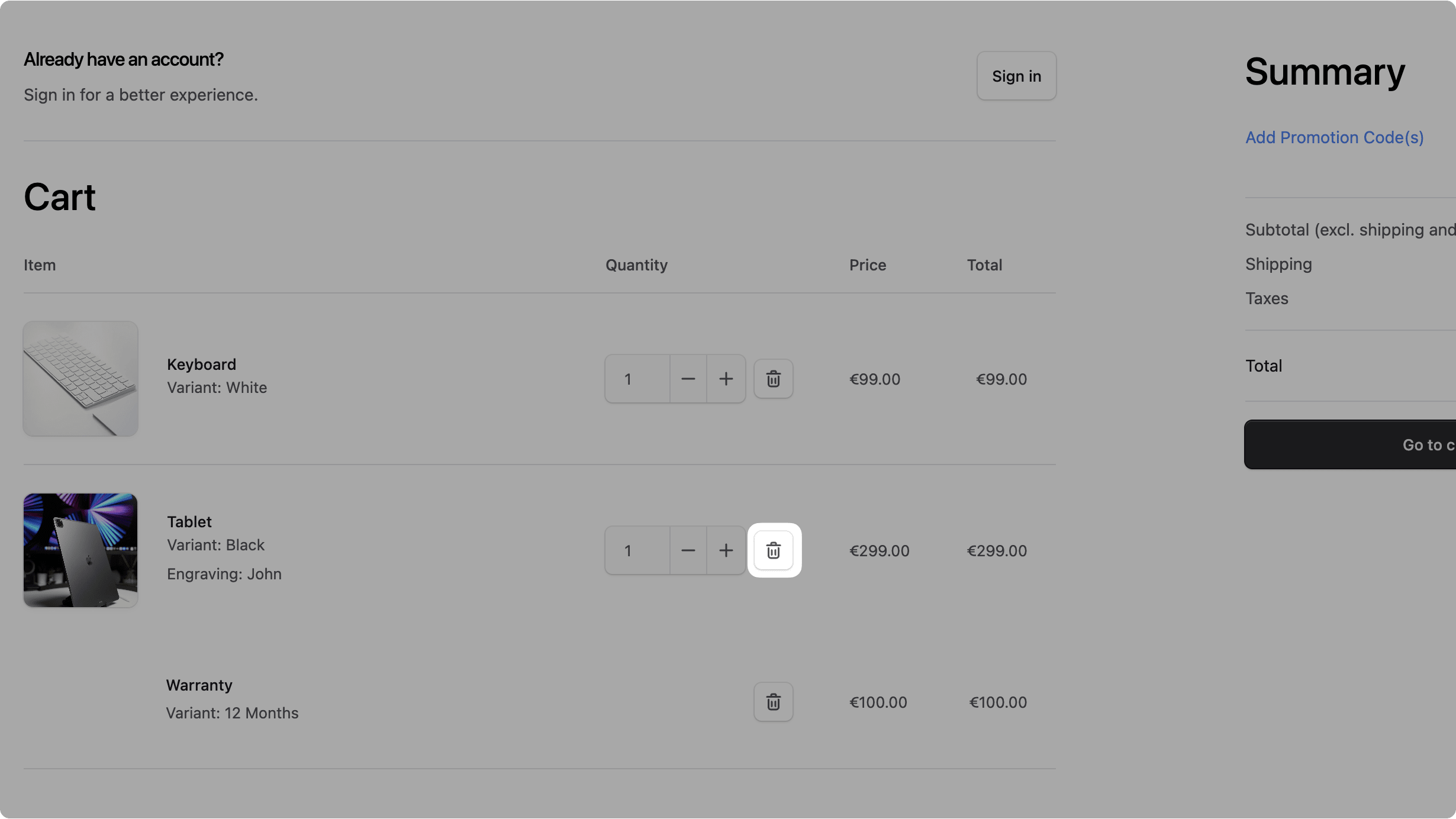
In src/modules/common/components/delete-button/index.tsx, add the following import at the top of the file:
Then, in the DeleteButton component, replace the button element in the return statement with the following:
Next, you'll update the LineItemOptions component to receive a className prop that allows customizing its styles.
In src/modules/common/components/line-item-options/index.tsx, add the following import at the top of the file:
Next, update the LineItemOptionsProps to accept a className prop:
Then, destructure the className prop and use it in the return statement of the LineItemOptions component:
1const LineItemOptions = ({2 // ...3 className,4}: LineItemOptionsProps) => {5 return (6 <Text7 data-testid={dataTestid}8 data-value={dataValue}9 className={clx(10 "inline-block txt-medium text-ui-fg-subtle w-full overflow-hidden text-ellipsis",11 className12 )}13 >14 Variant: {variant?.title}15 </Text>16 )17}
Next, you'll make small adjustments to the text size of the item price components.

In src/modules/common/components/line-item-price/index.tsx, update the className prop of the span element containing the price:
1return (2 <div>3 {/* ... */}4 <span5 className={clx("txt-sm", {6 "text-ui-fg-interactive": hasReducedPrice,7 })}8 data-testid="product-price"9 >10 {convertToLocale({11 amount: currentPrice,12 currency_code: currencyCode,13 })}14 </span>15 {/* ... */}16 </div>17)
You change the text-base-regular class to txt-small.
Next, in src/modules/common/components/line-item-unit-price/index.tsx, update the className prop of the wrapper div and the span element containing the price:
1return (2 <div className="flex flex-col text-ui-fg-subtle justify-center h-full">3 {/* ... */}4 <span5 className={clx("txt-small", {6 "text-ui-fg-interactive": hasReducedPrice,7 })}8 data-testid="product-unit-price"9 >10 {convertToLocale({11 amount: total / item.quantity,12 currency_code: currencyCode,13 })}14 </span>15 {/* ... */}16 </div>17)
You changed the text-ui-fg-muted class in the wrapper div to text-ui-fg-subtle, and the text-base-regular class in the span element to txt-small.
Update Item Component
Next, you'll update the component showing a line item row. This component is used in multiple places, including the cart and checkout pages.
You'll update the component to ignore addon products. Instead, you'll show them as part of the main product line item. You'll also display the custom field values of the main product.
In src/modules/cart/components/item/index.tsx, add the following import at the top of the file:
Then, add a cartItems prop to the ItemProps:
And add the prop to the Item component's destructured props:
Next, add the following in the component before the return statement:
1const Item = ({ item, type = "full", currencyCode, cartItems }: ItemProps) => {2 // ...3 // Check if this is a main product builder item4 const itemWithMetadata = item as LineItemWithBuilderMetadata5 const isMainBuilderProduct = isBuilderLineItem(itemWithMetadata)6 7 // Find addon items for this main product8 const addonItems = isMainBuilderProduct && cartItems9 ? cartItems.filter((cartItem: any) => 10 cartItem.metadata?.main_product_line_item_id === item.id && 11 cartItem.metadata?.is_addon === true12 )13 : []14 15 // Don't render addon items as separate rows (they'll be shown under the main item)16 if (itemWithMetadata.metadata?.is_addon === true) {17 return null18 }19 20 // ...21}
You create an itemWithMetadata variable, which is a typed version of the item prop that includes the metadata fields you defined earlier.
Next, if the item being viewed is a main product with builder configurations, you retrieve its addon items. Otherwise, if it's an addon item, you return null to skip rendering it as a separate row.
Finally, update the return statement to the following:
1return (2 <>3 <Table.Row className={clx(4 "w-full",5 addonItems.length > 0 ? "border-b-0": ""6 )} data-testid="product-row">7 <Table.Cell className="!pl-0 py-6 w-24">8 <LocalizedClientLink9 href={`/products/${item.product_handle}`}10 className={clx("flex", {11 "w-16": type === "preview",12 "small:w-24 w-12": type === "full",13 })}14 >15 <Thumbnail16 thumbnail={item.thumbnail}17 images={item.variant?.product?.images}18 size="square"19 />20 </LocalizedClientLink>21 </Table.Cell>22 23 <Table.Cell className="text-left py-7 w-2/3">24 <Text25 className="!txt-small-plus text-ui-fg-base"26 data-testid="product-title"27 >28 {item.product_title}29 </Text>30 <LineItemOptions variant={item.variant} data-testid="product-variant" className="txt-small" />31 {!!itemWithMetadata.metadata?.custom_fields && (32 <div className="inline-block overflow-hidden">33 {itemWithMetadata.metadata.custom_fields.map((field) => (34 <Text key={field.field_id} className="text-ui-fg-subtle txt-small">35 {field.name}: {field.value}36 </Text>37 ))}38 </div>39 )}40 </Table.Cell>41 42 {type === "full" && (43 <Table.Cell className="px-6">44 <div className="flex gap-2 items-center justify-end">45 <CartItemSelect46 value={item.quantity}47 onQuantityChange={(value) => {48 if (value === item.quantity) {49 return50 }51 changeQuantity(value)52 }}53 data-testid="product-select-button"54 max={maxQuantity}55 />56 <DeleteButton id={item.id} data-testid="product-delete-button" />57 {updating && <Spinner />}58 </div>59 <ErrorMessage error={error} data-testid="product-error-message" />60 </Table.Cell>61 )}62 63 {type === "full" && (64 <Table.Cell className="hidden small:table-cell px-6">65 <LineItemUnitPrice66 item={item}67 style="tight"68 currencyCode={currencyCode}69 />70 </Table.Cell>71 )}72 73 <Table.Cell className="px-6">74 <span75 className={clx("!pr-0", {76 "flex flex-col items-end h-full justify-center": type === "preview",77 })}78 >79 {type === "preview" && (80 <span className="flex gap-x-1 ">81 <Text className="text-ui-fg-muted">{item.quantity}x </Text>82 <LineItemUnitPrice83 item={item}84 style="tight"85 currencyCode={currencyCode}86 />87 </span>88 )}89 <LineItemPrice90 item={item}91 style="tight"92 currencyCode={currencyCode}93 />94 </span>95 </Table.Cell>96 </Table.Row>97 98 {/* Display addon items if this is a main builder product */}99 {isMainBuilderProduct && addonItems.length > 0 && addonItems.map((addon: any) => (100 <Table.Row key={addon.id} className="w-full" data-testid="addon-row">101 <Table.Cell className="!pl-0 py-6 w-24">102 </Table.Cell>103 <Table.Cell className="text-left !pl-0 py-7">104 <div className="flex items-center gap-2 py-1">105 <div className="flex flex-col gap-1">106 <Text107 data-testid="addon-title"108 className="!txt-small-plus text-ui-fg-base"109 >110 {addon.product_title}111 </Text>112 <div>113 <LineItemOptions variant={addon.variant} data-testid="addon-variant" className="txt-small" />114 </div>115 </div>116 </div>117 </Table.Cell>118 119 {type === "full" && (120 <Table.Cell className="px-6">121 <DeleteButton id={addon.id} data-testid="addon-delete-button" className="justify-end" />122 </Table.Cell>123 )}124 125 {type === "full" && (126 <Table.Cell className="hidden small:table-cell px-6">127 <LineItemUnitPrice128 item={addon}129 style="tight"130 currencyCode={currencyCode}131 />132 </Table.Cell>133 )}134 135 <Table.Cell className="px-6">136 <span137 className={clx("!pr-0", {138 "flex flex-col items-end h-full justify-center": type === "preview",139 })}140 >141 <LineItemPrice142 item={addon}143 style="tight"144 currencyCode={currencyCode}145 />146 </span>147 </Table.Cell>148 </Table.Row>149 ))}150 </>151)
You make the following key changes:
- Render the custom field values.
- Pass the new props to the
CartItemSelectcomponent. - Render the add-on items after the main product item.
- Make general styling updates to improve the layout.
You also need to update the components that use the Item component to pass the new cartItems prop.
In src/modules/cart/templates/items.tsx, replace the return statement with the following:
1const ItemsTemplate = ({ cart }: ItemsTemplateProps) => {2 // ...3 return (4 <div>5 <div className="pb-3 flex items-center">6 <Heading className="text-[2rem] leading-[2.75rem]">Cart</Heading>7 </div>8 <Table>9 <Table.Header className="border-t-0">10 <Table.Row className="text-ui-fg-subtle txt-medium-plus">11 <Table.HeaderCell className="!pl-0">Item</Table.HeaderCell>12 <Table.HeaderCell></Table.HeaderCell>13 <Table.HeaderCell className="px-6">Quantity</Table.HeaderCell>14 <Table.HeaderCell className="hidden small:table-cell px-6">15 Price16 </Table.HeaderCell>17 <Table.HeaderCell className="px-6">18 Total19 </Table.HeaderCell>20 </Table.Row>21 </Table.Header>22 <Table.Body>23 {items24 ? items25 .sort((a, b) => {26 return (a.created_at ?? "") > (b.created_at ?? "") ? -1 : 127 })28 .map((item) => {29 return (30 <Item31 key={item.id}32 item={item}33 currencyCode={cart?.currency_code}34 cartItems={items}35 />36 )37 })38 : repeat(5).map((i) => {39 return <SkeletonLineItem key={i} />40 })}41 </Table.Body>42 </Table>43 </div>44 )45}
You pass the cartItems prop to the Item component, and you pass new class names to other components for better styling.
Finally, in src/modules/cart/templates/preview.tsx, find the Item component in the return statement and update it to pass the cartItems prop:
1const ItemsPreviewTemplate = ({ cart }: ItemsTemplateProps) => {2 // ...3 return (4 <div className={5 // ...6 }>7 {/* ... */}8 <Item9 key={item.id}10 item={item}11 type="preview"12 currencyCode={cart.currency_code}13 cartItems={cart.items}14 />15 {/* ... */}16 </div>17 )18}
Test out Changes
To test out the design changes to the cart page, make sure both the Medusa application and the Next.js Starter Storefront are running.
Then, open the cart page in the storefront. If you have a product with an addon and custom fields in the cart, you'll see them displayed within the main product's row.

c. Update Cart Items Count in Dropdown#
The cart dropdown at the top right of the page will display the total number of items in the cart, including addon products.
You'll update the cart dropdown to ignore the quantity of addon products when displaying the total count.
In src/modules/layout/components/cart-dropdown/index.tsx, add the following variable before the totalItems variable in the CartDropdown component:
You filter the items to exclude any that are marked as add-ons.
Next, replace the totalItems declaration with the following:
You calculate the total items by summing the quantities of the filteredItems, which excludes addon products.
Finally, in the return statement, replace all usages of cartState.items with filteredItems, and remove the children element of the DeleteButton for better styling:
1return (2 <div3 // ...4 >5 {/* ... */}6 {cartState && filteredItems?.length ? (7 <>8 <div className="overflow-y-scroll max-h-[402px] px-4 grid grid-cols-1 gap-y-8 no-scrollbar p-px">9 {filteredItems10 .sort((a, b) => {11 return (a.created_at ?? "") > (b.created_at ?? "")12 ? -113 : 114 })15 .map((item) => (16 // ..17 <div18 // ...19 >20 {/* ... */}21 <DeleteButton22 id={item.id}23 className="mt-1"24 data-testid="cart-item-remove-button"25 />26 {/* ... */}27 </div>28 ))29 }30 </div>31 {/* ... */}32 </>33 ) : (34 {/* ... */}35 )}36 {/* ... */}37 </div>38)
Test Cart Dropdown Changes
To test out the cart dropdown changes, make sure both the Medusa application and the Next.js Starter Storefront are running.
Then, check the "Cart" navigation item at the top right. The total count next to "Cart" should not include the addon products, and the dropdown should exclude them as well.
Step 10: Delete Product with Builder Configurations from Cart#
In this step, you'll implement the logic to delete a product with builder configurations from the cart. This will include removing its addon products from the cart.
You'll create a workflow, use that workflow in an API route, then customize the storefront to use this API route when deleting a product with builder configurations from the cart.
a. Remove Product with Builder Configurations from Cart Workflow#
The workflow to remove a product with builder configurations from the cart has the following steps:
View step details
Medusa provides all of these steps, so you can create the workflow without needing to implement any custom steps.
Create the file src/workflows/remove-product-builder-from-cart.ts with the following content:
11} from "@medusajs/medusa/core-flows"12 13type RemoveProductBuilderFromCartInput = {14 cart_id: string15 line_item_id: string16}17 18export const removeProductBuilderFromCartWorkflow = createWorkflow(19 "remove-product-builder-from-cart",20 (input: RemoveProductBuilderFromCartInput) => {21 // Step 1: Get current cart with all items22 const { data: carts } = useQueryGraphStep({23 entity: "cart",24 fields: ["*", "items.*"],25 filters: {26 id: input.cart_id,27 },28 options: {29 throwIfKeyNotFound: true,30 },31 })32 33 acquireLockStep({34 key: input.cart_id,35 timeout: 2,36 ttl: 10,37 })38 39 // Step 2: Remove line item and its addons40 const itemsToRemove = transform({41 input,42 currentCart: carts,43 }, (data) => {44 const cart = data.currentCart[0]45 const targetLineItem = cart.items.find((item: any) => item.id === data.input.line_item_id)46 const lineItemIdsToRemove = [data.input.line_item_id]47 const isBuilderItem = targetLineItem?.metadata?.is_builder_main_product === true48 49 if (targetLineItem && isBuilderItem) {50 // Find all related addon items51 const relatedItems = cart.items.filter((item: any) => 52 item.metadata?.main_product_line_item_id === data.input.line_item_id &&53 item.metadata?.is_addon === true54 )55 56 // Add their IDs to the removal list57 lineItemIdsToRemove.push(58 ...relatedItems.map((item: any) => item.id)59 )60 }61 62 return {63 cart_id: data.input.cart_id,64 ids: lineItemIdsToRemove,65 }66 })67 68 deleteLineItemsWorkflow.runAsStep({69 input: itemsToRemove,70 })71 72 // Step 3: Get the updated cart73 const { data: updatedCart } = useQueryGraphStep({74 entity: "cart",75 fields: ["*", "items.*", "items.metadata"],76 filters: {77 id: input.cart_id,78 },79 options: {80 throwIfKeyNotFound: true,81 },82 }).config({ name: "get-updated-cart" })83 84 releaseLockStep({85 key: input.cart_id,86 })87 88 return new WorkflowResponse({89 cart: updatedCart[0],90 })91 }92)
This workflow receives the IDs of the cart and the line item to remove.
In the workflow, you:
- Acquire a lock on the cart to prevent concurrent modifications.
- Retrieve the cart details with its items.
- Prepare the line items to remove by identifying the main product and its related addons.
- Remove the line items from the cart.
- Retrieve the updated cart details.
- Release the lock on the cart.
You return the cart details in the response.
b. Remove Product with Builder Configurations from Cart API Route#
Next, you'll create an API route that uses the workflow you created to remove a product with builder configurations from the cart.
Create the file src/api/store/carts/[id]/product-builder/[item_id]/route.ts with the following content:
1import { MedusaRequest, MedusaResponse } from "@medusajs/framework/http"2import { removeProductBuilderFromCartWorkflow } from "../../../../../../workflows/remove-product-builder-from-cart"3 4export const DELETE = async (5 req: MedusaRequest,6 res: MedusaResponse7) => {8 const {9 id: cartId,10 item_id: lineItemId,11 } = req.params12 13 const { result } = await removeProductBuilderFromCartWorkflow(req.scope)14 .run({15 input: {16 cart_id: cartId,17 line_item_id: lineItemId,18 },19 })20 21 res.json({22 cart: result.cart,23 })24}
You expose a DELETE API route at /store/carts/[id]/product-builder/[item_id].
In the route handler, you execute the removeProductBuilderFromCartWorkflow with the cart and line item IDs from the request path parameters.
You return the cart details in the response.
c. Use API Route in Storefront#
Next, you'll customize the storefront to use the API route you created when deleting a product with builder configurations from the cart.
In src/lib/data/cart.ts, add the following function:
1export async function removeBuilderLineItem(lineItemId: string) {2 if (!lineItemId) {3 throw new Error("Missing lineItem ID when deleting builder line item")4 }5 6 const cartId = await getCartId()7 8 if (!cartId) {9 throw new Error("Missing cart ID when deleting builder line item")10 }11 12 const headers = {13 ...(await getAuthHeaders()),14 }15 16 await sdk.client17 .fetch(`/store/carts/${cartId}/product-builder/${lineItemId}`, {18 method: "DELETE",19 headers,20 })21 .then(async () => {22 const cartCacheTag = await getCacheTag("carts")23 revalidateTag(cartCacheTag)24 25 const fulfillmentCacheTag = await getCacheTag("fulfillment")26 revalidateTag(fulfillmentCacheTag)27 })28 .catch(medusaError)29}
This function sends a DELETE request to the API route you created earlier to remove a line item with builder configurations from the cart.
Next, to use this function when deleting a line item from the cart, you'll update the DeleteButton component to accept a new prop that determines whether the item belongs to a product with builder configurations.
In src/modules/common/components/delete-button/index.tsx, add the following import at the top of the file:
Then, pass an isBuilderConfigItem prop to the DeleteButton component, and update its handleDelete function to use it:
1const DeleteButton = ({2 // ...3 isBuilderConfigItem = false,4}: {5 // ...6 isBuilderConfigItem?: boolean7}) => {8 // ...9 const handleDelete = async (id: string) => {10 setIsDeleting(true)11 if (isBuilderConfigItem) {12 await removeBuilderLineItem(id).catch((err) => {13 setIsDeleting(false)14 })15 } else {16 await deleteLineItem(id).catch((err) => {17 setIsDeleting(false)18 })19 }20 }21 22 // ...23}
You update the handleDelete function to use the removeBuilderLineItem function if the isBuilderConfigItem prop is true. Otherwise, it uses the regular deleteLineItem function.
Next, you need to pass the isBuilderConfigItem prop to the DeleteButton component in the components using it.
In src/modules/cart/components/item/index.tsx, update the first DeleteButton component usage in the return statement to pass the isBuilderConfigItem prop:
Don't update the DeleteButton for addon products, as they don't have builder configurations.
Then, in src/modules/layout/components/cart-dropdown/index.tsx, add the following import at the top of the file:
Next, find the DeleteButton usage in the return statement and update it to pass the isBuilderConfigItem prop:
1return (2 <div3 // ...4 >5 {/* ... */}6 <DeleteButton7 id={item.id}8 className="mt-1"9 data-testid="cart-item-remove-button"10 isBuilderConfigItem={11 isBuilderLineItem(item as LineItemWithBuilderMetadata)12 }13 />14 {/* ... */}15 </div>16)
Test Deleting Product with Builder Configurations from Cart#
To test out the changes, make sure both the Medusa application and the Next.js Starter Storefront are running.
Then, in the storefront, delete the product with builder configurations from the cart either from the cart page or the cart dropdown. The addon item will also be removed from the cart.
Step 11: Show Product Builder Configurations in Order Confirmation#
In this step, you'll customize the order confirmation page in the storefront to group addon products with their main product, similar to the cart page.
In src/modules/order/components/item/index.tsx, add the following import at the top of the file:
Next, pass a new orderItems prop to the Item component and its prop type:
This prop will include all the items in the order, allowing you to find the addons of a main product.
After that, add the following in the Item component before the return statement:
1const Item = ({ item, currencyCode, orderItems }: ItemProps) => {2 // Check if this is a main product builder item3 const itemWithMetadata = item as LineItemWithBuilderMetadata4 const isMainBuilderProduct = isBuilderLineItem(itemWithMetadata)5 6 // Find addon items for this main product7 const addonItems = isMainBuilderProduct && orderItems8 ? orderItems.filter((orderItem: any) => 9 orderItem.metadata?.main_product_line_item_id === item.metadata?.cart_line_item_id && 10 orderItem.metadata?.is_addon === true11 )12 : []13 14 // Don't render addon items as separate rows (they'll be shown under the main item)15 if (itemWithMetadata.metadata?.is_addon === true) {16 return null17 }18 19 // ...20}
If the item is a main product, you retrieve its addons. If an item is an addon, you return null to skip rendering it as a separate row.
Finally, replace the return statement with the following:
1return (2 <>3 <Table.Row className={clx(4 "w-full",5 addonItems.length > 0 ? "border-b-0": ""6 )} data-testid="product-row">7 <Table.Cell className="!pl-0 p-4 w-24">8 <div className="flex w-16">9 <Thumbnail thumbnail={item.thumbnail} size="square" />10 </div>11 </Table.Cell>12 13 <Table.Cell className="text-left">14 <Text15 className="txt-medium-plus text-ui-fg-base"16 data-testid="product-name"17 >18 {item.product_title}19 </Text>20 <LineItemOptions variant={item.variant} data-testid="product-variant" />21 {!!itemWithMetadata.metadata?.custom_fields && (22 <div className="inline-block overflow-hidden">23 {itemWithMetadata.metadata.custom_fields.map((field) => (24 <Text key={field.field_id} className="text-ui-fg-subtle txt-small">25 {field.name}: {field.value}26 </Text>27 ))}28 </div>29 )}30 </Table.Cell>31 32 <Table.Cell className="!pr-0">33 <span className="!pr-0 flex flex-col items-end h-full justify-center">34 <span className="flex gap-x-1 ">35 <Text className="text-ui-fg-muted">36 <span data-testid="product-quantity">{item.quantity}</span>x{" "}37 </Text>38 <LineItemUnitPrice39 item={item}40 style="tight"41 currencyCode={currencyCode}42 />43 </span>44 45 <LineItemPrice46 item={item}47 style="tight"48 currencyCode={currencyCode}49 />50 </span>51 </Table.Cell>52 </Table.Row>53 54 {/* Display addon items if this is a main builder product */}55 {isMainBuilderProduct && addonItems.length > 0 && addonItems.map((addon: any) => (56 <Table.Row key={addon.id} className="w-full" data-testid="addon-row">57 <Table.Cell className="!pl-0 p-4 w-24">58 </Table.Cell>59 <Table.Cell className="text-left !pl-0">60 <div className="flex items-center gap-2 py-1">61 <div className="flex flex-col gap-1">62 <Text63 data-testid="addon-title"64 className="txt-medium text-ui-fg-base"65 >66 {addon.product_title}67 </Text>68 <div>69 <LineItemOptions variant={addon.variant} data-testid="addon-variant" className="txt-small" />70 </div>71 </div>72 </div>73 </Table.Cell>74 75 <Table.Cell className="!pr-0">76 <span className="!pr-0 flex flex-col items-end h-full justify-center">77 <span className="flex gap-x-1 ">78 <Text className="text-ui-fg-muted">79 <span data-testid="addon-quantity">{addon.quantity}</span>x{" "}80 </Text>81 <LineItemUnitPrice82 item={addon}83 style="tight"84 currencyCode={currencyCode}85 />86 </span>87 88 <LineItemPrice89 item={addon}90 style="tight"91 currencyCode={currencyCode}92 />93 </span>94 </Table.Cell>95 </Table.Row>96 ))}97 </>98)
You make the following key changes:
- Show the custom field values of a product with builder configurations.
- Show addons as a row after the main product row.
- Other design and styling changes.
You need to pass the orderItems prop to the Item component in the components using it.
In src/modules/order/components/items/index.tsx, find the Item component in the return statement and add the orderItems prop:
Test Order Confirmation Page#
To test out the changes in the order confirmation page, make sure both the Medusa application and the Next.js Starter Storefront are running.
Then, place an order with a product that has builder configurations. In the confirmation page, you'll see the product with its custom fields and addon items displayed similar to the cart page.

Step 12: Show Product Builder Configuration in Order Admin Page#
In the last step, you'll inject an admin widget to the order details page that shows the product builder configurations for each item in the order.
To create the widget, create the file src/admin/widgets/order-builder-details-widget.tsx with the following content:
1import { defineWidgetConfig } from "@medusajs/admin-sdk"2import { Container, Heading, Text, clx } from "@medusajs/ui"3import { DetailWidgetProps, AdminOrder } from "@medusajs/framework/types"4 5type BuilderLineItemMetadata = {6 is_builder_main_product?: boolean7 main_product_line_item_id?: string8 product_builder_id?: string9 custom_fields?: {10 field_id: string11 name?: string12 value: string13 }[]14 is_addon?: boolean15 cart_line_item_id?: string16}17 18type LineItemWithBuilderMetadata = {19 id: string20 product_title: string21 variant_title?: string22 quantity: number23 metadata?: BuilderLineItemMetadata24}25 26const OrderBuilderDetailsWidget = ({ 27 data: order,28}: DetailWidgetProps<AdminOrder>) => {29 const orderItems = (order.items || []) as LineItemWithBuilderMetadata[]30 31 // Find all builder main products (items with custom configurations)32 const builderItems = orderItems.filter((item) => 33 item.metadata?.is_builder_main_product || 34 item.metadata?.custom_fields?.length35 )36 37 // If no builder items, don't show the widget38 if (builderItems.length === 0) {39 return null40 }41 42 const getAddonItems = (mainItemId: string) => {43 return orderItems.filter((item) => 44 item.metadata?.main_product_line_item_id === mainItemId &&45 item.metadata?.is_addon === true46 )47 }48 49 return (50 <Container className="divide-y p-0">51 <div className="flex items-center justify-between px-6 py-4">52 <Heading level="h2">Items with Builder Configurations</Heading>53 </div>54 55 <div className="px-6 py-4">56 {builderItems.map((item, index) => {57 const addonItems = getAddonItems(item.metadata?.cart_line_item_id || "")58 const isLastItem = index === builderItems.length - 159 60 return (61 <div key={item.id} className={clx(62 "mb-6 last:mb-0",63 !isLastItem && "pb-6 border-b border-ui-border-base"64 )}>65 {/* Main Product Info */}66 <div className="flex items-start justify-between mb-3">67 <div className="flex-1">68 <Text className="font-medium text-ui-fg-base">69 {item.product_title}70 </Text>71 {item.variant_title && (72 <Text className="text-ui-fg-muted text-sm">73 Variant: {item.variant_title}74 </Text>75 )}76 <Text className="text-ui-fg-muted text-sm">77 Quantity: {item.quantity}78 </Text>79 </div>80 </div>81 82 {/* Custom Fields */}83 {item.metadata?.custom_fields && item.metadata.custom_fields.length > 0 && (84 <div className="mb-4 p-3 bg-ui-bg-field rounded-lg">85 <Text className="font-medium text-ui-fg-base mb-2 txt-compact-medium">86 Custom Fields87 </Text>88 <div className="space-y-1">89 {item.metadata.custom_fields.map((field, index) => (90 <div key={field.field_id || index} className="flex justify-between">91 <Text className="text-ui-fg-subtle txt-compact-sm">92 {field.name || `Field ${index + 1}`}93 </Text>94 <Text className="text-ui-fg-subtle txt-compact-sm">95 {field.value}96 </Text>97 </div>98 ))}99 </div>100 </div>101 )}102 103 {/* Addon Products */}104 {addonItems.length > 0 && (105 <div className="p-3 bg-ui-bg-field rounded-lg">106 <Text className="font-medium text-ui-fg-base mb-2 txt-compact-medium">107 Add-on Products ({addonItems.length})108 </Text>109 <div className="space-y-2">110 {addonItems.map((addon) => (111 <div key={addon.id} className="flex justify-between items-center">112 <div className="flex-1">113 <Text className="text-ui-fg-base txt-compact-sm">114 {addon.product_title}115 </Text>116 {addon.variant_title && (117 <Text className="text-ui-fg-muted txt-compact-xs">118 Variant: {addon.variant_title}119 </Text>120 )}121 <Text className="text-ui-fg-muted txt-compact-sm">122 Quantity: {addon.quantity}123 </Text>124 </div>125 </div>126 ))}127 </div>128 </div>129 )}130 </div>131 )132 })}133 </div>134 </Container>135 )136}137 138export const config = defineWidgetConfig({139 zone: "order.details.side.after",140})141 142export default OrderBuilderDetailsWidget
You first define types for the line item of a product builder, and a type for its metadata.
Then, in the widget, you find the items that have builder configurations by checking if they have the is_builder_main_product metadata or custom fields.
If no builder items are found, the widget will not be displayed. Otherwise, you display the item's custom values and add-on products.
Notice that to find the addons of the main product, you compare the main_product_line_item_id of the addon with the cart_line_item_id of the main product's item.
Test Order Admin Widget#
To test out the widget on the order details page:
- Make sure the Medusa Application is running.
- Open the Medusa Admin dashboard and log in.
- Go to Orders.
- Click on an order that contains an item with builder configurations.
You'll find at the end of the side section an "Items with Builder Configurations" section. The section will show the custom field values and add-ons for each item that has builder configurations.

Next Steps#
You've now implemented the product builder feature in Medusa. You can expand on this feature based on your use case. You can:
- Allow users to edit their product configurations from the cart or checkout page.
- Disallow purchasing addon products without a main product by filtering products with the
addontag. - Expand on the builder configurations to support more complex setups.
Learn More about Medusa#
If you're new to Medusa, check out the main documentation, where you'll get a more in-depth understanding of all the concepts you've used in this guide and more.
To learn more about the commerce features that Medusa provides, check out Medusa's Commerce Modules.
Troubleshooting#
If you encounter issues during your development, check out the troubleshooting guides.
Getting Help#
If you encounter issues not covered in the troubleshooting guides:
- Visit the Medusa GitHub repository to report issues or ask questions.
- Join the Medusa Discord community for real-time support from community members.